Note: You can also change the default size of a graph using the Graph Height option in File > Preferences > Graphs.
|
2.
|
|
2.
|
|
2.
|
Select Line Width Scale.
|
|
3.
|
Select to increase the current line width one to three times its default width. Or, select Other and specify a larger or smaller number. Select Scale with Font to increase the line size as you increase the display font size using Window > Font Sizes (Windows) and View > Make Text Bigger/Smaller (Macintosh).
|
|
2.
|
Select Background Color.
|
|
4.
|
Click OK.
|
|
1.
|
Right-click anywhere in a histogram and select Histogram Color.
|
|
2.
|
Click a color, or click Other and create your own color.
|

|
•
|
|
•
|
You can also right-click in a plot or graph, and select Size/Scale (or Graph > Size/Scale). Choose one of the following options:
|
•
|
To adjust the scale of the X axis, select X Axis. To adjust the scale of the Y axis, select Y Axis or Right Y Axis. For more details about this window, see Customize Axes and Axis Labels in the Axis Settings Window.
|
|
•
|
|
•
|
Select Size to Isometric when the x- and y-axes are measured in the same units and you want distances on the graph to be represented accurately regardless of direction.
|
Double-click a numeric axis to customize it using the Axis Settings window. Or, right-click the axis area and select Axis Settings to access the window.
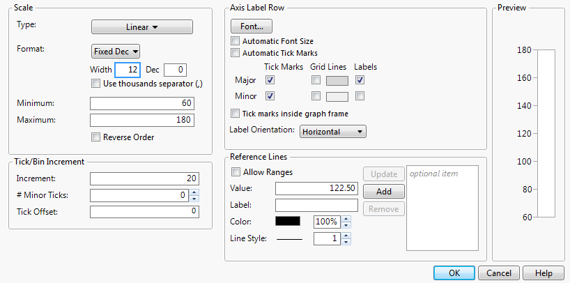
Customization features in the window depend on the data type of the axis and the specific platform JMP uses to create the plot or chart. Axis Settings Window for a Numeric (Continuous) Axis shows a typical Axis Settings window for numeric (continuous) axes.
|
•
|
|
•
|
|
•
|
|
•
|
|
•
|
|
•
|
If you selected a scale type of Log, enter the Base to use.
|
|
•
|
If you selected a scale type of Power, enter the Power to use.
|
To set a default scale type for a variable, which avoids making this change every time you run an analysis, see Axis in The Column Info Window.
For plots and charts that contain a numeric axis area, you can change the format of the axis. For details about numeric formats, see Numeric Formats in The Column Info Window.
|
•
|
If you selected Date, Time, or Duration, you need to specify the format of the increments. See Add and Remove Axis Labels. You can also specify label row nesting. See Label Row Nesting.
|
|
•
|
If you selected Fixed Dec, enter the number of decimal places that you want JMP to display in the Dec box.
|
|
•
|
If you selected Precision, select whether you want to keep trailing zeros and all whole digits.
|
|
•
|
To add commas to values that equal a thousand or more, select the Use thousands separator option. You must account a space for each comma in the Width box, or else they might not appear. This option is available for the Best, Fixed Dec, Percent, and Currency formats.
|
Note: When you change the numeric format of an axis, you do not change the numeric format of the way the values appear in the corresponding data table. To change how a date or time appears in a data table, see Numeric Formats in The Column Info Window.
|
•
|
|
•
|
Select Reverse Order to reverse the axes by reversing the minimum and maximum values.
|
Tip: To set a default minimum and maximum axis value for a variable, which avoids making this change every time you run an analysis, see Axis in The Column Info Window.
The example on the right in Rescale Axis to Enlarge a Plot Section is an enlargement of the point cluster that shows between 80 and 140 in the plot to the left. The enlarged plot is obtained by reassigning the maximum and minimum axis values and changing the number of minor tick marks to 1. (See Extend Divider Lines and Frames for Categorical Axes, for details.)

If the axis Format is set to Date, Time, or Duration, a format menu appears beside Increment. See Selecting the Format for Date and Time Increments. Select which format you want the increments to take.

Tip: To set a default axis increment for a variable, which avoids making this change every time you run an analysis, see Axis in The Column Info Window.
You can add tick marks to a numeric axis, or change the number of minor tick marks that appear on a numeric axis. In the Axis Label Row panel, be sure to select the Minor Tick Marks box so that the tick marks appear on the axis.
Tip: To set default minor tick marks for a variable, which avoids making this change every time you run an analysis, see Axis in The Column Info Window.
To change the starting point of the tick marks, enter a number in the Tick Offset box. For example, if the Tick Offset is currently set to 0, setting it to 1 will move all the values on the axes up by 1.
This option appears only if you have selected Date, Time, or Duration as the axis Format. Label row nesting enables you to split a date axis into multiple rows based on the format. For example, you might put the year on the outermost row, then the month, then the day:
|
1.
|
|
2.
|
Select Graph > Graph Builder.
|
|
3.
|
|
4.
|
|
6.
|
|
7.
|
Increase the value for Label Row Nesting to 3.
|
|
8.
|
Click OK.
|
|
9.
|
Click Done to see the finished graph.
|

You can modify the axis label font on any axis type. Your changes only apply to the active graph. To set the default axis label font, see Fonts in JMP Preferences.
|
•
|
|
•
|
Select Automatic Font Size to have JMP attempt to decrease the font size (down to a certain minimum) if all of the labels cannot fit at the default size.
|

|
•
|
Select Automatic Tick Marks to turn on tick marks only if one or more labels is hidden (due to insufficient space).
|
|
•
|
Select Tick marks inside graph frame to move the tick marks inside the graph.
|
|
•
|
|
•
|
Select Automatic Tick Marks to turn on tick marks only if one or more labels is hidden (due to insufficient space).
|
|
•
|
Add grid lines by selecting Show Grid.
|
|
•
|
Select Tick marks inside graph frame to move the tick marks inside the graph.
|
|
•
|
Select Lower Frame to add a frame around the labels.
|
|
•
|
Change the Tick Mark Style by selecting one of the options.
|
|
•
|
Tip: To set default tick marks for a variable, which avoids making this change every time you run an analysis, see Properties That Control the Display of Columns in The Column Info Window.
To change the orientation for tick labels, select an option from the Label Orientation list.
|
1.
|
|
2.
|
In the Value text box, enter the value to which you want the reference line to correspond. This is the position on the graph at which the line is placed.
|
|
3.
|
Enter a Label for the line.
|
|
‒
|
Select Allow Ranges to enter a minimum and a maximum value, which define the beginning and the end of the reference line. The reference line appears over a range of data.
|
|
‒
|
Color changes the line color. You can also specify the opacity.
|
|
‒
|
Line Style specifies the line style (when Allow Ranges is not selected). You can also specify the line width.
|
|
5.
|
Click Add. The value moves into the box to the right of the Add button, indicating that it will be placed on the graph. Your changes appear in the Preview window.
|
Tip: To set a default reference line for a variable, which avoids making this change every time you run an analysis, see Properties That Control the Display of Columns in The Column Info Window.
To extend the divider line to the x-axis labels:
|
2.
|
Select Tick Marks > Divider Lines to add the lines, or Lower Frame to add a frame around the axis area.
|

|
1.
|
Right-click a numeric axis and select Add Axis Label.
|
To remove an axis label, right-click a numeric axis and select Remove Axis Label. The last label added is removed.
|
2.
|
Select Rotate Text.
|
|
3.
|
Tip: To set a default axis label position for a variable, which avoids making this change every time you run an analysis, see Properties That Control the Display of Columns in The Column Info Window.
On a nominal axis, you can rotate tick marks. Right-click the tick label and select Rotated Tick Labels.
|
2.
|
Select Edit > Copy Frame Contents.
|
|
4.
|
Select Edit > Paste Frame Contents.
|
Note: If you are having difficulty pasting histogram bars, see the JSL workaround in the Scripting Guide.
After customizing an axis (as described in Customize Axes and Axis Labels in the Axis Settings Window), you can copy and paste your new settings to another axis:
|
2.
|
Select Edit > Copy Axis Settings.
|
|
4.
|
Select Edit > Paste Axis Settings.
|
Data in a JMP report might not appear in the order that you prefer. To give data a specific order so that it appears that way in a report, assign the column the Value Ordering property before running the analysis, as described in Value Ordering in The Column Info Window.
Right-click the item in the legend and select Fill Pattern to select a new pattern.
Select File > Preferences > Graphs (Windows) or JMP > Preferences > Graphs (Macintosh) to change the Filled Areas preferences.
For details about adding maps, see Essential Graphing.

JMP includes a variety of image processing options. Image processing includes filters that can sharpen, blur, resize, and enhance. JMP also allows flipping, rotating, and locking images. Descriptions of Image Options details the processing options.
|
|||||||||||||||||||||||
|
|||||||||||||||||||||||
|
|||||||||||||||||||||||
JMP provides the ability to extract information from images into a data table and then analyze that information. Researchers at WildTrack.org analyze digital footprint photos in JMP to track endangered species. They drag and drop a footprint image into a JMP report and draw data points to capture the size and shape of the print. A JMP Scripting Language (JSL) script extracts those measurements into a data table. At that point, the researchers can analyze the data and determine whether the footprint is from a new animal. This method helps them track populations of endangered species in specific regions of the world.

You can add a graph to a new data table. Right-click on a graph and select Edit > Make table of graphs like this. The graph and the variables appear in a new data table.
