The default report format is the Crosstab format, which gathers all three statistics for each sample level and response together. The Crosstab format displays the responses on the top and the sample levels down the side, with multiple table elements together in each cell of the cross tabulation.
The Crosstab format has a transposed version, Crosstab Transposed, which is useful when there are a lot of response categories but not a lot of sample levels. Crosstab Transposed displays the responses down the side and the sample levels across the top, with multiple table elements together in each cell.
The Structured analysis always uses the Crosstab Transposed form, but in a more complex arrangement. The Free Text analysis has its own specialized reports. For more information about Free Text, refer to Free Text Report Options.
Selecting the Legend red triangle menu shows or hides the legend for the response column on the Share Chart.
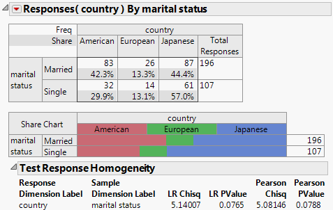
Single responses are tested with a chi-square test of homogeneity. However, there are two types of this test: the Likelihood Ratio Chi-square and the Pearson Chi-square. It is a matter of personal preference and training which one you prefer. An option, Chi-square Test Choices, on the Categorical red triangle menu, enables you to show one or the other, or both. For more information, refer to Test Options.
Shows extra slots for supercategories in the Crosstab table and the Frequency Chart to aggregate over groups of categories. For more information about supercategories, refer to Supercategories.
Calculates the response means, using the numeric categories, or value scores. This is enabled for columns that use numeric codes, or for categories that have a Value Scores property. To make the Mean Score interpretable, you can assign specific value scores in the Column Info window with the Value Scores column property.For more information and an example, refer to Mean Score Example.
Compares the mean scores across groups of sample levels, showing which groups are significantly different. A pairwise multiple comparisons Student’s t test is used for the mean score comparison, based on the specified comparison groups. For more information about the letter codes, refer to Comparisons with Letters. For more information about specifying the comparison groups, refer to Specify Comparison Groups.
Filters data to specific groups or ranges. Opens the Local Data Filter panel allowing you to identify varying subsets of data. The filtered rows do not appear in the reports. Sample levels with 0 values are always hidden. To show the filtered rows in reports, select Include Responses Not in Data in the launch window. You can also select the Set Preferences red triangle menu, and then select Include Responses Not in Data.
Enables you to set preferences for future launches and sessions. For more information, refer to Set Preferences.
Contains options (Grouping Option, Count Missing Response, Order Response Levels High to Low, Shorten Labels, and Include Responses Not in Data) that are also presented on the launch window that could be specified before the analysis. The options can also be selected here and have the effect of rerunning the platform with the new option setting. For more information, refer to Other Launch Window Options.
Enables you to return to the launch window and edit the specifications for a structured table. For more information, refer to Structured Tab.
|
1.
|
|
2.
|
|
3.
|
|
4.
|
|
5.
|
Click OK.
|
|
6.
|
Select Test Response Homogeneity from the Categorical red triangle menu.
|
|
1.
|
|
2.
|
|
3.
|
|
4.
|
Select brush and click X, Grouping Category to compare the sample levels across the brush treatment variable.
|
|
5.
|
Click OK.
|
|
6.
|
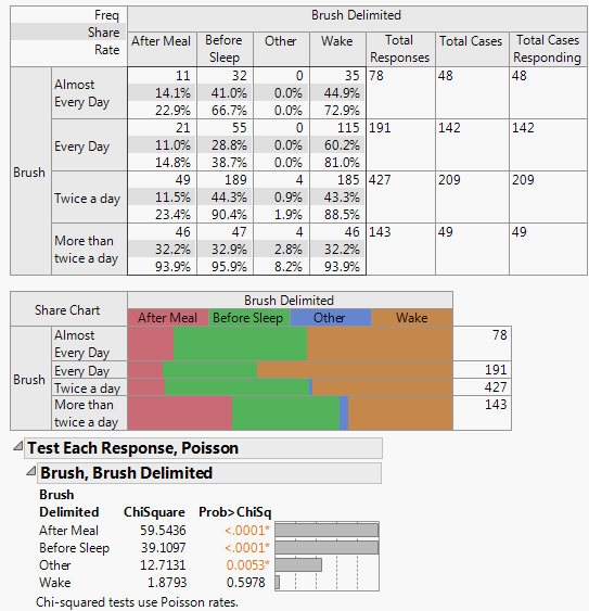
The p-values show that After Meal and Before Sleep are the most significantly different. Wake is not significantly different with this amount of data.
|
7.
|
Select Test Multiple Response and then Homogeneity Test, Binomial from the Categorical red triangle menu.
|

The Homogeneity Test, Binomial option always produces a larger test statistic (and therefore a smaller p-value) than the Count Test, Poisson option. The binomial distribution compares not only the rate at which the response occurred (the number of people who reported that they brush upon waking) but also the rate at which the response did not occur (the number of people who did not report that they brush upon waking).
|
1.
|
|
2.
|
|
3.
|
|
4.
|
|
5.
|
Click OK.
|
|
6.
|
Select Crosstab Transposed from the red triangle menu.
|
|
7.
|
Select Cell Chisq from the red triangle menu.
|

|
•
|
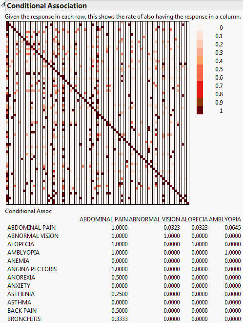
The response variable is a Multiple Response and the Unique occurrences within ID box is checked on the Categorical launch window.
|
The Conditional Association option is used to compute the conditional probability of one response given a different response. A table and color map of the conditional probabilities are given. This option is available only when the Unique occurrences within ID box is checked on the Categorical launch window. A common application of this analysis is when the responses represent adverse events (side effects) from a drug. The computations represent the conditional probability of one side effect given the presence of another side effect. For AdverseR.jmp, given the response in each row, Conditional Association shows the rate of also having the response in a column. Conditional Association only displays a few variables in the table due to size constraints.
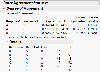
The Rater Agreement analysis answers the questions of how closely raters agree with one another and if the lack of agreement is symmetrical. For example, open Attribute Gauge.jmp. The Attribute Chart script runs the Variability Chart platform, which has a test for agreement among raters.
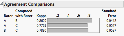
Launch the Categorical platform and designate the three raters (A, B, and C) as Rater Agreement responses on the Related tab on the launch window. In the resulting report, you have a similar test for agreement that is augmented by a symmetry test that the lack of agreement is symmetric.
|
1.
|
|
2.
|
Select Analyze > Consumer Research > Categorical.
|
|
3.
|
|
4.
|
|
5.
|
Click OK.
|

For a given response, Compare Each Sample tests whether the response probability for each of its levels differs from the response probabilities for its other levels. In simple situations, the Compare Each Sample report consists of symmetric matrices of p-values, as shown in Compare Each Sample.
In addition, a new row or column, entitled Compare, appears in the Crosstabs table. The Compare row is placed at the bottom of the table, or the Compare column is placed at the far right. (Whether a row or column is appended depends on whether Crosstab or Crosstab Transposed is specified.) The Compare row or column contains letter codes showing which sample levels differ significantly. For more information about the letter codes, refer to Comparisons with Letters.

For a given response and a given X variable, Compare Each Cell tests, for each level of the X variable, whether the response probabilities differ across the levels of the response. In other words, Compare Each Cell tests response probabilities across the cells in a given row of the Crosstabs table. The Compare Each Cell report gives p-values in a tabular format. The letters across the top indicate the response levels tested for the given level of the X variable. An example is shown in Compare Each Cell (cut off after column AE).
In addition, when a cell differs significantly from other cells, a letter code is inserted into the appropriate cell in the Crosstabs table. For details on the letter codes and on their placement in cells, refer to Comparisons with Letters.

Lowercase letters are also used for comparisons that are slightly less significant, according to Letter Comparisons. These comparisons suffer when the count for that sample level group (the Base Count) is small, and asterisks start to appear in the comparison cells to warn you.
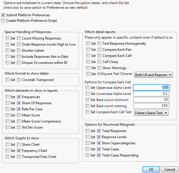
The comparison features are controlled by four options set in Preferences or through a script. For more information, refer to Set Preferences.
Single responses are tested with a chi-square test of homogeneity; either the Likelihood Ratio Chi-square or the Pearson Chi-square, or both. Options are: Both LR and Pearson, LR Only, or Pearson Only. You can set an option in Preferences.
Saves a transposed version of the Frequency report to a new data table, without the marginal totals.
The options are initialized to the current state. Select the appropriate options and select either Submit Platform Preferences or Create Platform Preference Script to submit the options to your preferences as the new default. When the Categorical platform is launched, the preferences associated with the current preference set are enacted.
Free Text is used for comment fields where the analysis counts the frequency of each word used. Free Text gives word counts in both word order and frequency order, and the rate of non-empty text. The following example uses the Consumer Preferences.jmp sample data table, which contains survey data relating to oral hygiene preferences. A comment field was included in the survey asking for reasons why the participant did not floss.
|
1.
|
|
2.
|
Select Analyze > Consumer Research > Categorical.
|
|
3.
|
|
4.
|
Click OK.
|
|
5.
|
Select Score Words by Column from the first Free Text Word Counts for Reasons Not to Floss red triangle menu and then select Floss. Click OK.
|

Free Text Report Example details the free text word counts the respondents included as reasons why they do not floss. From the analysis, you can determine the number of words, cases, non-empty cases, and portions of non-empty cases. You can also view the word counts alphabetically, in terms of frequency, or by the mean scores. There are more commands to further customize the analysis on the Free Text red triangle menu on the report:
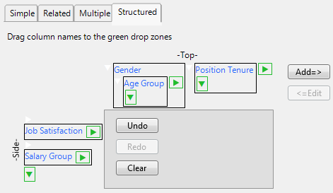
The Structured tab enables you to construct complex tables of descriptive statistics by dragging column names into green icon drop zones to create side-by-side and nested results. The following example uses the Consumer Preferences.jmp sample data table. From this data, suppose that you wanted to compare job satisfaction and salary against gender by age group and position tenure.
|
1.
|
|
2.
|
|
4.
|
|
5.
|
|
6.
|
|
7.
|
|
8.
|
|
9.
|
Click Add=>.
|
|
10.
|
Click OK.
|
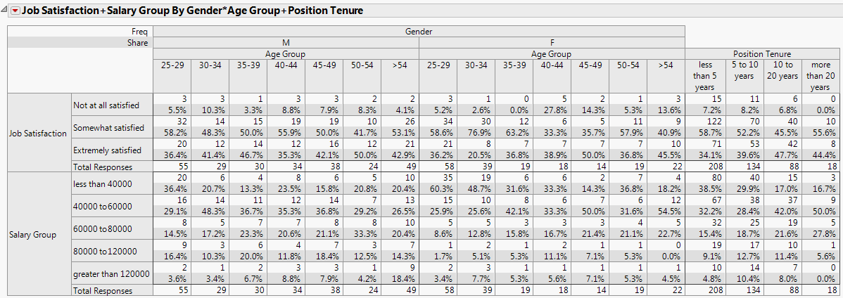
Structured Tab Report Example shows that the majority of both the male and female respondents were somewhat satisfied with their jobs, with the highest percentage of males being in the 25-29 age group, while the females were in the 30-34 age group. Most of those who were somewhat satisfied had been in their current position for less than 5 years.