The red triangle menu on the window title bar lists options that affect the report window. If you request XBar and R at the same time, you can check each chart type to show or hide it. The specific options that are available depend on the type of control chart you request. Unavailable options show as grayed menu items.
Connects points when some samples have missing values. In Example of Connected through Missing Option, the left chart has no missing points. The middle chart has samples 2, 11, 19, and 27 missing with the points not connected. The right chart appears if you select the Connect Through Missing option, which is the default.

For Run Charts, when you select the Show Center Line option in the individual Run Chart red triangle menu, a line is drawn through the center value of the column. The center line is determined by the Use Median setting of the main Run Chart red triangle menu. When Use Median is selected, the median is used as the center line. Otherwise, the mean is used. When saving limits to a file, both the overall mean and median are saved
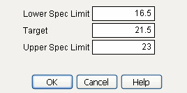
An example of a capability analysis report is shown in Capability Analysis Report for Coating.jmp for Coating.jmp when the Lower Spec Limit is set as 16.5, the Target is set to 21.5, and the Upper Spec Limit is set to 23.
Capability Analysis Report for Coating.jmp
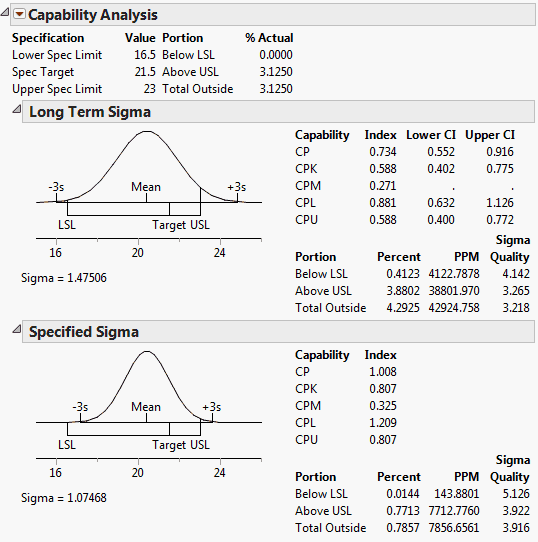
For additional information about Capability Analysis, see the Basic Analysis book.
Saves all parameters for the particular chart type, including sigma and K Sigma, sample size, the center line, and the upper and lower control limits in a new JMP data table. Save this data table to use the limits later. On the Control Chart launch window, click Get Limits and then select the saved data table. See the section Saving and Retrieving Limits for more information.
Enables you to write and run a script that indicates when the data fail special causes tests. Results can be written to the log or spoken. See Tests in Control Chart Builder of this guide for more information. See the Scripting Guide for more information about writing custom Alarm Scripts.
The red triangle menu of chart options appears when you click the icon next to the chart name. Some options are also available under Chart Options when you right-click the chart.
Superimposes box plots on the subgroup means plotted in a Mean chart. The box plot shows the subgroup maximum, minimum, 75th percentile, 25th percentile, and median. Markers for subgroup means show unless you deselect the Show Points option. The control limits displayed apply only to the subgroup mean. The Box Plots option is available only for  -charts. It is most appropriate for larger subgroup sample sizes (more than 10 samples in a subgroup).
Shows or hides the points representing summary statistics. Initially, the points show. You can use this option to suppress the markers denoting subgroup means when the Box Plots option is in effect.
Initially displays the center line in green. Deselecting Show Center Line removes the center line and its legend from the chart.
Shows a submenu that enables you to choose which tests to mark on the chart when the test is positive. Tests apply only for charts whose limits are 3σ limits. Tests 1 to 4 apply to Mean, Individual, and attribute charts. Tests 5 to 8 apply to Mean charts, Presummarize, and Individual Measurement charts only. If tests do not apply to a chart, the Tests option is dimmed. When sample sizes are unequal, the Test options are grayed out. If the samples change while the chart is open and they become equally sized, and the zone and/or test option is selected, the zones and/or tests are applied immediately and appear on the chart. These special tests are also referred to as the Western Electric Rules. For more information about special causes tests, see Tests in Control Chart Builder.
Westgard rules are control rules that help you decide whether a process is in or out of control. The different tests are abbreviated with the decision rule for the particular test.tailed below. See the text and chart in Westgard Rules in Control Chart Builder.
Flags as a “*” any point that is beyond the limits. This test works on all charts with limits, regardless of the sample size being constant, and regardless of the size of k or the width of the limits. For example, if you had unequal sample sizes, and wanted to flag any points beyond the limits of an r-chart, you could use this command.
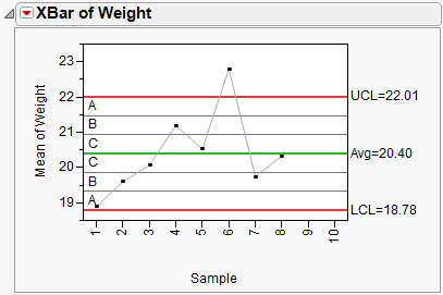
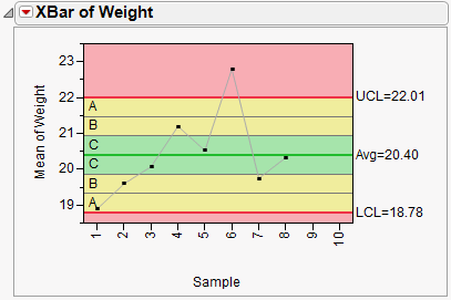
Shows or hides the zone lines. The zones are labeled A, B, and C as shown here in the Mean plot for weight in the Coating.jmp sample data. Control Chart tests use the zone lines as boundaries. The seven zone lines are set one sigma apart, centered on the center line.
Gives Operating Characteristic (OC) curves for specific control charts. OC curves are defined in JMP only for X-, p-, np-, c-, and u-charts. The curve shows how the probability of accepting a lot changes with the quality of the sample. When you choose the OC Curve option from the control chart option list, JMP opens a new window containing the curve, using all the calculated values directly from the active control chart. Alternatively, you can run an OC curve directly from the Control category of the JMP Starter. Select the chart on which you want the curve based, then a window prompts you for Target, Lower Control Limit, Upper Control Limit, k, Sigma, and Sample Size. You can also perform both single and double acceptance sampling in the same manner. To engage this feature, choose View > JMP Starter > Control (under Click Category) > OC Curves. A pop-up window enables you to specify whether single or double acceptance sampling is desired. A second pop-up window is invoked, where you can specify acceptance failures, number inspected, and lot size (for single acceptance sampling). Clicking OK generates the desired OC curve.