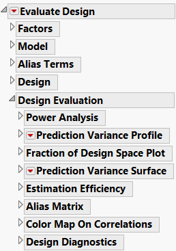
The Evaluate Design window consists of two parts. See Evaluate Design Window Showing All Possible Outlines, where all outline nodes are closed.
|
•
|
|
•
|
|
•
|
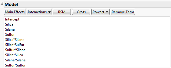
Model Outline for Bounce Data.jmp shows the Model outline for the Bounce Data.jmp data table, found in the Design Experiment folder. The Model script in the data table contains response surface effects for the three factors Silica, Silane, and Sulfur. Consequently, the Model outline contains the main effects, two-way interactions, and quadratic effects for these three factors.
It is possible that effects not included in your assumed model are active. In the Alias Terms outline, list potentially active effects that are not in your assumed model but might bias the estimates of model terms. The Alias Matrix entries represent the degree of bias imparted to model parameters by the effects that you specified in the Alias Terms outline. For details, see The Alias Matrix in Technical Details.
By default, the Alias Terms outline includes all two-way interaction effects that are not in your Model outline (with the exception of terms involving blocking factors). Add or remove terms using the buttons. For a description of how to use these buttons to add effects to the Alias Terms table, see Model.
Power is calculated for the effects listed in the Model outline. These include continuous, discrete numeric, categorical, blocking, covariate, mixture, and covariate factors. The tests are for individual model parameters and for whole effects. For details on how power is calculated, see Power Calculations.
Power Analysis for Coffee Data.jmp shows the Power Analysis outline for the design in the Coffee Data.jmp sample data table, found in the Design Experiment folder. The model specified in the Model script is a main effects only model.
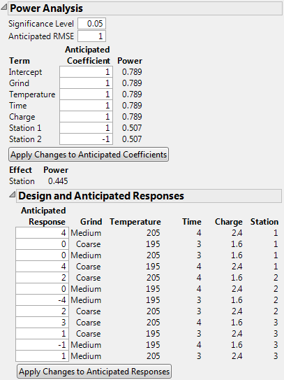
The top portion of the Power Analysis report opens with default values for the Anticipated Coefficients. See Power Analysis for Coffee Data.jmp. The default values are based on Delta. For details, see Advanced Options > Set Delta for Power.
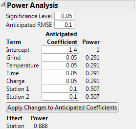
Possible Specification of Anticipated Coefficients for Coffee Data.jmp shows the top portion of the Power Analysis report where values have been specified for the Anticipated Coefficients. These values reflect the differences you want to detect.
A value for the coefficient associated with the model term. This value is used in the calculations for Power. These values are also used to calculate the Anticipated Response column in the Design and Anticipated Responses outline. When you set a new value in the Anticipated Coefficient column, click Apply Changes to Anticipated Coefficients to update the Power and Anticipated Response columns.
Note: The anticipated coefficients have default values of 1 for continuous effects. They have alternating values of 1 and –1 for categorical effects. You can specify a value for Delta be selecting Advanced Options > Set Delta for Power from the red triangle menu. If you change the value of Delta, the values of the anticipated coefficients are updated so that their absolute values are one-half of Delta. For details, see Advanced Options > Set Delta for Power.
Calculations use the specified Significance Level and Anticipated RMSE. For details of the power calculation, see Power for a Single Parameter.
When you set a new value in the Anticipated Coefficient column, click Apply Changes to Anticipated Coefficients to update the Power and Anticipated Response columns.
Calculations use the specified Significance Level and Anticipated RMSE. For details of the power calculation, see Power for a Categorical Effect.
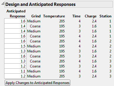
Anticipated Responses for Coffee Data.jmp shows the Design and Anticipated Responses outline corresponding to the specification of Anticipated Coefficients given in Possible Specification of Anticipated Coefficients for Coffee Data.jmp.
Click Apply Changes to Anticipate Responses to update both the Anticipated Coefficient and Power columns.
The response value obtained using the Anticipated Coefficient values as coefficients in the model. When the outline first appears, the calculation of Anticipated Response values is based on the default values in the Anticipated Coefficient column. When you set new values in the Anticipated Response column, click Apply Changes to Anticipated Responses to update the Anticipated Coefficient and Power columns.
When you set new values in the Anticipated Response column, click Apply Changes to Anticipated Responses to update the Anticipated Coefficient and Power columns.
Consider the design in the Coffee Data.jmp data table. Suppose that you are interested in the power of your design to detect effects of various magnitudes on Strength. Recall that Grind is a two-level categorical factor, Temperature, Time, and Charge are continuous factors, and Station is a three-level categorical (blocking) factor.
In this example, ignore the role of Station as a blocking factor. You are interested in the effect of Station on Strength. Since Station is a three-level categorical factor, it is represented by two terms in the Parameters list: Station 1 and Station 2.
Specifically, you are interested the probability of detecting the following changes in the mean Strength:
|
•
|
A change of 0.10 units as you vary Grind from Coarse to Medium.
|
|
•
|
A change of 0.10 units or more as you vary Temperature, Time, and Charge from their low to high levels.
|
You set 0.05 as your Significance Level. Your estimate of the standard deviation of Strength for fixed design settings is 0.1 and you enter this as the Anticipated RMSE.
Power Analysis Outline with User Specifications in Anticipated Coefficients Panel shows the Power Analysis node with these values entered. Specifically, you specify the Significance Level, Anticipated RMSE, and the value of each Anticipated Coefficient.

Recall that Temperature is a continuous factor with coded levels of -1 and 1. Consider the test whose null hypothesis is that Temperature has no effect on Strength. Power Analysis Outline with User Specifications in Anticipated Coefficients Panel shows that the power of this test to detect a difference of 0.10 (=2*0.05) units across the levels of Temperature is only 0.291.
Now consider the test for the whole Station effect, where Station is a three-level categorical factor. Consider the test whose null hypothesis is that Station has no effect on Strength. This is the usual F test for a categorical factor provided in the Effect Tests report when you run Analyze > Fit Model. (See the Fitting Linear Models book.)
The Power of this test is shown directly beneath the Apply Changes to Anticipated Coefficients button. The entries under Anticipated Coefficients for the model terms Station 1 and Station 2 are both 0.10. These settings imply that the effect of both stations is to increase Strength by 0.10 units above the overall anticipated mean. For these settings of the Station 1 and Station 2 coefficients, the effect of Station 3 on Strength is to decrease it by 0.20 units from the overall anticipated mean. Power Analysis Outline with User Specifications in Anticipated Coefficients Panel shows that the power of the test to detect a difference of at least this magnitude is 0.888.
The Prediction Variance Profile outline shows a profiler of the relative variance of prediction. Select the Maximize Desirability option from the red triangle next to Prediction Variance Profile to find the maximum value of the relative prediction variance over the design space. For details, see Maximize Desirability.
The Prediction Variance Profile plots the relative variance of prediction as a function of each factor at fixed values of the other factors. Prediction Variance Profiler shows the Prediction Variance Profile for the Bounce Data.jmp data table, located in the Design Experiment folder.
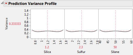
For given settings of the factors, the prediction variance is the product of the error variance and a quantity that depends on the design and the factor settings. Before you run your experiment, the error variance is unknown, so the prediction variance is also unknown. However, the ratio of the prediction variance to the error variance is not a function of the error variance. This ratio, called the relative prediction variance, depends only on the design and the factor settings. Consequently, the relative variance of prediction can be calculated before acquiring the data. For details, see Relative Prediction Variance.
You can also evaluate a design or compare designs in terms of the maximum relative prediction variance. Select the Maximize Desirability option from the red triangle next to Prediction Variance Profile. JMP uses a desirability function that maximizes the relative prediction variance. The value of the Variance displayed in the Prediction variance Profile is the worst (least desirable from a design point of view) value of the relative prediction variance.
Prediction Variance Profile Showing Maximum Variance shows the Prediction Variance Profile after Maximize Desirability was selected. The plot is for the Bounce Data.jmp sample data table, located in the Design Experiment folder. The largest value of the relative prediction variance is 1.395833. The plot also shows values of the factors that give this worst-case relative variance. However, keep in mind that many settings can lead to this same relative variance. See Prediction Variance Surface.

The Fraction of Design Space Plot shows the proportion of the design space over which the relative prediction variance lies below a given value. Fraction of Design Space Plot shows the Fraction of Design Space plot for the for the Bounce Data.jmp sample data table, located in the Design Experiment folder.
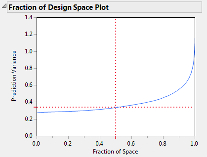
The X axis in the plot represents the proportion of the design space, ranging from 0 to 100%. The Y axis represents relative prediction variance values. For a point  that falls on the blue curve, the value x is the proportion of design space with variance less than or equal to y. Red dotted crosshairs mark the value that bounds the relative prediction variance for 50% of design space.
Fraction of Design Space Plot shows that the minimum relative prediction variance is slightly less than 0.3, while the maximum is below 1.4. (The actual maximum is 1.395833, as shown in Prediction Variance Profile Showing Maximum Variance.) The red dotted crosshairs indicate that the relative prediction variance is about 0.34. You can use the crosshairs tool to find the maximum relative prediction variance that corresponds to any Fraction of Space value. Use the crosshairs tool in Fraction of Design Space Plot to see that 90% of the prediction variance values are below approximately 0.55.
The Prediction Variance Surface report plots the relative prediction variance surface as a function of any two design factors. Prediction Variance Surface shows the Prediction Variance Surface outline for the for the Bounce Data.jmp sample data table, located in the Design Experiment folder. Show or hide the controls by selecting Control Panel on the red triangle menu. See Control Panel.
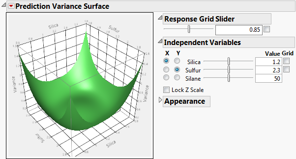
The Grid check box superimposes a grid that shows constant values of Variance. The value of the Variance is shown in the text box. The slider enables you to adjust the placement of the grid. Alternatively, you can enter a Variance value in the text box. Click outside the box to update the plot.
This panel enables you to select which two factors are used as axes for the plot and to specify the settings for factors not used as axes. Select a factor for each of the X and Y axes by clicking in the appropriate column. Use the sliders and text boxes to specify values for each factor not selected for an axis. The plot shows the three-dimensional slice of the surface at the specified values of the factors that are not used as axes in the plot. Move the sliders to see different slices.
Lock Z Scale locks the z-axis to its current values. This is useful when moving the sliders that are not on an axis.
The Resolution slider affects how many points are evaluated for a formula. Too coarse a resolution means that a function with a sharp change might not be represented very well. But setting the resolution high can make evaluating and displaying the surface slower.
The Orthographic projection check box shows a projection of the plot in two dimensions.
The Contour menu controls the placement of contour curves. A contour curve is a set of points whose Response values are constant. You can select to turn the contours Off (the default) or place them contours Below, Above, or On Surface.
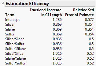
This report gives the Fractional Increase in CI (Confidence Interval) Length and Relative Std (Standard) Error of Estimate for each parameter estimate in the model. Estimation Efficiency Outline shows the Estimation Efficiency outline for the Bounce Data.jmp sample data table, located in the Design Experiment folder.
n is the number of runs.
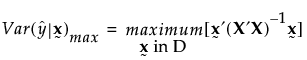
The Relative Std Error of Estimate gives the ratio of the standard deviation of a parameter’s estimate to the error standard deviation. These values indicate how large the standard errors of the model’s parameter estimates are, relative to the error standard deviation. For the ith parameter estimate, the Relative Std Error of Estimate is defined as follows:
The Alias Matrix addresses the issue of how terms that are not included in the model affect the estimation of the model terms, if they are indeed active. In the Alias Terms outline, you list potentially active effects that are not in your assumed model but that might bias the estimates of model terms. The Alias Matrix entries represent the degree of bias imparted to model parameters by the Alias Terms effects. See Alias Terms.
Consider the Coffee Data.jmp sample data table, located in the Design Experiment folder. The design assumes a main effects model. You can see this by running the Model script in the data table. Consequently, in the Evaluate Design window’s Model outline, only the Intercept and five main effects appear. The Alias Terms outline contains the two-way interactions. The Alias Matrix is shown in Alias Matrix for Coffee Data.jmp.

The Alias Matrix shows the Model terms in the first column defining the rows. The two-way interactions in the Alias Terms are listed across the top, defining the columns. Consider the model effect Temperature for example. If the Grind*Time interaction is the only active two-way interaction, the estimate for the coefficient of Temperature is biased by 0.333 times the true value of the Grind*Time effect. If other interactions are active, then the value in the Alias Matrix indicates the additional amount of bias incurred by the Temperature coefficient estimate.
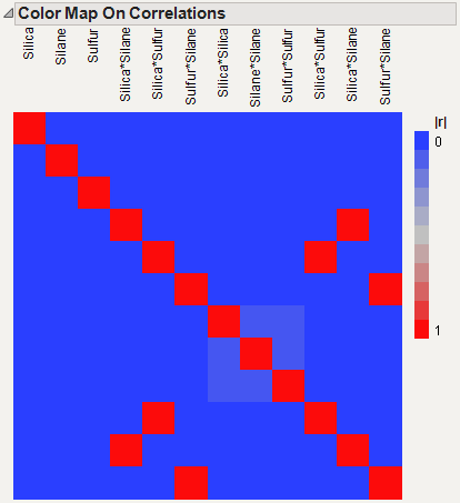
Consider the Bounce Data.jmp sample data table, located in the Design Experiment folder. The Model script contains all two-way interactions. Consequently, the Evaluate Design window shows all main effects and two-way interactions in the Model outline. The three two-way interactions are automatically added to the list of Alias Terms. Therefore, the Alias Matrix shows a column for each of these three interactions (Alias Matrix for Bounce Data.jmp). Notice that the only non-zero entries in the alias matrix correspond to the bias impact of the two-way interactions on themselves. These entries are 1s, which is expected because the two-way interactions are already in the model.

Color Map on Correlations shows the Color Map on Correlations for the Bounce Data.jmp sample data table, found in the Design Experiment folder. The deep red coloring indicates absolute correlations of one. Note that there are red cells on the diagonal, showing correlations of model terms with themselves. Three red cells off the main diagonal show the correlations of the Alias Terms with themselves. Those three terms appear both in the Model outline and in the Alias Terms list. To see how to remove these terms from the color map, see Color Map on Correlations.
The Design Diagnostics report shows D-, G-, and A-efficiencies and the average variance of prediction. These diagnostics are not shown for designs that include factors with Changes set to Hard or Very Hard or effects with Estimability designated as If Possible.
Design Diagnostics Outline shows the Design Diagnostics outline for the Bounce Data.jmp sample data table, found in the Design Experiment folder.

|
•
|
X is the model matrix
|
|
•
|
n is the number of runs in the design
|
|
•
|
p is the number of terms, including the intercept, in the model
|