|
2.
|
Click Add.
|
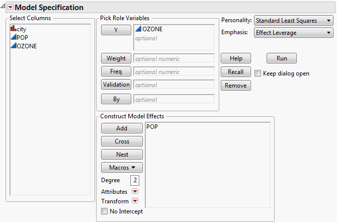
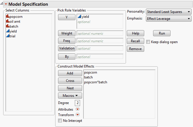
Open Polycity.jmp. You are interested in the relationship between POP, the population in thousands of the given city, and Ozone. Ozone is the response of interest, and POP is the continuous model effect.
|
1.
|
Select Analyze > Fit Model.
|
|
2.
|
|
4.
|
Click Add.
|
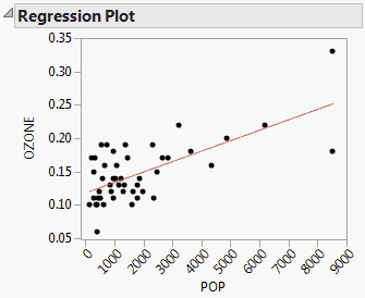
When you click Run, the Fit Least Squares report appears, showing various results, including a Regression Plot. The Regression Plot shows the data and a simple linear regression model fit to the data (Model Fit for Simple Linear Regression).
|
1.
|
|
3.
|
Select Macros > Polynomial to Degree.
|
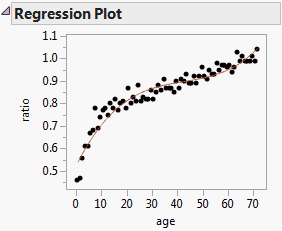
Model Fit for a Degree-Three Polynomial in One Variable shows a plot of the data and a cubic polynomial model fit to the data for the Growth.jmp sample data table. This is one of the fits produced when you run the Bivariate data table script.
|
1.
|
|
3.
|
Select Macros > Polynomial to Degree.
|
For a plot of a degree-two fit for a polynomial two variables, see Model Fit for a Degree-Two Polynomial in Two Variables.
|
2.
|
Click Add.
|
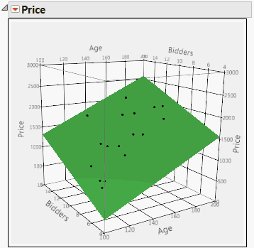
Model Fit for a Multiple Linear Regression Model with Two Predictors shows a surface profiler plot of the data and of the multiple linear regression fit to the data for the Grandfather Clocks.jmp sample data table. The model effects are Age and Bidders. The response is Price. You can obtain the plot by running the data table script Fit Model with Surface Profiler Plot.
|
2.
|
Click Add.
|
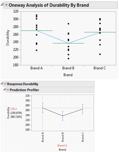
Consider the Golf Balls.jmp sample data table. You are interested in whether Durability varies by Brand. Model Fit for One-Way Analysis of Variance shows two plots.
The first is a plot, obtained using Fit Y by X, that shows the data by brand. Horizontal lines are plotted at the mean for each brand and line segments connect the means. To produce this plot, run the script Oneway: Durability by Brand in the Golf Balls.jmp sample data table.
The second plot is a profiler plot obtained using Fit Model. This second plot shows the predicted responses for each brand, connected by line segments. To produce this plot, run the script Fit Model: Durability by Brand in the Golf Balls.jmp sample data table. Drag the vertical dashed red line to the brand of interest. The horizontal dashed red line updates to intersect the vertical axis at the predicted response.
|
2.
|
Click Add.
|
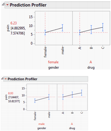
Model Fit for a Two-Way Analysis of Variance with No Interaction shows two profiler plots of the fit to the data for the Analgesics.jmp sample data table. The model effects are gender and drug. The response is pain. To obtain this plot, select Analyze > Fit Model, select pain as Y, select gender and drug as model effects, and then click Run. From the report’s red triangle menu, select Factor Profiling > Profiler.
The top plot in Model Fit for a Two-Way Analysis of Variance with No Interaction shows predictions for females, while the bottom plot shows predictions for males. Note that the relative effects of the three drugs are consistent across the levels of gender. This is because there is no interaction term in the model. For an example with interaction, see Model Fit for a Two-Way Analysis of Variance with Interaction.
|
2.
|
Select Macros > Full Factorial.
|
|
2.
|
Click Add.
|
|
1.
|
Select Analyze > Fit Model.
|
|
2.
|
|
3.
|
|
4.
|
Select Macros > Full Factorial.
|
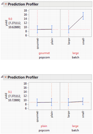
The Fit Model window appears as shown in Fit Model Window for Two-Way Analysis of Variance with Interaction.
Model Fit for a Two-Way Analysis of Variance with Interaction shows a profiler plot of the fit for this example. To obtain this plot, click Run in the Fit Model window shown in Fit Model Window for Two-Way Analysis of Variance with Interaction. Then, from the red triangle menu for the Fit Least Squares report, select Factor Profiling > Profiler.
In the top plot, popcorn is set to gourmet, and in the bottom plot, it is set to plain. Note how the predicted values for the settings of batch depend on the type of popcorn. This is a consequence of the interaction between popcorn and batch.
|
2.
|
Select Macros > Full Factorial.
|
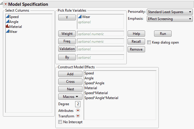
Open Tool Wear.jmp. You are interested in whether Speed, Angle, and Material, or their interactions, have an effect on the Wear of a cutting tool.
|
1.
|
Select Analyze > Fit Model.
|
|
2.
|
|
3.
|
|
4.
|
Select Macros > Full Factorial.
|
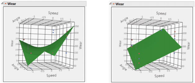
The Surface Profiler plots in Model Fit for a Three-Way Full Factorial Design - Material A on Left, Material B on Right show the predicted response for Wear in terms of the two continuous effects Speed and Angle. The plot on the left shows the predicted response when Material is A; the plot on the right shows the predicted response when Material is B. The points for which Material is A are colored red, while those for which Material is B are colored blue. The difference in the form of the response surfaces across the levels of Material is a consequence of the three-way interaction.
To obtain Surface Profiler plots, click Run in the Fit Model window shown in Fit Model Window for Three-Way Full Factorial. From the red triangle menu for the Fit Least Squares report, select Factor Profiling > Surface Profiler. To add points to the plot, open the Appearance panel and click Actual. If you want to make the points appear larger, right click in the plot, select Settings and adjust the Marker Size.
To show plots for both Materials A and B, use the slider marked Material in the Independent Variables panel, setting it at 0 for Material A and 1 for Material B. Note that the table contains two data table scripts that produce Surface Profiler plots: Prediction and Surface Profilers and Surface Profilers for Two Materials.
|
1.
|
|
2.
|
Click Add.
|
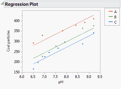
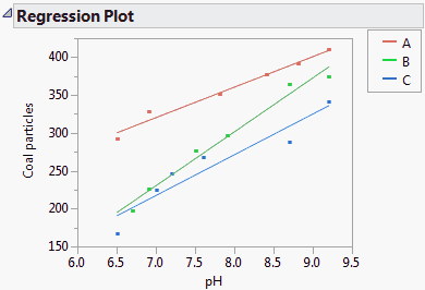
Model Fit for Analysis of Covariance, Equal Slopes shows the data from the Cleansing.jmp sample data table. You are interested in which Polymer removes the most Coal particles from a cleansing tank. However, you suspect that the pH of the tank also has an effect on removal. The plot shows an analysis of covariance fit. Here the slopes relating pH and Coal particles are assumed equal across the levels of Polymer.
The plot in Model Fit for Analysis of Covariance, Equal Slopes is obtained as follows. In the Fit Model window, enter Coal particles as Y and both pH and Polymer in the Construct Model Effects box. Click Run. The Regression Plot appears in the Fit Least Squares report. To color the points, select Rows > Color or Mark by Column, select Polymer from the Mark by Column list, and click OK.
However, a more complete analysis indicates that pH and Polymer do interact in their effect on Coal particles. The appropriate model fit is shown in Analysis of Covariance, Unequal Slopes.
|
1.
|
|
2.
|
Select Macros > Full Factorial.
|
|
1.
|
|
2.
|
Click Add.
|
Open Cleansing.jmp. You are interested in whether any of the three polymers (Polymer) has an effect on coal particle removal (Coal particles). The tank pH is included as a covariate as it might affect a polymer’s ability to clean the tank. You allow for possibly different slopes when modeling the relationship between pH and Coal particles for the three Polymer types.
|
1.
|
Select Analyze > Fit Model.
|
|
2.
|
|
3.
|
|
4.
|
Select Macros > Full Factorial.
|
The Fit Model window appears as shown in Fit Model Window for Analysis of Covariance, Unequal Slopes.

When you click Run, the Fit Least Squares report appears. The Effect Tests report indicates that the interaction between pH and Polymer is significant and should be included in the model.
The Regression Plot given in the report is shown in Model Fit for Analysis of Covariance, Unequal Slopes. This plot shows the points and the model fit. The interaction allows the slopes of the lines that relate pH to Coal particles to depend on the Polymer. Note that, despite this interaction, over the range of interest, Polymer A consistently has the highest removal. If you want to color the points as shown in Model Fit for Analysis of Covariance, Unequal Slopes, select Rows > Color or Mark by Column, select Polymer from the Mark by Column list, and click OK.
|
2.
|
Click Add.
|
|
4.
|
Click Nest.
|
|
5.
|
With B[A] highlighted in the Construct Model Effects list, select Attributes > Random Effect.
|
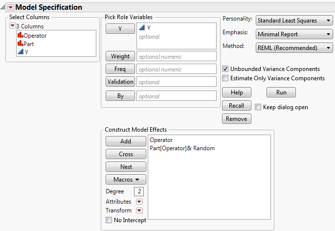
Open the 2 Factors Nested.jmp sample data table located in the Variability Data subfolder. As part of a measurement systems analysis study, 24 randomly chosen parts are measured. These parts are evenly divided among the six operators who typically measure these parts. Each operator make three independent measurements of each of the four assigned parts.
Since the parts measured by one operator are measured only by that specific operator, Part is nested within Operator. Since the parts are a random sample of production, Part is considered a random effect. Since these specific six operators are of interest, Operator is treated as a fixed effect. The appropriate model is specified as follows.
|
1.
|
Select Analyze > Fit Model.
|
|
2.
|
|
3.
|
|
4.
|
Click Add.
|
|
5.
|
To nest Part within Operator: In the Construct Model Effects list, select Part. In the Select Columns list, select Operator. The two effects should be highlighted.
|
|
6.
|
Click Nest.
|
|
7.
|
With Part[Operator] highlighted in the Construct Model Effects list, select Attributes > Random Effect.
|
The Fit Model window appears as shown in Fit Model Window for Two-Factor Nested Random Effects Model.
|
8.
|
Click Run to obtain the Fit Least Squares report.
|
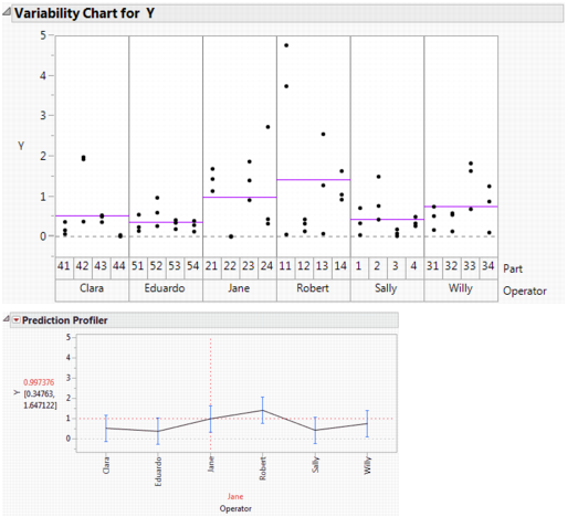
Model Fit for Two-Factor Nested Random Effects Model shows two plots. The first is a Variability Chart showing the three measurements by each Operator on each of the four parts. Horizontal line segments show the mean measurement for each Operator.
To construct the Variability Chart in Model Fit for Two-Factor Nested Random Effects Model, in the 2 Factors Nested.jmp sample data table, run the data table script Variability Chart - Nested. From the report’s red triangle menu, deselect Show Range Bars and select Show Group Means.
The second plot is the Fit Least Squares report Prediction Profiler plot for Operator. This plot shows the predicted response for each operator. The vertical dashed red line set at Jane indicates that Jane’s predicted response is 0.997. You can see the correspondence between the model predictions given in the Prediction Profiler plot and the raw data in the Variability Chart.
To obtain the Prediction Profiler plot, from the Fit Least Squares report red triangle menu, select Factor Profiling > Profiler.
These plots show how the predicted measurements for each Operator are modeled. However, keep in mind that you are not only interested in whether the operators differ in how they measure parts. You are also interested in the variability of the part measurements themselves, which requires estimation of the variance component associated with Part.
|
2.
|
Click Add.
|
|
4.
|
Click Nest.
|
|
6.
|
Click Nest.
|
|
7.
|
With both B[A] and C[A,B] highlighted in the Construct Model Effects list, select Attributes > Random Effect.
|
|
2.
|
Click Add.
|
|
4.
|
Click Nest.
|
|
6.
|
Select Attributes > Random Effect.
|
|
8.
|
Click Add.
|
|
10.
|
Click Cross.
|
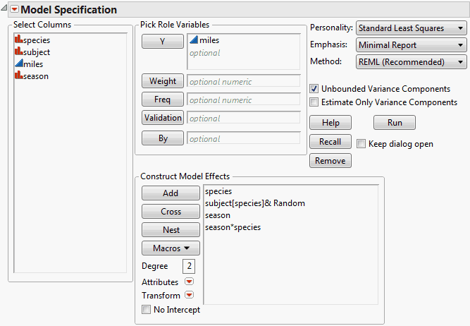
Open the Animals.jmp sample data table. The column Miles gives the distance traveled by each of six animals in each of the four seasons. Note that there are two species and that subject, the animal identifier, is nested within species. Since these six animals are representatives of larger species populations, you decide to treat subject as a random effect. You want to model the response, miles, as a function of species and season, accounting for the fact that there are repeated measures for each animal.
|
1.
|
Select Analyze > Fit Model.
|
|
2.
|
|
3.
|
|
4.
|
Click Add.
|
|
5.
|
To nest subject within species: In the Construct Model Effects list, select subject. In the Select Columns list, select species. The two effects should be highlighted.
|
|
6.
|
Click Nest.
|
|
7.
|
In the Construct Model Effects list, select subject[species].
|
|
8.
|
Select Attributes > Random Effect.
|
|
9.
|
|
10.
|
Click Add.
|
|
11.
|
In the Construct Model Effects list, select season. In the Select Columns list, click species. Both effects should be highlighted.
|
|
12.
|
Click Cross.
|
|
2.
|
Select Macros > Response Surface.
|
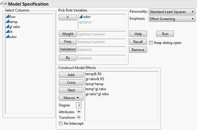
Open the Odor Control Original.jmp sample data table. You want to fit a response surface to model the response, odor, as a function of temp and gl ratio. (Although you could include ht, as shown in the data table script Response Surface, for this illustration do not.)
|
1.
|
Select Analyze > Fit Model.
|
|
2.
|
|
3.
|
|
4.
|
Select Macros > Response Surface.
|
|
5.
|
Click Run.
|
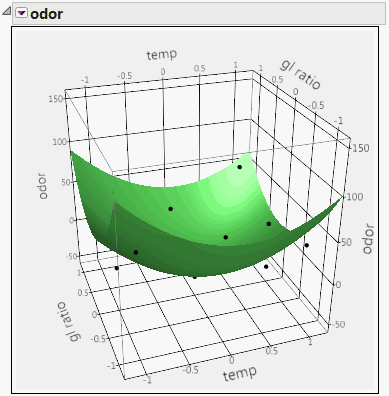
Model Fit for a Degree-Two Polynomial in Two Variables shows a Surface Profiler plot of the data and a quadratic response surface fit to the data for the Odor Control Original.jmp sample data table. To obtain this plot, from the report’s red triangle menu, select Factor Profiling > Surface Profiler. To show the points, click the disclosure icon to open the Appearance panel and click Actual. If you want to make the points appear larger, right click in the plot, select Settings and adjust the Marker Size.
|
2.
|
Click Add.
|
|
4.
|
Select Attributes > Knotted Spline Effect.
|
|
6.
|
Click OK.
|
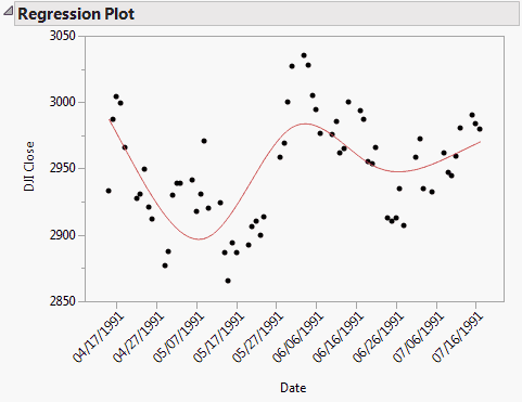
Model Fit for a Knotted Spline with Five Knots shows the Regression Plot for a model fit to the data in the XYZ Stock Averages (plots).jmp sample data table. Here Date is assigned the Knotted Spline Effect and five knots are specified. DJI Close is the response.