To produce the plot shown in Example of a Mosaic Plot, follow the instructions in Example of Contingency Analysis.
|
•
|
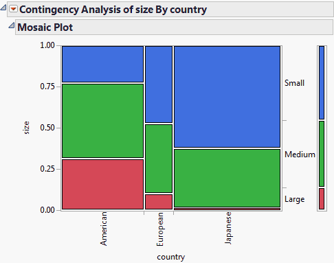
The proportions on the x-axis represent the number of observations for each level of the X variable, which is country.
|
|
•
|
The proportions on the y-axis at right represent the overall proportions of Small, Medium, and Large cars for the combined levels (American, European, and Japanese).
|
|
•
|
The scale of the y-axis at left shows the response probability, with the whole axis being a probability of one (representing the total sample).
|
|
Shows the levels of the Y variable corresponding to each cell.
|
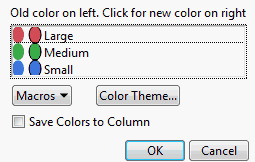
When you select the Set Colors option, the Select Colors for Values window appears.
|
|||||||
|
If you select this check box, a new column property (Value Colors) is added to the column in the associated data table. To edit this property from the data table, select Cols > Column Info.
|