Displays the summarized data in bar charts that mirrors the table of summary statistics. The simple bar chart enables visual comparison of the relative magnitude of the summary statistics. By default, all columns of bars share the same scale. You can have each column of bars use the scale determined separately from the data in each displayed column, by clearing the Uniform plot scale check box. You can specify a uniform custom scale using the Change Plot Scale button. The charts are either 0-based or centered on 0. If the data are all nonnegative, or all non-positive, the charts baseline is at 0. Otherwise, the charts are centered on 0.
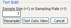
Displays the control area that lets you create a test build using a random sample from the original table. This is particularly useful when you have large amounts of data. See Show Test Build Panel.
Displays options for saving scripts, redoing analyses, and viewing the data table. For details, see the Using JMP book.
Note: For a description of the options in the Select Columns red triangle menu, see the Using JMP book.
|
1.
|
From the red triangle menu next to Tabulate, select Show Test Build Panel.
|
|
2.
|
Enter the size of the sample that you want in the box under Sample Size (>1) or Sampling Rate (<1), as shown in The Test Build Panel. The size of the sample can be either the proportion of the active table that you enter or the number of rows from the active table.
|
|
3.
|
Click Resample.
|
|
4.
|
To see the sampled data in a JMP data table, click the Test Data View button. When you dismiss the test build panel, Tabulate uses the full data table to regenerate the tables as designed.
|