From textbook equations to real-world results: Optimizing chemical process manufacturing with data
Your process was designed once. The troubleshooting never ends. Here’s a practical data science workflow that bridges the gap between engineering theory and plant-floor reality.
Yasmine Hajar
May 26, 2026
6 min. read

Having been through a chemical engineering program, I encountered Coulson and Richardson’s Chemical Engineering Design book that covers everything from thermodynamics and mass transfer to reactor design and separation units. It’s a remarkable map of how a chemical process is put together, from raw material to final product.
But here's the thing no engineering textbook quite prepared me for: a process is built once, and requires endless troubleshooting.
Once you’re on the plant floor, whether you’re producing shampoo, corn syrup, sulfuric acid, nylon, or petroleum fuel, the Arrhenius equations get set aside. The real work becomes figuring out why yield dropped yesterday, why purity has been drifting for three weeks, and how to prevent it all from happening again.
That’s where data-driven process optimization comes in. And thanks to modern sensor networks and historian systems, the data to do this work is already flowing through your plant. But are you using it?
Why process optimization is more urgent than ever
Margin pressure, volatile energy costs, raw material swings, and uneven demand are squeezing chemical manufacturers from every direction. Small, consistent efficiency gains, from tightening a setpoint and catching a sensor drift early to validating a parameter interaction, all add up. Over a year, they are the difference between a profitable plant and a struggling one.
How to build a predictive model from process historian data
The physics-based models from your textbooks are powerful tools for process development. But when yield drops and you need to diagnose why, empirical models fitted to your historical data are far more practically useful.
Consider a starting point: the classic Arrhenius relationship describes yield as a function of temperature. Expand it to include feed concentration, F, and you get something like:
Y = Ymax · e-Ea/RT · KF.F / (1+KF.F)
If the variation in temperature and concentration is small enough, those nonlinear terms can be approximated as linear. A log transformation then makes the relationship additive, leaving something far more tractable:
ln Y = β0 + β₁T + β₂F + β3T² + β4F² + β5T· F + …
Using regression, this polynomial form can be fitted directly to sensor data. The result: coefficients that tell you which parameters have a meaningful effect on yield, and how strong that effect is.
Is this model correct and true, in a physics sense? No. Is it close enough to diagnose what’s happening and guide decisions? Almost always, yes.
When a simple linear regression isn’t enough because the relationship is highly nonlinear, or because many of your parameters are correlated, you have options:
- Lasso regression penalizes and drops correlated or low-signal parameters.
- Partial least squares handles correlated inputs while preserving linearity assumptions.
- Gaussian stochastic process (GaSP) models capture complex nonlinear surfaces with uncertainty estimates.
- Large data models (neural networks, gradient boosting, SVMs) provide maximum flexibility when interpretability is less critical.
JMP’s Model Screening and Fit Model platforms let you compare these approaches and select the one that best balances fit quality with interpretability for your specific process.
The process parameters that actually drive yield variation
A model alone doesn’t translate to decisions. To act on the model, you need to interpret it and understand which parameters have a statistically significant effect and the operating range each one should be held within.
JMP’s Profiler tool is particularly valuable here. It renders the modeled relationship graphically, letting you slice across each parameter’s range while holding others at target values. The resulting curves immediately reveal:
- Which parameters have steep response gradients (high leverage).
- Where yield is most sensitive to deviation from target.
- Which parameters can tolerate wider variation without significant yield impact.
In practice, this analysis often reveals that a small number of parameters, sometimes just two or three out of a dozen, are responsible for most yield variation. Focusing control efforts on those few is far more effective than trying to tighten everything simultaneously.
Example
In one profiler analysis across 12 process parameters, a single variable emerged as the dominant factor for yield loss when it drifted outside a narrow operating band. Tightening its control range became the immediate priority; a straightforward operational fix that required no capital investment.
Why design of experiments (DOE) outperforms historical data alone
To find out what happens to a system when you interfere with it, you have to interfere with it, not just passively observe it. - George E.P. Box
Historical data is a powerful starting point, but it has a fundamental limitation: it only reflects the conditions under which your process has already run. Observational models can identify correlations, but correlation isn’t causation, and a model built on historical data alone may miss important interactions or have inflated confidence.
Using design of experiments closes this gap. Rather than changing one factor at a time, which is slow, hard to interpret, and prone to order effects; DOE varies multiple factors simultaneously in a structured pattern. This approach:
- Separates the true effect of each factor from the others.
- Detects interaction effects that one-factor-at-a-time testing would miss.
- Produces a stronger, better-calibrated model you can rely on for setpoint decisions.
For processes where experiments are expensive or disruptive, Bayesian optimization offers a smarter sequencing strategy; using a GaSP model built from early runs to predict which experiment to run next, focusing effort where the uncertainty is highest, and the potential gain in knowledge is greatest.
The outcome is a validated model with tighter confidence intervals and clearer guidance on optimal operating conditions.
Building process control charts that catch drift before yield drops
The final step turns insight into sustained performance. Once you’ve identified the parameters with the greatest impact and confirmed their effects, the goal is to catch drift in those parameters before it propagates into yield loss or failed batches.
It means moving beyond generic process dashboards toward targeted control charts focused on the parameters your model identified as critical. A well-designed monitoring setup will:
- Flag instability in high-impact parameters as early as possible.
- Distinguish signal from noise using statistically grounded control limits.
- Help operators prioritize which out-of-control signals matter.
- Create a feedback loop that continuously refines the model as new data accumulates.
JMP’s Process Screening platform integrates model outputs directly into monitoring, allowing you to build control charts calibrated to specific processes and prioritize alerts by predicted yield impact.
The complete process optimization cycle: From historian to control chart
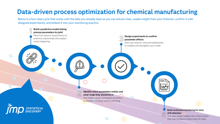
The full cycle looks like this:
- Import and clean historian sensor data.
- Fit an empirical model to link parameters to yield.
- Use the profiler to identify high-leverage parameters and target ranges.
- Design and run experiments to validate and refine the model.
- Deploy targeted control charts to catch drift before it hits yield.
None of this requires exotic machine learning or a data science team. All it takes is the right workflow, tools, and focus on the parameters that truly drive yield.
Your historian already has the answers. This series shows you how to find them.
Up next in the series
Post 2: Getting the most out of your historian data: cleaning, exploring, and preparing sensor data for analysis
Subscribe to The Analytics Advantage newsletter to receive each post as it publishes.