Your control chart might be hiding a process shift right now
Recalculating your limits doesn't make your chart smarter, it makes it blind.
Annie Dudley and Di Michelson
September 8, 2026
8 min. read

Imagine a thermostat that recalculates what “comfortable” means every time it takes a reading. The room drifts a degree warmer each day, but the thermostat never triggers the AC because it keeps updating its reference point. After a month, you’re sitting at 82°F wondering why you’re perspiring, and the thermostat indicates everything is perfectly normal.
That is exactly what happens when you leave control chart limits to recalculate with every new data point.
Control charts are one of the most enduring tools in process monitoring; they’ve been used successfully in industry for more than a century. The idea behind them is straightforward: plot your measurements over time, draw a centerline at the process average, and add upper and lower control limits (typically at three standard deviations from the center). When a point falls outside those limits, something in the process has changed and needs attention.
But here’s the catch: those limits only work as a reliable alarm system if you fix them, like a thermostat setpoint, once you’ve confirmed the process is stable. If you let them keep recalculating, the chart absorbs real shifts into its “new normal” and never raises the alarm. Your chart becomes wallpaper, something you glance at but that never tells you anything useful.
Two phases, one goal
Walter Shewhart, who invented control charts in the 1920s, designed them to work in two distinct phases.
Phase I is the setup period. You’re collecting data, watching the process, and asking: is this process stable? Are there factors changing the output that I need to identify and address? Think of it like tuning a musical instrument before a performance – you’re making adjustments, testing, and listening carefully. This phase is inherently exploratory. It’s not meant to be permanent.
Phase II is the performance itself. Once you’ve established that the process is stable, you fix the control limits based on that stable data. From this point forward, every new data point is judged against those fixed limits. This phase is where the chart does its job by detecting real changes in the process.
The goal of implementing control charts is always to reach Phase II. Phase I is necessary, but it is not the endpoint. Shewhart never intended control charts to operate indefinitely in Phase I. Yet many chart owners do exactly that, allowing limits to recalculate with each new observation and unknowingly disabling the alarm system they set up.
What goes wrong when you never leave Phase I
Staying in Phase I creates real, measurable consequences. With properly fixed limits, a control chart can detect a 1.5-sigma shift in the process mean within roughly five samples on an Individuals chart. That’s a shift large enough to affect product quality but small enough to slip past casual observation. With recalculating limits, that same shift can go undetected indefinitely, because each new data point nudges the limits just enough to accommodate the change. The chart never signals, and the shift becomes part of the new baseline.
Here are two scenarios from common practice that show how this plays out.
Scenario 1: The retrospective signal trap
An engineer is measuring the diameter of a part in millimeters. They start charting with the first week of data, turning on Test 1 (one point beyond the control limits) and Test 2 (nine points in a row on one side of the centerline). A few signals appear, so they investigate, find some issues, make adjustments, and restart the process.
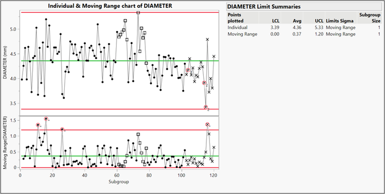
Figure 1. Initial diameter data with 120 subgroups. Limits are estimated from the data.
The second week of data looks clean – no new signals. The engineer is feeling good. But then they notice something odd: the control limits have narrowed. The new data has changed the calculations, and points from the first week that were inside the limits are now signaling. Four points now fall beyond the limits on the Individual chart. Three new Test 2 signals appear. The Moving Range chart picks up additional violations.
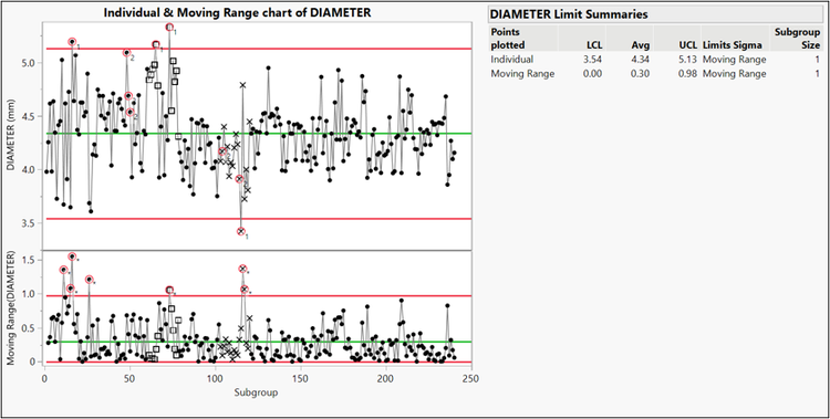
Figure 2. Original diameter data together with new data totaling 240 subgroups. Limits are estimated from the data. Now subgroups in the original data are signaling when they weren’t before.
Now the engineer is stuck in a loop: do they go back and investigate the first week again? Run a third week? How do they know when it’s “good enough”?
This is a well-documented problem. Evaluating Phase I data retrospectively using recalculated limits inflates the false alarm rate because Phase I data isn’t from a single, stable distribution. The result is chasing ghosts created by the shifting limits themselves.
Scenario 2: The invisible variability increase
A process is stable for 24 subgroups, but the chart owner never sets the limits. At Subgroup 25, the process variability increases - not the mean, just the spread - and parts are becoming less consistent.
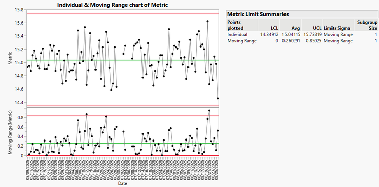
Figure 3. Original metric data with 24 subgroups together with new data with more variation. Limits are estimated from the data. No tests are signaling.
The chart doesn’t signal. Not at Subgroup 25, not at 30, not at 50. With each new observation, the control limits widen to accommodate the increased variability, absorbing the shift into the recalculated limits.
Had the chart owner fixed the limits after establishing stability at subgroup 24, the increased variability would have been caught almost immediately. Instead, the problem went undetected until it surfaced as customer complaints – a far more expensive way to find out.
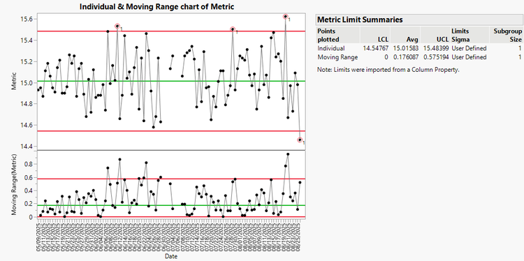
Figure 4. Same data as Figure 3, but with limits fixed after Subgroup 24. Note how the variation is clear in the tests signaling.
How to get from Phase I to Phase II
Getting to Phase II doesn’t require a mountain of data or a statistics degree. Here’s the practical path.
- Think about what can go wrong first. Before you start collecting data, talk to the people closest to the process. What changes from shift to shift? Does the process behave differently on Monday mornings after a weekend shutdown? Are there multiple operators or measurement gauges? Make sure your data collection captures these sources of variation. Identifying potential disruptions upfront saves you from chasing down mysterious signals later.
- Collect data across realistic conditions. Around 30 subgroups of in-control data is generally sufficient to establish stability, but those 30 subgroups need to represent the real operating conditions of the process. If you collect them all in a single morning, you’ve characterized one morning, not your process. Spread your data collection over the conditions you expect to encounter.
If it’s too difficult to capture every source of variation (say, you’re setting up charts in the spring but expect seasonal effects when cold weather arrives), don’t let that stall you. Establish control on the data you have. You can detect and correct for seasonal changes once you’re in Phase II.
- Investigate every signal, but don’t remove data without cause. During Phase I, examine every chart signal closely. If you find an assignable cause – a known equipment malfunction, an operator error, a measurement mistake – remove that subgroup from your limit calculations. But if you can’t find a cause, leave the data in. That unexplained variation is part of your process, and removing it would give you artificially narrow limits that trigger false alarms in Phase II.
- Set the limits when you’re comfortable saying “this process is stable.” When you have sufficient data without unexplained signals, you’ve reached your goal. Fix the control limits based on that stable data and begin Phase II monitoring. In a tool such as JMP, there’s a distinction worth noting between setting control limits and saving them. Setting limits means fixing their values to make the transition from Phase I to Phase II. Saving limits, such as a JMP scripting language (JSL) script, in a limits table or as a column property, can store those values so they persist when you redo the chart, publish it, or add new data. Setting is the statistical decision; saving is the practical step that protects it.
When you need to adjust limits later
Reaching Phase II doesn’t mean your limits are carved in stone forever. Processes change, and sometimes those changes are intentional.
If you know the expected effect of a change, you can adjust the limits directly. For example, if you’ve modified the process to run faster and expect moisture content to decrease by 5% without affecting variability, shift the centerline and limits by that amount and keep monitoring to confirm that your expectation was right.
If you don’t know the effect, return briefly to Phase I. Collect enough data under the new conditions to confirm stability, then fix the new limits. The key word is “briefly.” You already know how to do it and the goal is still the same: get back to Phase II as quickly as practical.
What Phase II looks like in practice
Once you're operating in Phase II with fixed limits, the real benefits start compounding. The next step is making sure you have a way to systematically track and respond to warnings as they happen, rather than relying on someone to notice a signal during a periodic chart review. A web-based monitoring tool that can flag changes and route them to the right people turns control charting from a passive glance-at-the-screen activity into a structured response system. In JMP Live, the Warnings Triage feature (available in JMP 19 and later) does exactly this, letting you store and track information on individual warnings and resolve them faster.
A real-world example of this comes from Tomoko Sakazawa at KM Biologics’ Kikuchi factory, in the manufacturing department. “Since I started creating control charts with JMP, I’ve been able to dramatically reduce the man-hours of work for specific tasks,” she says. “Before JMP, I was building control charts in Microsoft Excel, which was time-consuming and error-prone because I had to spot any abnormality in the data by eye. With JMP, I can so much more easily use Western Electric rules to obtain results – saving time and improving accuracy in the process.” Sakazawa was later recognized with KM Biologics’ presidential award for this improvement. Her experience should serve as a reminder that getting control charting right isn’t just a statistical exercise. It’s the kind of work that organizations notice and reward.
The bottom line
A control chart that keeps recalculating its limits gives you the feeling of monitoring without the benefit. The whole point of a control chart is to hold a fixed reference and tell you when something has genuinely changed, which means setting the limits and leaving them set.
Get to Phase II. Set the limits. Let the chart do the job Shewhart designed it to do.
For a solid foundation in control chart theory and practice
The Quality Methods module of the Statistical Thinking for Industrial Problem Solving free online course is a great place to start. You can also watch the on-demand webinar Monitor, Understand, and Optimize Processes for a closer look at how JMP supports process monitoring in practice.
Further reading
Woodall, W. H. (2024). On 100 Years of the Shewhart Control Chart. JMP white paper.
Jones-Farmer, L. A., et al. (2014). “An overview of Phase I analysis for process improvement and monitoring.” Journal of Quality Technology, Vol. 46, No. 3.
Montgomery, D. C. (2013). Introduction to Statistical Quality Control, 7th ed. John Wiley & Sons.
Shewhart, W. A. (1986). Statistical Method from the Viewpoint of Quality Control. Dover Publications.
Western Electric Company, Inc. (1958). Statistical Quality Control Handbook, 2nd ed.