The Curse of Dimensionality
What is the curse of dimensionality?
The curse of dimensionality refers to the exponential increase in data required to densely populate space as the dimension increases. A densely populated space is required to fit highly complex models.
The dimension of the space is essentially the number of variables you have. Many predictive modeling or data mining problems are massive in terms of dimension.
More technically, the dimension of a problem refers to the number of degrees of freedom that are available for creating a prediction. For linear models, the number of degrees of freedom is 1 for each continuous predictor variable and k – 1 for each categorical predictor with k levels. The total degrees of freedom are the sum of the degrees of freedom from each term in the model. With more complex models, like a linear model with interactions or a neural network model, the degrees of freedom calculation becomes more complex as well.
Imagine you have eight observations to fit a model. As seen in the graphic below, the eight points densely fill the one-dimensional space but become more separated as the dimension increases. In a 100-dimensional space, they would be about as far as distant galaxies.
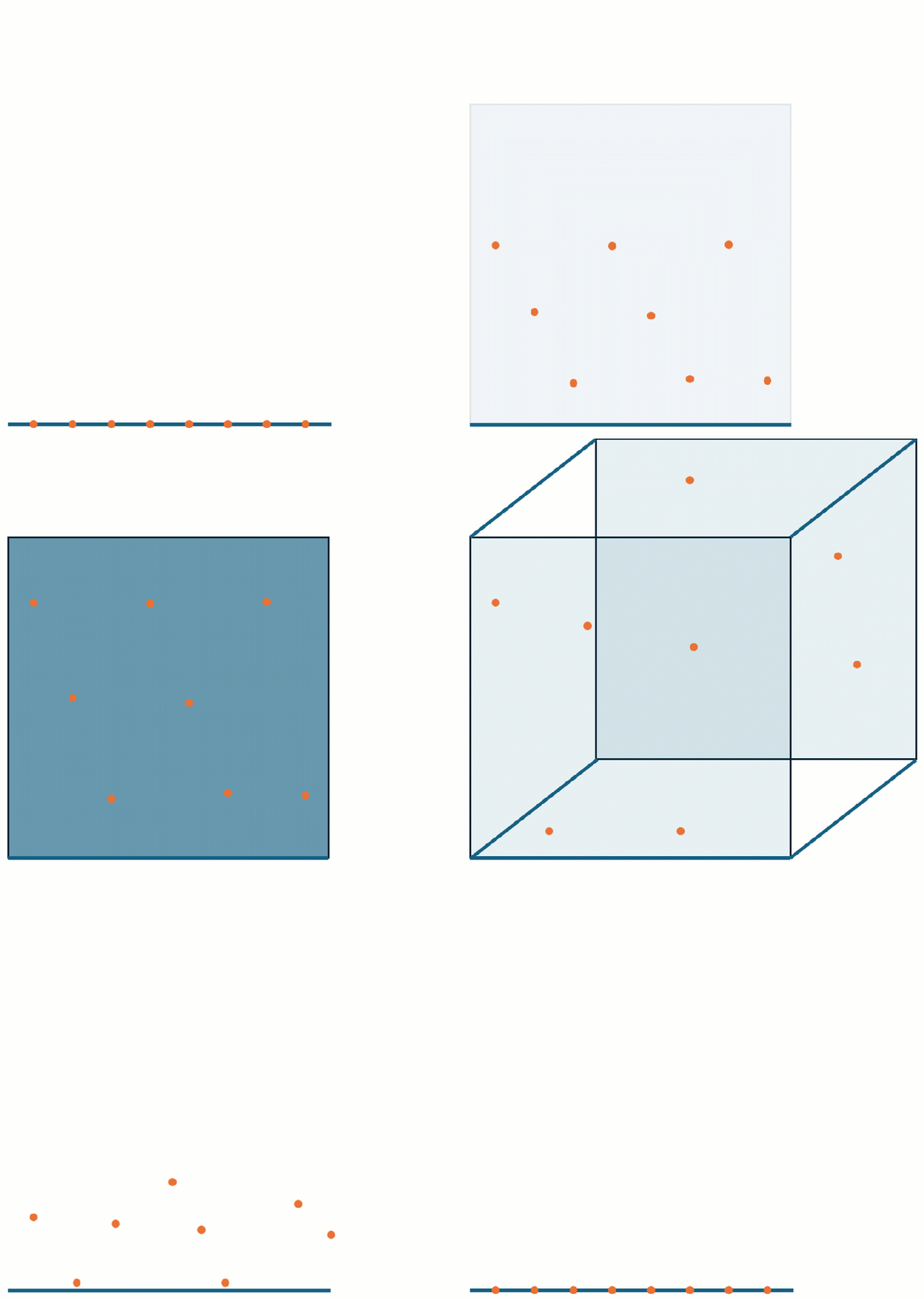
The curse of dimensionality limits your practical ability to fit a flexible model to noisy data when there are many input variables. A densely populated input space is required to fit highly complex models. When you assess how much data are available for your modeling, you must consider the dimension of the problem.
Example of the curse of dimensionality
Let’s examine the Recovery data we introduced in our overview of predictive modeling. We’ll look at the continuous response Percent Recovered.
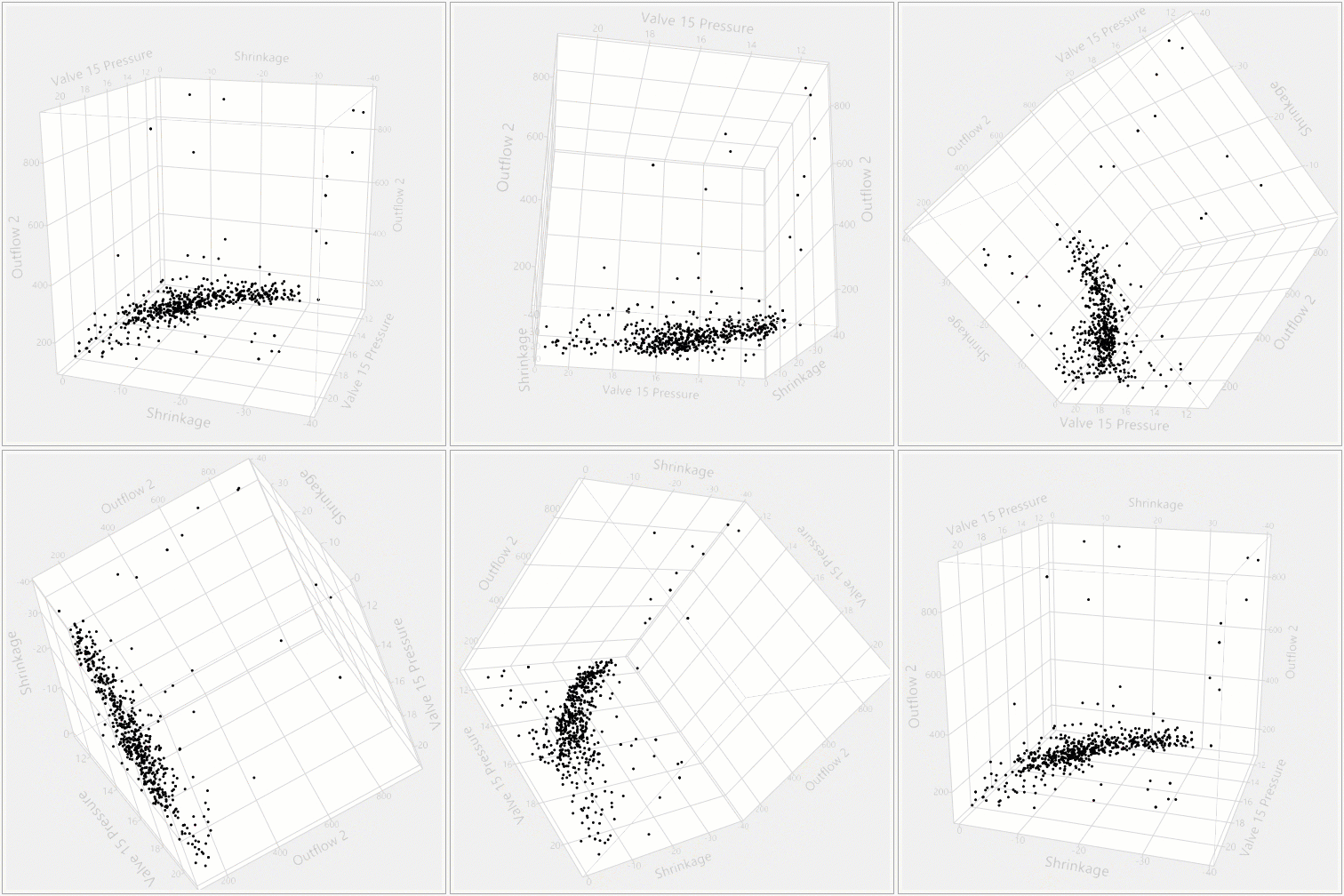
In the figure above, a 3-D scatterplot of three of the predictor variables is shown. The data do not fill up the three-dimensional space. Fitting a main effects model to the response with these effects gives the following surface profiles.
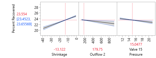
Notice that the confidence bands are wide for low Shrinkage and high Outflow 2. What do the surface profiles look like in that region of the space?
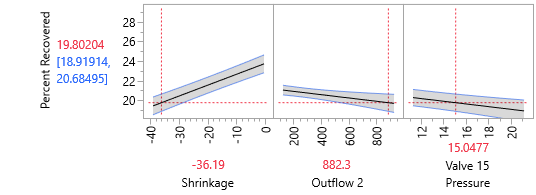
The uncertainty in the model is high! We know this because we can see the wide confidence bands. We can add the data values to the graph to see how the data sparsity in those regions translates to higher variance around the model.
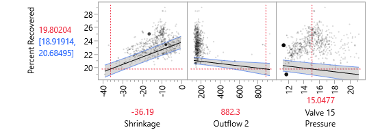
In the figure above, the plotting symbol for data values that are close to the response/predictor plane for each panel are larger and darker, and values further away are smaller and lighter. At the settings of Shrinkage, Outflow 2, and Valve 15 Pressure shown above, there are not many observations in the region of low Shrinkage and high Outflow 2. The model uncertainty is reflected in wide confidence bands around the predicted surface.
It’s no surprise that the model has greater uncertainty where there is data sparsity. For models like neural networks and KNN that don’t have distributional assumptions, you won’t see that wide confidence band as a clue that the model is very uncertain in that region, but it will still be true that in regions with very little data any model will be uncertain.
The next figure shows the surface profiles for three different variables that fill their input space.
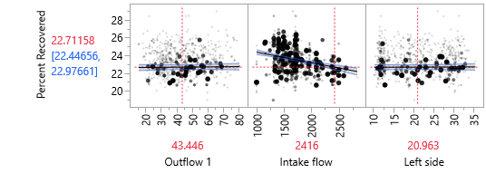
The uncertainty is lower and the confidence bands are narrower in this model.