Make dashboards an essential part of the science and engineering workflow

Keynote
The Missing Ingredient That Kills So Many Dashboards
When it comes to dashboards, “user satisfaction is usually low and the abandonment rate high,” says Nick Desbarats of Practical Reporting. Why? Because they take too much time to review, serve too many user roles and contain too much information. This makes it easy to miss the very problems that dashboards are supposed to highlight.
In this presentation, Desbarats explains how we can make dashboards that are trustworthy and valuable by understanding the concept of valence and the four-threshold method.
Watch to learn more about:
- The benefits of valence indicators.
- Ways to visually flag valence metrics.
- The four-threshold method for reliably flagging things that require attention.
- Common (but weird) user objections.
- Other considerations for great dashboards.
Panel Discussion
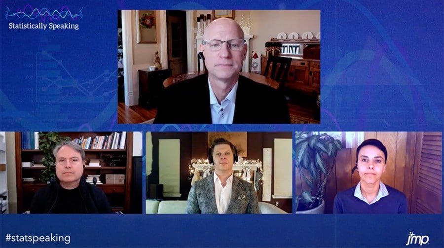
Tips on getting from data to decision quickly from NXP, SAS and Practical Reporting
With the right tools for dashboard building and data analysis, you can standardize and streamline workflows and make customized, repeatable analyses – leaving you with more time to explore ideas and experiment. Throughout the process, dashboards provide shared views of interactive data visualizations, giving people across your organization access to emerging key findings.
You’ll hear from:
- Alex Pamatat, IT Solutions Manager – Advanced Analytics, NXP
- Aurora Tiffany-Davis, JMP Senior Software Developer, SAS
- Nick Desbarats, Independent Educator and Author, Practical Reporting
Register to watch the panel discussion
