Pattern and Structural Discovery
Methods for clustering and dimension reduction can reveal patterns and hidden structure in genomic data. Clustering methods can typically be performed on most any types of genomic data, including SNP markers, methylation measurements, and gene, protein, or metabolite expression.
The following sections describe various methods and provide some introductory examples.
Clustering
Clustering algorithms place samples and/or variables near other ones that are similar. They usually operate using some type of distance metric as well as an algorithm for constructing the clusters.
Hierarchical Clustering
Two-way hierarchical clustering of gene expression data has been a standard analysis method for over twenty years. It is a great way to visually detect similarities and patterns across both variables and samples.
The following example uses the Genotypes Pedigree.jmp data set found in the JMP Sample Data folder (Help > Sample Data Folder > Life Sciences). This simulated data set contains genotypes for 60 markers for 100 individuals.
| 8 | Open the Genotypes Pedigree.jmp data set. |
| 8 | Click Analyze > Clustering > Hierarchical Cluster. |
| 8 | Select the Markers group as the Y, Columns. |
| 8 | Select Fast Ward as the clustering method. |
| 8 | Check the Two Way Clustering box. |
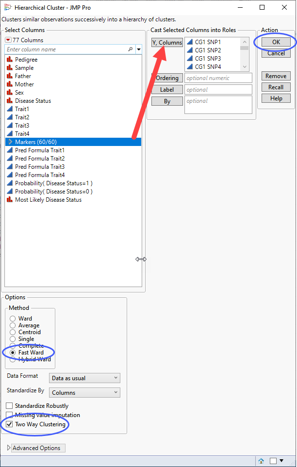
| 8 | Click . |
The following report is generated:
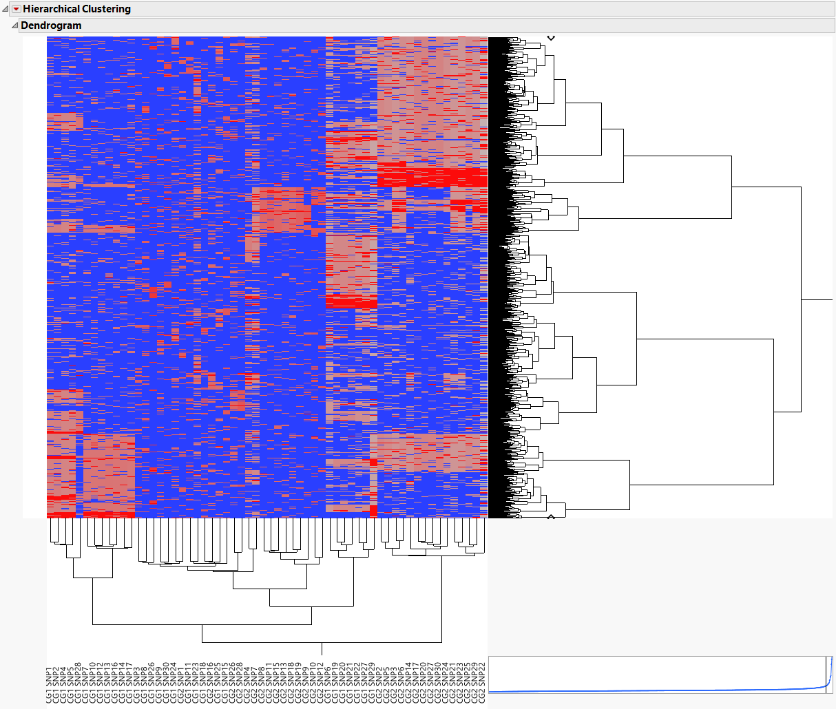
The 60 markers are clustered along the horizontal axis of the heat map, while the 1000 samples cluster on the vertical axis.
The individual samples cluster into related groups based on the genotypes of the markers.
K-Means Clustering
K-Meansclustering assigns rows into k different clusters, where k is a number that you specify up front. It typically runs faster than Hierarchical Clustering and can sometimes reveal interesting patterns across the samples.
Another application of K-Means Clustering is to transpose the data and assign the molecular variables into k clusters, optionally choosing a representative from each cluster. The resulting representatives can then be used in statistical or predictive modeling as a way to reduce analysis times.
The following example uses the Genotypes Pedigree.jmp data set described above.
| 8 | Open the Genotypes Pedigree.jmp data set. |
| 8 | Click Analyze > Clustering > K Means Cluster. |
| 8 | Select the Markers group as the Y, Columns. |
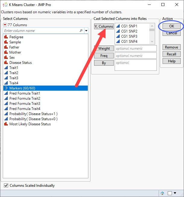
| 8 | Click . |
The Iterative Clustering window opens.
| 8 | Select the default 3 clusters. |
| 8 | Specify 15 as the Range of Clusters. |
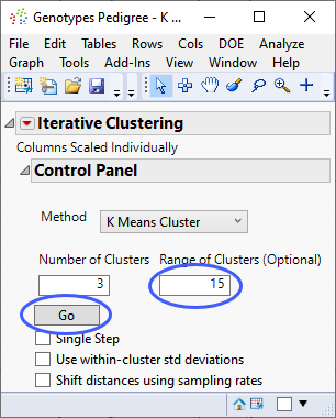
| 8 | Click . |
The following report is generated:
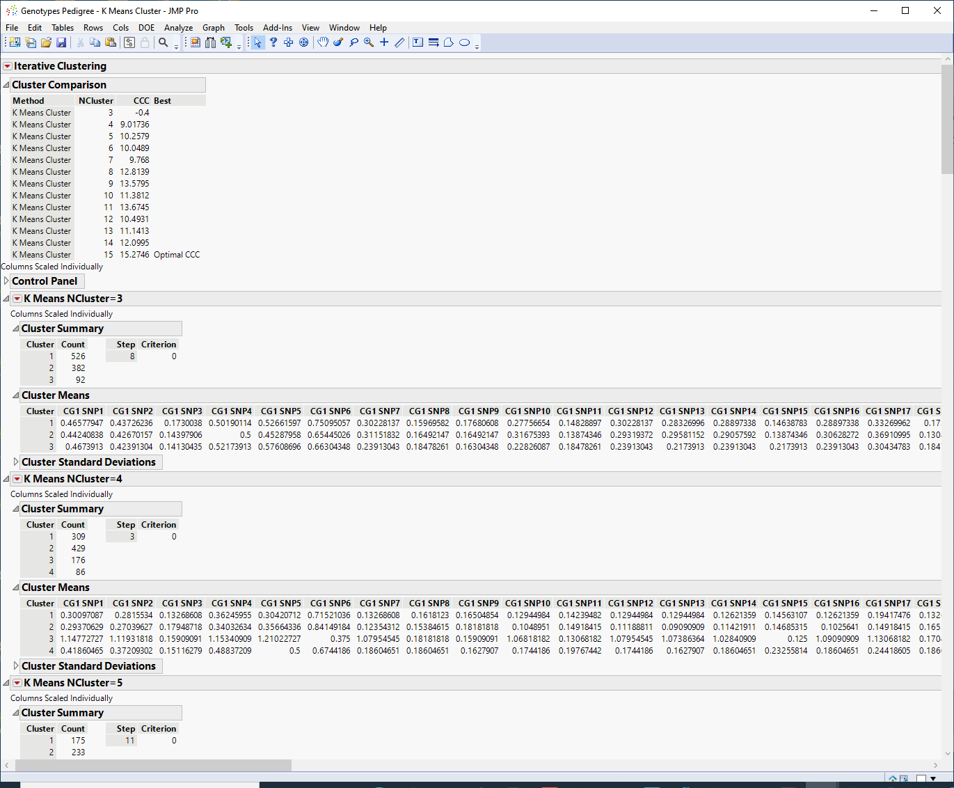
The Cluster Comparison report appears at the top of the report window. The best fit is determined by the highest CCC value. In this case, the best fit occurs when you fit 15 clusters.
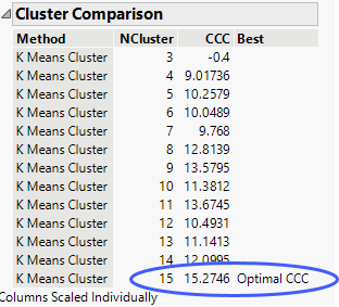
| 8 | Scroll to the K Means NCluster=15 report. |
The Cluster Summary report shows the number of observations in each of the 15 clusters. The Cluster Means report shows the means of the 60 marker readings for each cluster.
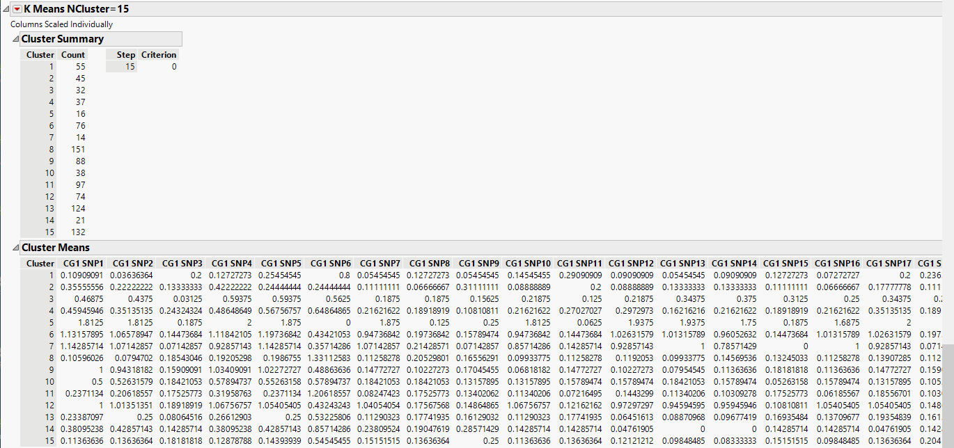
| 8 | Click the K Means NCluster=15 and select Biplot. and select Biplot. |
A legend that identifies the colors of the clusters is shown to the right of the plot. The clusters that appear to be most separated from the others based on their first two principal components are clusters 5, 10, and 12.
Normal Mixtures
Normal Mixtures is an iterative clustering technique based on the assumption that the joint probability distribution of the observations is approximated using a mixture of multivariate normal distributions. These mixtures represent different clusters. The individual clusters have multivariate normal distributions.
The following example uses the Genotypes Pedigree.jmp data set described above.
| 8 | Open the Genotypes Pedigree.jmp data set. |
| 8 | Click Analyze > Clustering > Normal Mixtures. |
| 8 | Select the Markers group as the Y, Columns. |
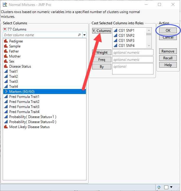
| 8 | Click . |
The Normal Mixtures window opens.
| 8 | Specify 6 clusters. |
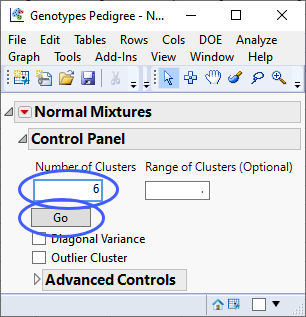
| 8 | Click . |
The following report is generated:
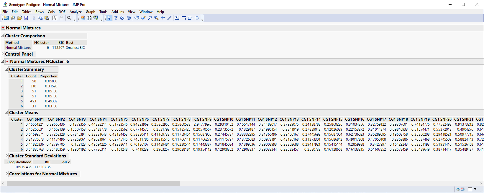
The Cluster Summary report shows the number of observations in each of the six clusters. The Cluster Means report shows the means of the 60 marker readings for each cluster.
| 8 | Click the Normal Mixtures NCluster=6 and select Biplot 3D. and select Biplot 3D. |
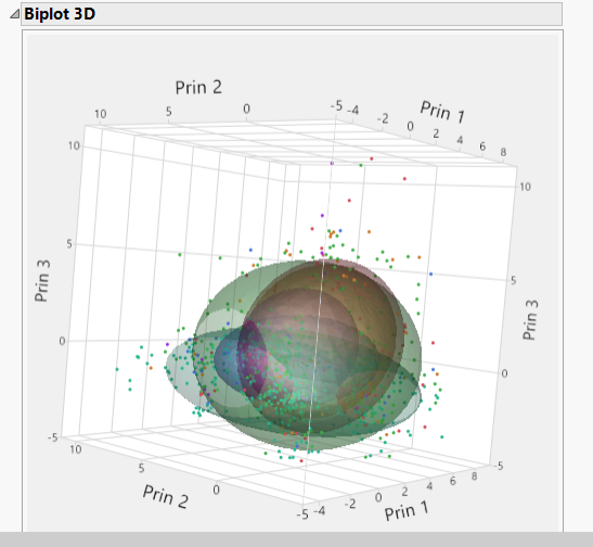
The plot shows contours for the normal densities that are fit to the clusters. These cluster all appear to overlap.
Dimension Reduction
While clustering rearranges the full genomics data, dimension reduction attempts to project the high dimensional molecular variables into a low dimensional space in some type of intuitive way. Several common approaches are as follows.
Principal Components
The first principal component of a wide table is the linear combination of the molecular variables exhibiting the highest degree of variability. Subsequent principal components are the directions of maximal variability orthogonal to all previous components. Principal component analysis (PCA) is useful for separating samples but can be subject to influence of outliers and sample sizes.
A classic PCA algorithm would form the p x p covariance or correlation matrix of the p molecular variables and perform an eigen decomposition on it. For wide tables this direct approach is infeasible due to the large size of p. Instead, we can use an advanced randomized singular value decomposition (SVD) directly on the wide matrix and compute the principal components of the samples as the eigenvectors times the singular values.
The following example uses the Genotypes Pedigree.jmp data set described above.
| 8 | Click Analyze > Multivariate Methods > Principal Components. |
| 8 | Select the Markersgrouping of the genotype columns as the Y, Columns. |
| 8 | Specify Wide Data as the Method Family. |
| 8 | Specify Fast Approximate as the Special Method. |
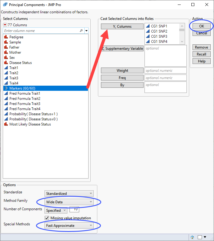
| 8 | Click . |
The following report is generated:
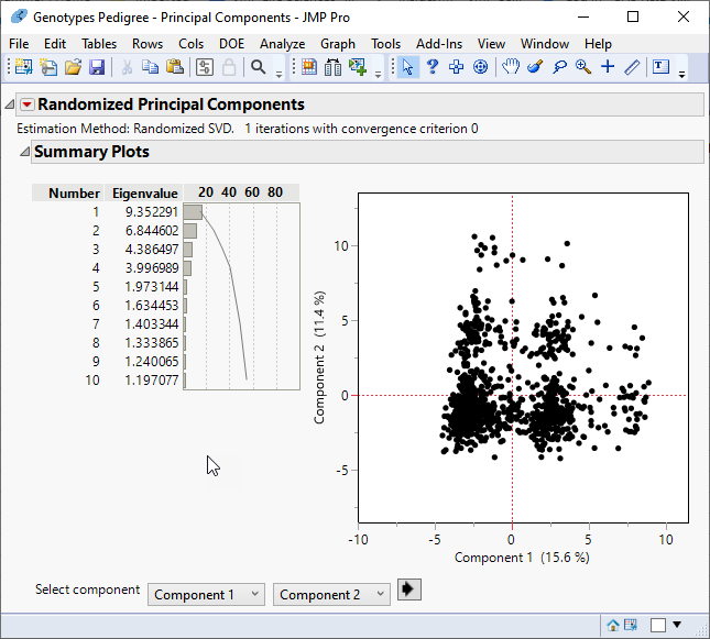
The report gives the eigenvalues and a bar chart of the percent of the variation accounted for by each principal component. In this example, variation is spread among the principal components, with no one or combination of principal components accounting for most of the variation.
Multivariate Embedding
The Multivariate Embedding platform enables you to map data from very high dimensional spaces to a low dimensional space. The Multivariate Embedding platform uses either the t-Distributed Stochastic Neighbor Embedding (t-SNE) or the Uniform Manifold Approximation and Projection (UMAP) methods.
The t-SNE method attempts to fill the low-dimensional space in such a way that clusters of near neighbors can be more easily identified. Unlike PCA, which strives to maintain the global structure of your data while preserving variance, t-SNE attempts to preserve the local structure by preserving distance between points. In addition, PCA is highly affected by outliers, while t-SNE handles outliers well.
UMAP also attempts to fill the low-dimensional space in such a way that clusters of near neighbors can be more easily identified. However, UMAP, while also preserving local structures, is better at preserving global structure. UMAP is also more flexible, offering more parameters that allow you to more fine control over the configuration of the clusters.
PCA can be used in conjunction with both t-SNE and UMAP to reduce the size and complexity of the analysis. In this scenario, the initial reduction in dimensions is performed using PCA. The resulting principal components can then be used as input for t-SNE and UMAP.
The following example uses the Genotypes Pedigree.jmp data set described above.
| 8 | Click Analyze > Multivariate Methods > Multivariate Embedding. |
| 8 | Select the Markersgrouping of the genotype columns as the Y, Columns. |
| 8 | Select either t-SNE (below, left) or UMAP (below, right) as the Method. |
| 8 | Use the default settings for the Options. |

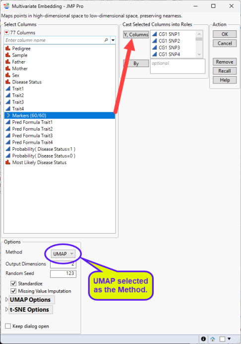
| 8 | Click . |
The following reports (t-SNE, left; UMAP, right) are generated:
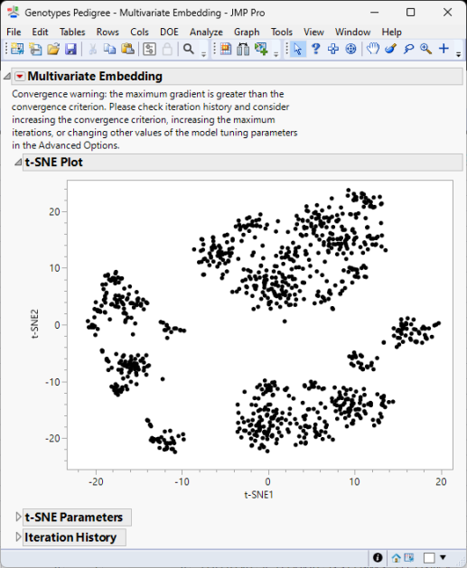
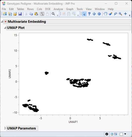
The Multivariate Embedding report window contains a plot of the two dimensions computed using either the t-SNE method and information about its parameter settings and iteration history (left) or the UMAP method and its parameter settings (right).
t-SNE tries to reduce the dimensions by searching for localized areas of structure to form tight local clusters while UMAP reduces dimensions to form tight clusters while maintaining global topography.
Multidimensional Scaling
Multidimensional Scaling (MDS) is a technique that is used to create a visual representation of the pattern of proximities (similarities, dissimilarities, or distances) among a set of objects. While both MDS and PCA are dimension reduction techniques, MDS differs from PCA in that, while MDS aims to preserve pairwise distances or dissimilarities between data points, PCA mainly preserves the covariance of the data.
The following example uses the Genotypes Pedigree.jmp data set described above.
| 8 | Click Analyze > Multivariate Methods > Multivariate Scaling. |
| 8 | Select the SNPsgrouping of the genotype columns as the Y, Columns. |
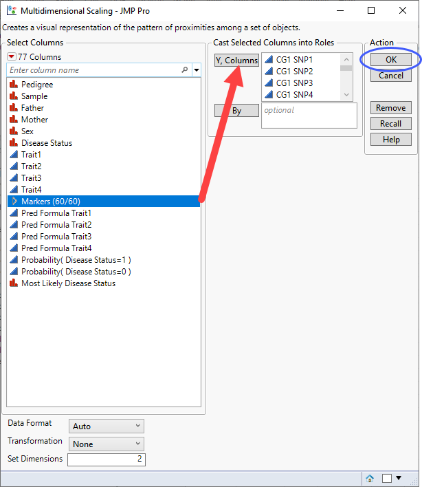
| 8 | Click . |
The following report is generated:

The MDS plot displays the multidimensional scaling in two dimensions.
The Shepard Diagram is a plot of the actual or transformed proximities versus the predicted proximities. The plot indicates how well the Multidimensional Scaling Plot reflects the actual proximities. Ideally the points fall on the Y = X line, which is shown in red.