Distribution
Data distributions show the number or proportion of the events falling within a particular interval. JMP Clinical software presents these distributions as histograms or parallel plots.
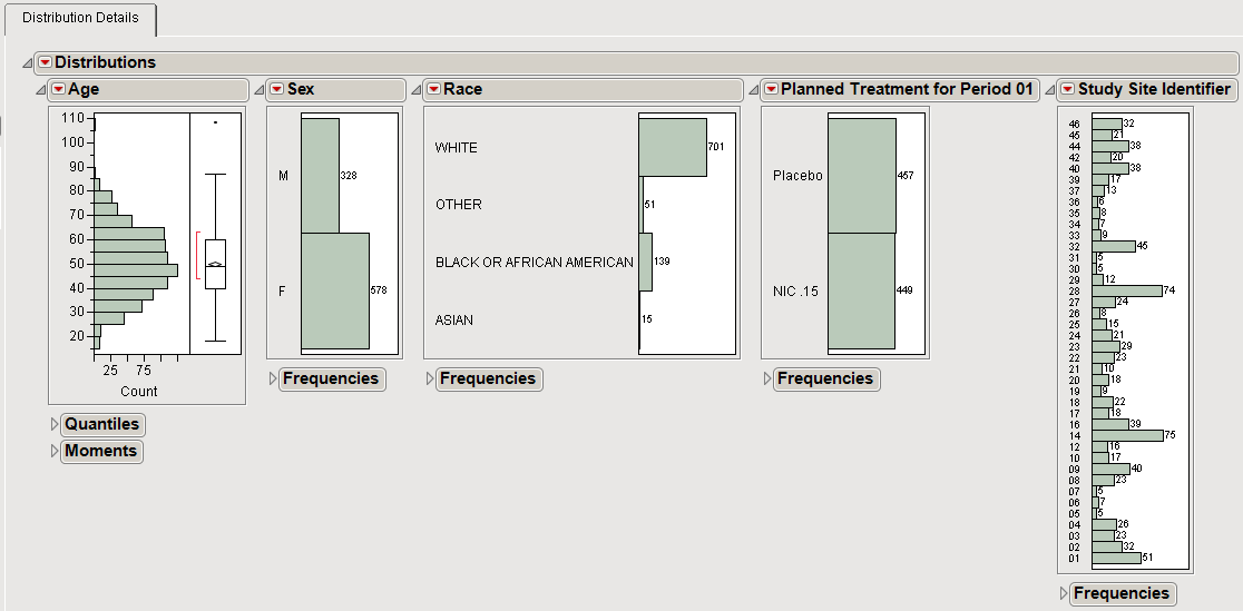
The histograms below show the number of patients that fall into specific bins or categories. For numeric variables, you can adjust the bin size using the hand tool.
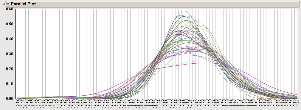
Distribution estimates can also be overlaid using a parallel plot. The parallel plot below is generated from gene expression data (as determined by hybridization intensities whose relative scale is plotted on the X axis) from a large number of individual subjects. Each curve represents one subject. Curves show the relative proportion (plotted on the Y axis) of gene probes exhibiting specific intensity values across the experiment.