This report tracks a pair of findings measurements over time with an animated
bubble plot
. Values are linearly interpolated over time. You can select subjects of interest and display their time profiles.
For the LB domain, lab measurements are standardized by a reference midrange derived from the lower limit of normal (LLN) and upper limit of normal (ULN) to facilitate comparisons. The
standardization
centers the values at the midpoint between the LLN and the ULN and scales by (ULN - LLN)/2.
Refer to the
Findings Bubble Plot
requirements description for more information.
Note
: JMP Clinical employs a special protocol for data including non-unique Findings test names. Refer to
How does JMP Clinical handle non-unique Findings test names?
for more information.
Running
Findings Bubble Plot
with the
Nicardipine
sample setting and
LB
findings domain generates the tabbed
Results
window shown below.
Note
: For this example, an
Ending Time Value
of
14
was entered on the
Display
portion of the
Options
dialog
because most measurements were taken only in the first two weeks of the study.
|
•
|
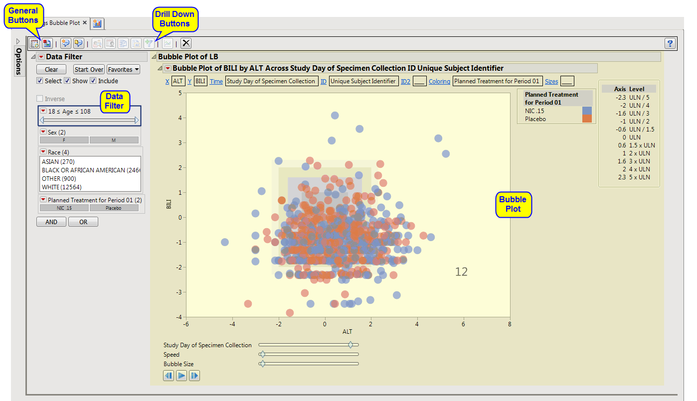
Bubble Plot of LB
: This tab displays a JMP
Bubble Plot
of findings values for each subject in a study that can be animated to view findings measurements across the study days or weeks of a trial. Note that the name of the tab is dependent on the current findings domain being analyzed. The tab is named "
Bubble Plot of XX
" where
XX
is the domain specified on the
dialog
.
|
This enables you to subset subjects based on demographic characteristics and other factors. Refer to
Data Filter
for more information.
|
•
|
Profile Subjects
: Select subjects and click
|
|
•
|
Profile Subjects
: Select subjects and click
|
|
•
|
Cluster Subjects
: Select subjects and click
|
|
•
|
Create Subject Filter
: Select subjects and click
|
|
•
|
Graph Time Trends
: Select one or more points on the
bubble plot
and click the
|
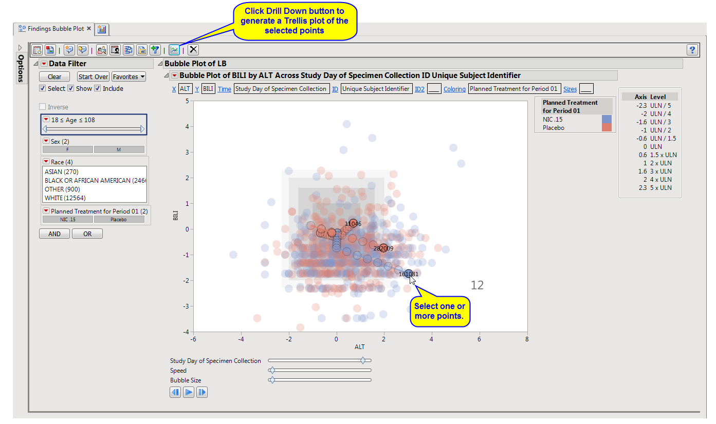
|
•
|
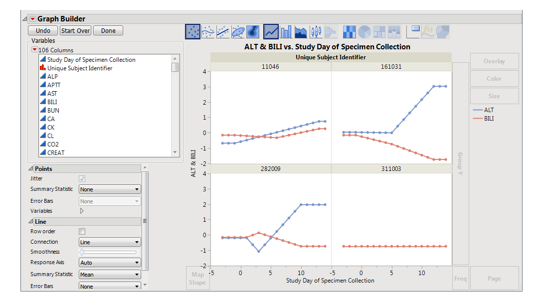
Initially, the plots display the two Findings tests that were shown on the
X
-axis and
Y
-axis in the original bubble plot on the
Y
-axis (in this case (
BILI
and
ALT
levels), as shown below.
|
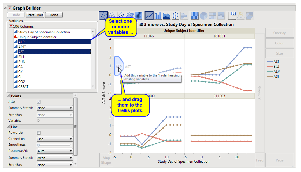
You can select more
Findings
tests to add to the
Y
-axis by clicking in the
Variables
panel on the left side of the plot and dragging selected tests to the right of the
Y
-axis of one of the subject plots. For example, you can select
ALP
and
AST
by clicking on
ALP
, then while holding
, also click
AST
and drag them both over until the light blue box appears as in the following figure:
|
•
|
Click
|
|
•
|
Click
|
|
•
|
Click
|
|
•
|
Click
|
|
•
|
Click the
arrow to reopen the completed process dialog used to generate this output.
|