
The
Bubble Plot of LB
section contains the following elements:
|
•
|
One JMP
bubble plot
to display findings measurements across time. (See
Bubble Plot
for a
general
description of bubble plots.)
|
This plot is useful for viewing findings measurements and their trends across time through animation. Two findings measurements are selected by default to be shown on the
X
-axis and
Y
-axis. Default measurements plotted by domain are as follows:
|
|||
|
vital signs (
VS
)
|
|||
|
electrocardiograms (
EG
)
|
|||
|
Alternatively, you can specify the two tests that are to show on the axes on the
Display
tab of the input
dialog
.
|
Each point or "bubble" represents the pair of findings measurements for a subject, colored by treatment
arm
or the selected treatment
variable
. Treatments are represented by the colors shown in the
Treatment Legend
. The animation can be started by clicking on the
play
(
 )
button
found with other
Plot and Animation Controls
at the bottom of the plot. When you click
play
, you start to see the bubbles move to show each subject's measurements for the findings plotted as study day (or week) progresses. Note that by default, the analysis linearly interpolates findings values for time points when a test was not measured. This is similar to viewing a timeline display and drawing a line between points of measurement. The
Linearly interpolate values
option is checked by default on the dialog so that bubble points do not appear and disappear in the visualization.
)
button
found with other
Plot and Animation Controls
at the bottom of the plot. When you click
play
, you start to see the bubbles move to show each subject's measurements for the findings plotted as study day (or week) progresses. Note that by default, the analysis linearly interpolates findings values for time points when a test was not measured. This is similar to viewing a timeline display and drawing a line between points of measurement. The
Linearly interpolate values
option is checked by default on the dialog so that bubble points do not appear and disappear in the visualization.
The
Time Unit
is shown in
gray text
in the
white space
of the plot. You can stop the display by clicking the
pause
(
 )
button
, or use the other
Plot and Animation Controls
to view the plot at a specific time point (
step backward
(
)
button
, or use the other
Plot and Animation Controls
to view the plot at a specific time point (
step backward
(
 )
button
,
step forward
(
)
button
,
step forward
(
 )
button
, or
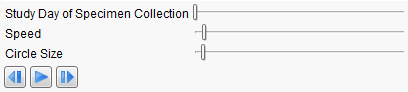
Study Day of Specimen Collection
slider), increase or decrease the speed of the animation (
Speed
slider), or change the size of the bubbles (
Circle Size
slider).
)
button
, or
Study Day of Specimen Collection
slider), increase or decrease the speed of the animation (
Speed
slider), or change the size of the bubbles (
Circle Size
slider).
If you are analyzing laboratory measurements, the tests can be normalized by the ULN, LLN, or a Geometric method that references both ULN and LLN. Tests can also be transformed to
log
scaling. An
Axis Legend
on the right of the plot shows how gray reference lines or gray boxes of reference are drawn to highlight abnormal measurements.
Variable Roles
are shown in boxes along the top of the bubble plot. These roles can be used to change the view to show alternate findings tests on the
X
and
Y
axes.
The bubble plot displayed on this tab is very useful to learn how your findings data behaves across the time of the trial. It is particularly informative at highlighting outliers in your data or measurements at an unusually high or low value for an unexpected length of time during the trial. This is especially useful with the laboratory measurements for evaluation of
hepatotoxicity
following Hy's Law. For
electrocardiograms
, it can highlight cardiotoxicity by showing extended QT intervals at given heart rate measurements. Subjects that show unusual temporal measurement in this plot can be easily profiled. Alternatively, the other available action button drill downs can be used to gather more information about your study.