This section provides a comprehensive summary of
ANOVA
model fitting results. It is important to keep in mind which
model
was fit and to carefully consider hypotheses of interest. Depending on the variability in your data and your objectives, you might wish to alter the significance criterion to obtain fewer or more significant Findings tests. The numerous drill-down options are valuable for exploring interesting subsets.
The
Results
tab contains the following elements:
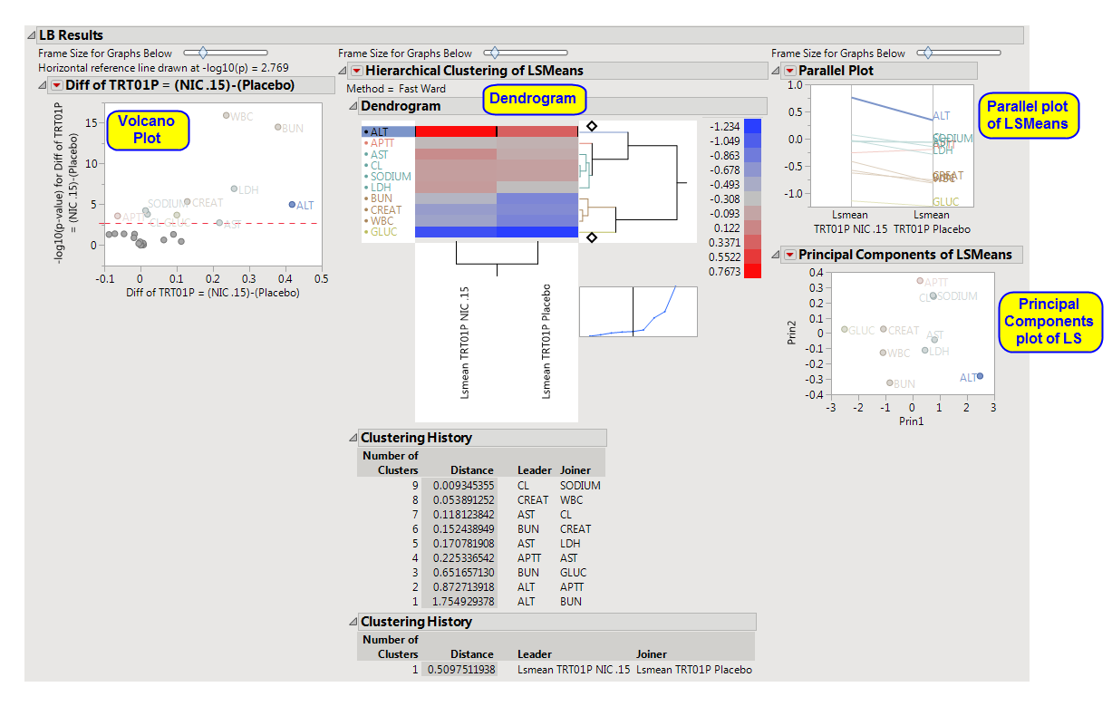
Volcano plots
are a convenient way to summarize a specific
hypothesis test
across all Findings tests. Each plot is based on a single hypothesis of interest and each point in the plot is a Findings test. The
x
-axis represents a difference or estimate and the
y
-axis its corresponding
-log
10
(
p-value
). Volcano plots have a characteristic "V" shape because estimates near
zero
(0) tend not to be significant and those away from zero tend to have smaller
p
-values and larger
-log
10
(
p
-values). Significant Findings tests are those in the upper left and right quadrants of the plot, akin to exploding pieces of molten lava. The red dashed horizontal line usually represents a significant criterion computed by some multiple testing method like
FDR
. You can change this value with an action button in the left panel. You can also resize all of the plots with a slider above them.
When interpreting volcano plots, it is important keep in mind the direction of the difference on the
x
-axis. For example, the plot from the
Nicardipine
example shown above has
Diff of TRT01P = (NIC .15)-(Placebo)
on the
x
-axis. Positive differences are located on the right side, whereas negative differences are located on the left.
You can mouse over points of interest to see their labels or select points by dragging a mouse rectangle over them. Use the
lasso tool
to select irregular regions. To find specific Findings tests whose identifier you know, click
Results
in the
Tabs
section, and then click
View Data
. In the subsequently opened data table, click
Edit > Search
, and type in the desired search string. Any Findings tests that you select in the table is highlighted in the graphs and vice versa. Selected Findings tests are highlighted in other plots and you can also then click on various
Drill Down Buttons
on the left-hand side for further analyses on those specific Findings tests.
Volcano plots are generated for the set of
LS means
you specify in the input
dialog
(for example, all possible pairs or differences with a control) as well as for all custom
ESTIMATE statements
that you specify.
See
Volcano Plot
for more information.
|
•
|
This plot enables you to compare
expression
patterns for all significant Findings tests simultaneously. The standardized least squares means for every Findings test that is significant in at least one volcano plot are clustered both horizontally and vertically and depicted with a heat map. The
standardization
is to
mean
zero
(0) and
variance
one
(1). Each row of the heat map is a Findings test and each column is a distinct LS mean. You can see which Findings tests and LS means have similar profiles. You can click on branches of the horizontal dendrogram to select all Findings tests in that cluster. These Findings tests are then highlighted in other plots, and you can click on
Drill Down Buttons
on the left-hand side for further analyses.
Click and slide the
cross-hair point
at the top or bottom of the horizontal dendrogram to change the number of colored cluster groups.
See
Heat Map and Dendrogram
for more information.
|
•
|
A
parallel plot
of LSMeans.
|
See
Parallel Plot
for more information.
This plot provides an alternative way of comparing significant LS means. It computes a
principal components
analysis on them and plots the first two components. This projects high-dimensional patterns into two dimensions. Findings tests that cluster together in this plot tend to also cluster together in the
hierarchical clustering
and parallel plots. This plot can help identify outliers. Points near the outer virtual bounding ellipse are well-explained by the first two principal components.
See
Principal Components Analysis Plot
for more information.