The
EG Max
tab is shown below:
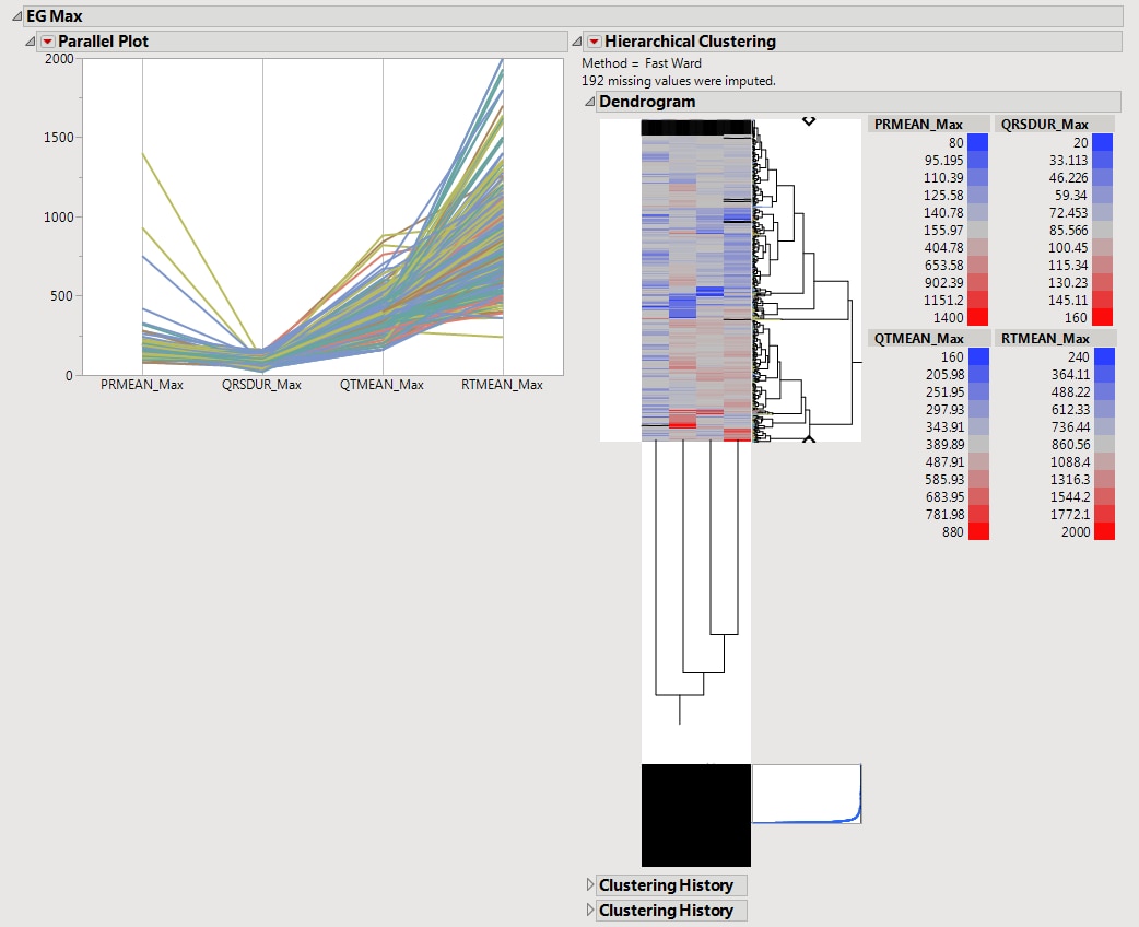
This shows a
Parallel Plot
of the computed statistic for each
variable
in the domain. Each line in the plot corresponds to a subject. In the example above, the
max
statistic is plotted for four variables. The coloring of the lines comes from the
hierarchical clustering
analysis of the first numeric domain.
See the JMP
Parallel Plot
platform for more information.
See the JMP
Hierarchical Clustering
platform for more information.