The
Treatment Time Trends
tab is shown below:
The
Treatment Time Trends
tab contains the following elements:
|
•
|
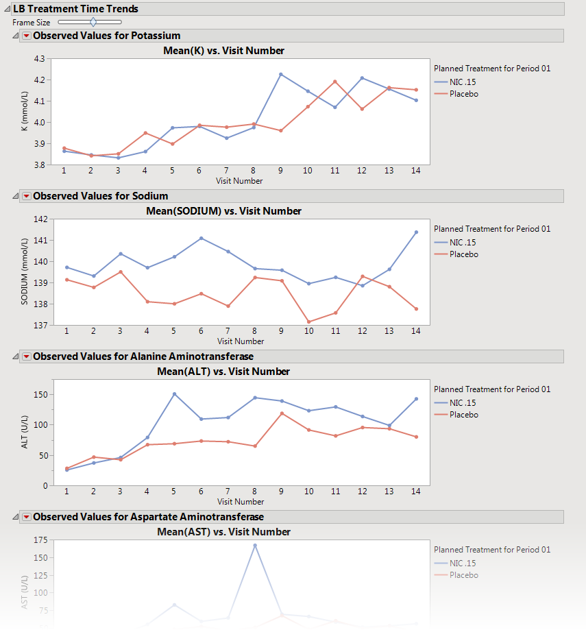
A set of
Treatment Level Time Trend Plots
|
If findings test category (
xxCAT
) exists (where
xx
represents the two letter domain abbreviation -- for example,
LB
), these plots are first ordered by
xxCAT
. Next, if findings test subcategory (
xxSCAT
) exists, plots are secondarily ordered by
xxSCAT
. If
xxCAT
is missing, plots are ordered by test short name (
xxTESTCD
), which is required. Findings tests with a missing
xxCAT
value are assigned to the “
OTHER
” category.
Note
: Findings tests with a missing numeric result (
xxSTRESN
), as well as those taken on only one day, are excluded from these plots.
Tip
: You can collapse categories (and simultaneously exclude them from any report that you create) by clicking on the
gray triangles
located to the left of the category labels.
Each plot displays the
means
of the measurements taken across time for each treatment
arm
in a study for a quantitative findings test. The value of
xxTEST
(where
xx
represents the two letter domain abbreviation -- for example,
LB
) is displayed in the outline box for each plot, and the test short name (
xxTESTCD
) is displayed along with the measurement units (where applicable) on the
y
-axis. The
y
-axis can represent the observed test result, the change from baseline, percent change from baseline, or percent of baseline, depending on the selection made for the
Plot findings measurements as:
parameter on the process
dialog
. Time, as either Study Day, Study Week, or Visit, is plotted on the
x
-axis (according to your
Time Scale
selection).
Time trend lines
connect the points of measurement; each marker point represents the average findings measurement for subjects belonging to that treatment arm at the measured time point.
The
y
-axis can optionally be displayed with
log scaling
(this is very useful for interpreting laboratory findings). In addition, you can choose to compute and show
standard error
bars
at each measured time point for each treatment group. These standard error bars can be helpful in visualizing significantly different measurements for a findings test at certain time points. Note that standard error calculations depend heavily on the number of measured subjects at a specific time point. These plotting options are found on the
Output
tab of the process dialog.
The time trend lines are
interactive
. Selecting a line selects all subjects belonging to the treatment group the selected line represents. You can then use the drill down buttons to profile, cluster, or show these subjects or to create a subject filter to do further analysis only with the selection of subjects. Selecting a treatment time trend line also selects and highlights all the individuals' subject time trend lines on the accompanying
Subject Time Trends
tab that is part of the output from this process.