The
Volcano Plots
tab contains the following elements:
|
•
|
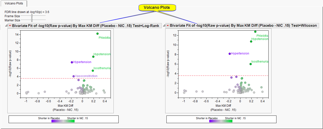
Two
Volcano Plots
.
|
The
y
-axis represents the -log
10
(raw
p-value
) from either the
Log-Rank test
(
left
) or the
Wilcoxon test
(
right
). In most instances, these two tests coincide. To interpret this axis, consider that
The
x
-axis represents the maximum computed distance between the two curves, and
color
indicates which treatment was likely to have the event sooner. For example,
Phlebitis
occurs at approximately 0.27 on the
x
-axis and is
green
. This means that at least one time point in the
Kaplan-Meier and Hazard Plots
, the risk of having this particular event was 27% more likely for Nicardipine versus Placebo.
Events above the
dotted red line
are considered statistically significant after adjusting for multiple comparisons. Adjustment is applied using the linear step-up method of Benjamini and Hochberg (1995) to control the false discovery rate.
See
Volcano Plot
for more information.