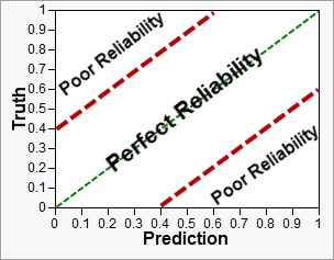
A
reliability diagram
is a graph where the conditional
distribution
of the
observations
, given the forecast probability, is plotted against the forecast probability. The distributions for perfectly reliable forecasts are plotted along the 45-degree diagonal. A guide is shown below.
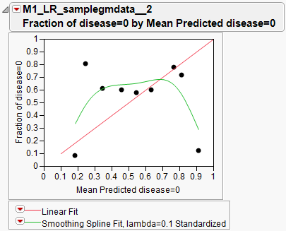
The more tightly data points are packed along the central 45-degree diagonal line, the better the
model
. An example is shown below.