This report tracks a pair of findings measurements over time with an animated bubble plot. Values are linearly interpolated over time. You can select subjects of interest to display their time profiles.
For the LB domain, lab measurements are standardized by a reference midrange derived from the lower limit of normal (LLN) and upper limit of normal (ULN) to facilitate comparisons. The standardization centers the values at the midpoint between the LLN and the ULN and scales by (ULN - LLN)/2.
Note: JMP Clinical uses a special protocol for data including non-unique Findings test names. Refer to How does JMP Clinical handle non-unique Findings test names? for more information.
Running Findings Bubble Plot with the Nicardipine sample setting and LB findings domain generates the tabbed Results shown below.
Note: For this example, an Ending Time Value of 14 was entered because most measurements were taken only in the first two weeks of the study.

Displays a JMP Bubble Plot of findings values for each subject in a study that can be animated to view findings measurements across the study days or weeks of a trial. Note that the name of the section is dependent on the current findings domain being analyzed. The section is named "Bubble Plot of XX" where XX is the domain specified on the dialog.
This section contains one JMP bubble plot to display findings measurements across time. (See Bubble Plot for a general description of bubble plots.)
This plot is useful for viewing findings measurements and their trends across time through animation. Two findings measurements are selected by default to be shown on the X axis and Y axis. Default measurements plotted by domain are as follows:
|
|||
|
Alternatively, you can specify the two tests that are to show on the axes on the Display tab of the input dialog.
|
Each point or "bubble" represents the pair of findings measurements for a subject, colored by treatment arm or the selected treatment variable. Treatments are represented by the colors shown in the Treatment Legend. The animation can be started by clicking on the play ( ) button found with other Plot and Animation Controls at the bottom of the plot. When you click play, you start to see the bubbles move to show each subject's measurements for the findings plotted as study day (or week) progresses. Note that by default, the analysis linearly interpolates findings values for time points when a test was not measured. This is similar to viewing a time line display and drawing a line between points of measurement. The Linearly interpolate values option is checked by default on the dialog so that bubble points do not appear and disappear in the visualization.
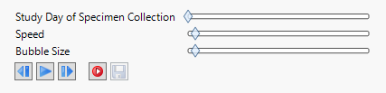
The Time Unit is shown in gray text in the white space of the plot. You can stop the display by clicking the pause ( ) button, or use the other Plot and Animation Controls to view the plot at a specific time point (step backward (
 ) button, step forward (
 ) button, or Study Day of Specimen Collection slider), increase or decrease the speed of the animation (Speed slider), or change the size of the bubbles (Circle Size slider). Finally, you can record (
 ) or save (
 )the animation.
If you are analyzing laboratory measurements, the tests can be normalized by the ULN, LLN, or a Geometric method that references both ULN and LLN. Tests can also be transformed to log scaling. An Axis Legend on the right of the plot shows how gray reference lines or gray boxes of reference are drawn to highlight abnormal measurements.
Variable Roles are shown in boxes along the top of the bubble plot. These roles can be used to change the view to show alternate findings tests on the X and Y axes.
The bubble plot displayed in this section is very useful to learn how your findings data behaves across the time of the trial. It is particularly informative at highlighting outliers in your data or measurements at an unusually high or low value for an unexpected length of time during the trial. This is especially useful with the laboratory measurements for evaluation of hepatotoxicity following Hy's Law. For electrocardiograms, it can highlight cardiotoxicity by showing extended QT intervals at given heart rate measurements. Subjects that show unusual temporal measurement in this plot can be easily profiled. Alternatively, the other available action button downs can be used to gather more information about your study.
This enables you to subset subjects based on demographic characteristics and other factors. Refer to Data Filter for more information.
|
•
|
Profile Subjects: Select subjects and click
|
|
•
|
Profile Subjects: Select subjects and click
|
|
•
|
Cluster Subjects: Select subjects and click
|
|
•
|
Demographic Counts: Select subjects and click
|
|
•
|
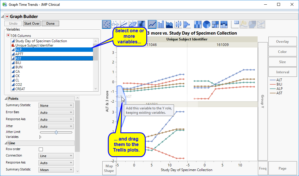
Graph Time Trends: Select one or more points on the bubble plot and click the
|

|
•
|
Initially, the plots display the two Findings tests that were shown on the X axis and Y axis in the original bubble plot on the Y axis (in this case (BILI and ALT levels), as shown below.
|

You can select more Findings tests to add to the Y axis by clicking in the Variables panel on the left side of the plot and dragging selected tests to the right of the Y axis of one of the subject plots. For example, you can select ALP and AST by clicking on ALP, then while holding , also click AST and drag them both over until the light blue box appears as in the following figure:
|
•
|
Click
|
|
•
|
Click
|
|
•
|
Click
|
|
•
|
Click
|
|
•
|
Click the arrow to reopen the completed report dialog used to generate this output.
|
|
•
|
Click the gray border to the left of the Options tab to open a dynamic report navigator that lists all of the reports in the review. Refer to Report Navigator for more information.
|
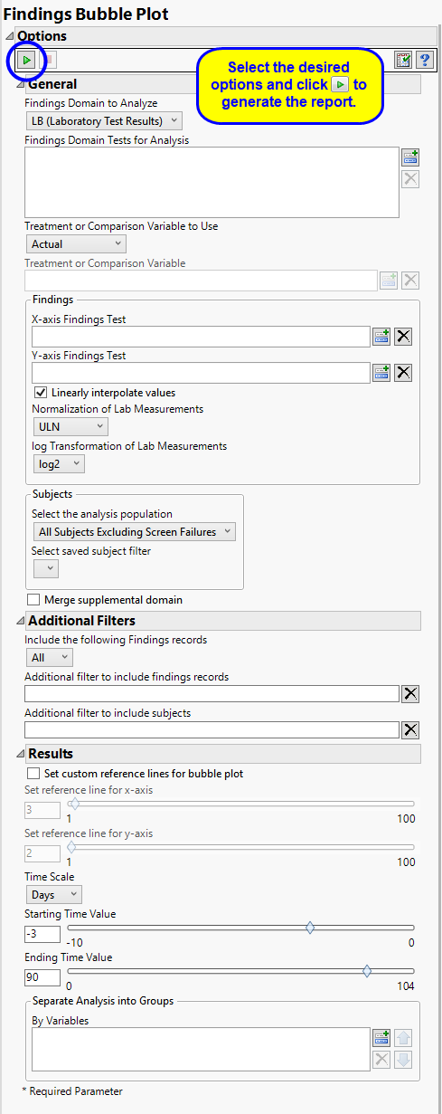
Use the Findings Domain to Analyze option to specify whether to plot the distribution of measurements from either the Electrocardiogram (EG), Laboratory (LB), or Vital Signs (VS) findings domains. LB is selected by default.
You can use the Findings Domain Tests for Analysis option to plot the distributions of one or more selected findings tests. Leaving the field blank (the default selection) plots the distributions for all available findings tests.
The primary goal of clinical trials is to distinguish treatment effects when reporting and analyzing trial results. Treatments are defined by specific values in the treatment or comparison variables of the CDISC models. These variables are specified in this report using the Treatment or Comparison Variable to Use andTreatment or Comparison Variable options.
Available variables include Planned, which is selected when the treatments patients received exactly match what was planned and Actual, which is selected when treatment deviates from what was planned.
You can also specify a variable other than the ARM or TRTxxP (planned treatment) or ACTARM or TRTxxA (actual treatment) from the CDISC models as a surrogate variable to serve as a comparator. Finally, you can select None to plot the data without segregating it by a treatment variable.
Use the x-Axis Findings Test and Y-Axis Findings Test options to specify the findings values to be plotted on the x-axis and y-axis, respectively
Each subject in a bubble plot is represented in the output graphic by a “bubble”. The position of these bubbles depends on the values of the selected findings. As the values change over time the positions of the bubbles change. Because bubbles can disappear and reappear when subjects are missing findings results, missing data can seriously compromise interpretation of these plots. This problem can be alleviated by using the Linearly interpolate values option to estimate the values of missing data based on the positions of adjacent findings thus creating a value for every subject at every time point.
By default, JMP Clinical reports unaltered laboratory measurement values. In any cases, simply examining the raw numbers can make interpretation somewhat confusing. Normalization of Lab Measurements to accepted values can often ease these difficulties. JMP Clinical offers three options for normalizing your data.
Selecting LLN normalizes the data to the lower limit of the expected normal range and is best used when you expect the values to fall below the normal. Normalized values less than one are considered to be lower than normal.
Selecting ULN normalizes the data to the upper limit of the expected normal range and is best used when you expect the values to exceed the normal range. Normalized values greater than one are considered to be higher than normal.
Selecting Geometric normalizes the data such that the lower limit of the expected normal range is set to -1 and the upper limit of the expected normal range is set to +1. This method is best used when there is no expectations of where the values might fall. Normalized values less than -1 are considered to be lower than normal while values greater that +1 are higher than normal.
Log transformations can make certain response distributions closer to Gaussian with constant variance and can enable you to draw more accurate statistical conclusions under standard modeling assumptions. They are especially useful for ratio-type measurements or measurements that are always positive and skewed to the right. You can use the log Transformation of Lab Measurements options to either use non-transformed data or to log2- or log10-transform your measurements.
Note: These options are available only when LB is the specified domain.
Filters enable you to restrict the analysis to a specific subset of subjects and/or findings records, based on values within variables. You can also filter based on population flags (Safety is selected by default) within the study data.
If there is a supplemental domain (SUPPXX) associated with your study, you can opt to merge the non-standard data contained therein into your data.
See Select the analysis population, Select saved subject Filter1, Merge supplemental domain, Include the following findings records:, Additional Filter to Include Findings Records, and Additional Filter to Include Subjects2
Reference lines can make it easier to interpret the results shown in the bubble plot. By default, reference lines are not displayed. To add these lines check the Set custom reference lines for bubble plot option and then use Set reference line for x-Axis and Set reference line for y-Axis to specify where to place the reference lines in the plot. By default the x-axis reference line is set to 3, which corresponds to 4x the upper limit of normal (ULN), and the y-axis reference line is set to 2, which corresponds to twice the ULN.
By default, time is measured in days. However, you can change the Time Scale to measure time in weeks. This option is useful for assessing report graphics for exceptionally long studies.
Use the Starting Time Value option to specify the first time point to be plotted. Because the first values to be plotted are normally measured before the start of the trial (at time equals 0), this value is typically negative. This value specified here indexes the number of days or weeks before the trial starts, depending on your selection for the Time Scale option. A value of -3 days is specified by default.
Use the Ending Time Value option to specify the last time point to be plotted, relative to 0, which is the start of the trial. Because the last values to be plotted are normally measured after the start of the trial (at time equals 0), this value is always positive. This value specified here indexes the number of days or weeks after the trial starts, depending on your selection for the Time Scale option. A value of 90 days is specified by default.
You can also subdivide the subjects and run analyses for distinct groups by specifying one or more By Variables.
Subject-specific filters must be created using the Create Subject Filter report prior to your analysis.