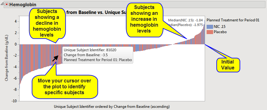
Waterfall charts show how the value of a variable increases or decreases until it reaches a final value. In the chart, bars represent an initial value of Y and a series of intermediate values identified by X leading to a final value of Y.
|
|
To select multiple subjects, hold down while left-clicking.
|