|
|
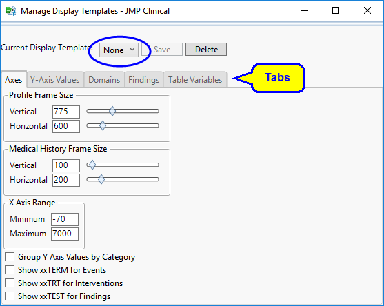
Click to open the Manage Display Templates .
|
|
|
Select a template using the Current Display Template drop-down menu (circled above) and either select a template that is closest to the one that you want to create, or just work from the default None template.
|
Note: Each action automatically updates the current display.
|
|
When you are satisfied with the display, click , enter a template name, and then click to save the new template.
|
|
|
To delete one or more templates, click , select the templates that you want to delete, and then click .
|
The Manage Display Templates dialog contains several tabs that enable you to configure the attributes of the Patient Profiler:
|
•
|
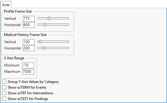
Axis tab: The controls on this tab enable you to adjust the vertical and horizontal space1 allocated to the primary subject profile view. Move the sliders (or enter values into the corresponding text fields) to suit your screen size and resolution. Right-click the sliders to change their range. Additional controls enable you to group Y axis values and specify which variables to use for events, interventions, and findings.
|
|
•
|
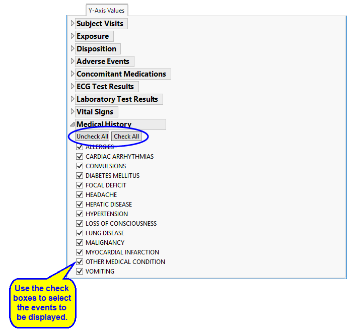
Y-Axis Values tab: These options enable you to control exactly what domain data are displayed in the displayed profiles on the General tab. Click on the triangle next to a domain (Medical History, for example) to expand it, and use the check boxes to remove or add items. and buttons (circled) are available for removing or adding entire domains.
|
|
•
|
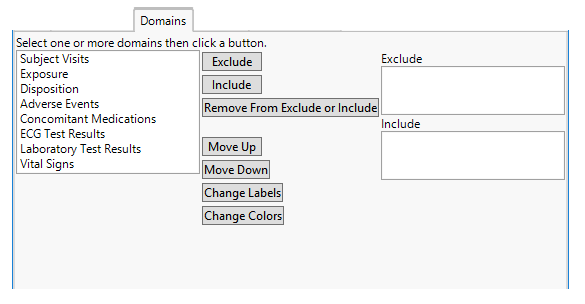
Domains tab: These options enable you to control the organization and appearance of data in the profiles. All of the domains in the study are listed on the left. To specify domains to include or exclude, select a domain in the list and click or to add that domain to the Exclude or Include panel. Click or to change the position of the domain in the display. Click and/or to change how domain data are labeled and colored in the profiles
|
|
•
|
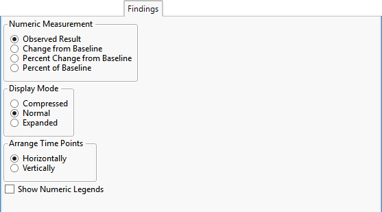
Findings tab: This pane contains options for specifying how numeric measurements are presented2 and to control the degree of detail shown for findings domains. Use the Numeric Measurement options to specify how numeric results are presented. Use the Display Mode options to control the degree of detail presented3. Determine which axis the time points are to be plotted on using the Arrange Time Points options. Toggle the visibility of numeric legends with the Show Numeric Legends check box.
|
|
•
|
Table Variables tab: These options enable you to control exactly what domain data are displayed and the order in which they are displayed in the Tables shown on the Tables tab. Click on the triangle next to a domain (Exposure, for example) to expand it. There are two sets of controls for each domain: one to specify the variables to display and the order to display them in the profiles, the second to specify which variables to sort the results by and the order in which to sort them. These are described below.
|
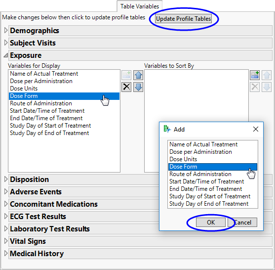
The panel on the left and its associated controls enable you to specify which variable to display in your profile and the order in which they are displayed. By default all variables in the domain are included and the Add option ( ) is disabled. To remove one or more variables, select the desired variables and click
  to remove the variables and enable the Add option. To change the order n which the variables are displayed select a variable and click the arrows to move it up or down in the list. Repeat as necessary.
The panel on the right and its associated controls enable you to specify one or more variables to sort the tabular data by. By default, no sorting variables are listed. To add one or more sorting variables, click to open the Add window. This window lists all of the variables in the corresponding domain. Select the variable(s) (up to three) that you want to sort by and click . The selected variable(s) are added to the panel. To remove one or more variables, select the desired variables and click to remove the variables and enable the Add option. By default, variables are sorted in ascending order. To change the order n which the variables are displayed select a variable and click the arrows to move it up or down in the list. Repeat as necessary.
Once you have made all of your changes, click to update your profile tables.
Use the Profile Frame Size controls to adjust the vertical and horizontal space allocated to the primary subject profile view. Use the Medical History Frame Size controls to adjust the vertical and horizontal space allocated to the primary subject profile view. Use the X Axis Range controls to adjust the X axis of the display. Enter minimum and maximum values into the text fields.
When Observed Result is selected as the numeric measurement, reference range values are taken as the first observed record for each subject in the high/low variables xxSTRNLO and xxSTRNHI in the data tables when these variables are available. If these variables are not available, reference range values are based on the 10th and 90th percentiles. Note: This does not apply when showing changes from baseline.
Compressed: Saves vertical space by collapsing values that have been grouped into a single row. (You must create an XXgrp.sas7bdat for the grouping to occur.) In the example, note the groupings for labs such as POTASSIUM / SODIUM and ALT / AST. Note a slight shift in the x-axis time value is used for visual clarity of groupings. Includes mini color legends on the right hand side of the display. The scale of these legends changes for each value. Normal: Allocates one row for each value, using more vertical space but aligning all measurements exactly on the x-axis time scale. Includes mini color legends on the right hand side of the display. The scale of these legends changes for each value. Expanded: Creates spark line plots for each row, using even more vertical space, but is informative for clearly visualizing time trends.