This report screens all findings measurements for a specified domain one at a time by performing a repeated-measures analysis of variance. The baseline measurements can be considered as a covariate or as a response. A measurement is determined to be a baseline measurement by the xxBLFL variable where xx is substituted with the 2-letter code for the chosen domain for analysis. If this variable does not exist, baseline is calculated from measurements taken on or before day 1 of the study. A time can be specified to determine baseline measurements. A compound symmetry covariance structure is assumed within each subject. A separate model is fit for each lab measurement. You can also separate the data into time s. A volcano plot of the interaction effect and other output enable efficient screening of lab scores that differ between treatment groups.
Note: JMP Clinical uses a special protocol for data including non-unique Findings test names. Refer to How does JMP Clinical handle non-unique Findings test names? for more information.
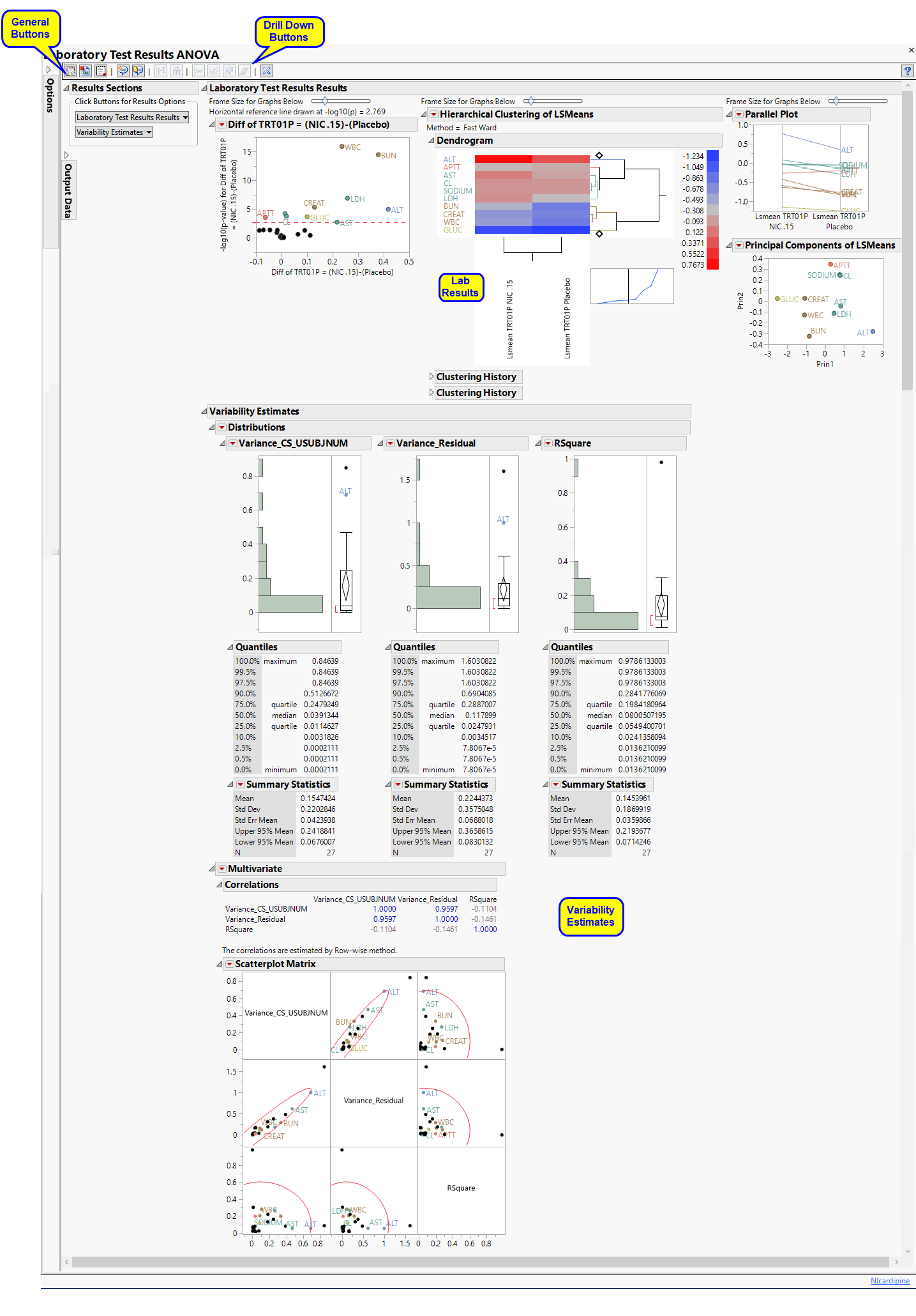
Running this report for Nicardipine using default settings generates the tabbed Report shown below. Results organized in sections. Each sections contains one or more plots, data panels, data filters, or other elements that facilitate your analysis.
This pane enables you to access and view the output plots and associated data sets on each tab. Use the drop-down menu to view the section in the Results pane or remove the section and its contents from the Results pane.

Shows the primary results from the analysis, including Volcano Plots and various analyses on least squares means.
Note: The name of this section and the findings results (LB, VS, or EG) displayed depend on the domain selected using the Findings Domain to Analyze option.
This section provides a comprehensive summary of ANOVA model fitting results. It is important to keep in mind which model was fit and to carefully consider hypotheses of interest. Depending on the variability in your data and your objectives, you might wish to alter the significance criterion to obtain fewer or more significant Findings tests. The numerous -down options are valuable for exploring interesting subsets.
|
•
|
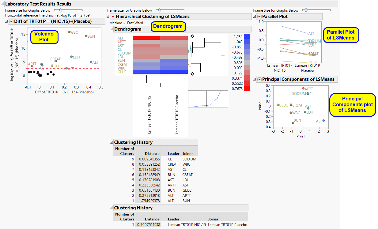
A series of volcano plots.
|
Volcano plots are a convenient way to summarize a specific hypothesis test across all Findings tests. Each plot is based on a single hypothesis of interest and each point in the plot is a Findings test. The X axis represents a difference or estimate and the Y axis its corresponding -log10(p-value). Volcano plots have a characteristic "V" shape because estimates near zero (0) tend not to be significant and those away from zero tend to have smaller p-values and larger -log10(p-values). Significant Findings tests are those in the upper left and right quadrants of the plot, akin to exploding pieces of molten lava. The red dashed horizontal line usually represents a significant criterion computed by some multiple testing method like FDR. You can change this value with an action button in the left panel. You can also resize all of the plots with a slider above them.
When interpreting volcano plots, it is important keep in mind the direction of the difference on the X axis. For example, the plot from the Nicardipine example shown above has Diff of TRT01P = (NIC .15)-(Placebo) on the X axis. Positive differences are located on the right side, whereas negative differences are located on the left.
You can mouse over points of interest to see their labels or select points by dragging a mouse rectangle over them. Use the lasso tool to select irregular regions. To find specific Findings tests whose identifier you know, click Results in the Tabs section, and then click View Data. In the subsequently opened data table, click Edit > Search, and type in the desired search string. Any Findings tests that you select in the table is highlighted in the graphs and vice versa. Selected Findings tests are highlighted in other plots and you can also then click on various Down Buttons on the left-hand side for further analyses on those specific Findings tests.
Volcano plots are generated for the set of LS means you specify in the input dialog (for example, all possible pairs or differences with a control) as well as for all custom ESTIMATE statements that you specify.
See Volcano Plot for more information.
|
•
|
This plot enables you to compare expression patterns for all significant Findings tests simultaneously. The standardized least squares means for every Findings test that is significant in at least one volcano plot are clustered both horizontally and vertically and depicted with a heat map. The standardization is to mean zero (0) and variance one (1). Each row of the heat map is a Findings test and each column is a distinct LS mean. You can see which Findings tests and LS means have similar profiles. You can click on branches of the horizontal dendrogram to select all Findings tests in that cluster. These Findings tests are then highlighted in other plots, and you can click on the Down Buttons on the left-hand side for further analyses.
Click and slide the cross-hair point at the top or bottom of the horizontal dendrogram to change the number of colored cluster groups.
See Heat Map and Dendrogram for more information.
|
•
|
A parallel plot of LSMeans.
|
See Parallel Plot for more information.
This plot provides an alternative way of comparing significant LS means. It computes a principal components analysis on them and plots the first two components. This projects high-dimensional patterns into two dimensions. Findings tests that cluster together in this plot tend to also cluster together in the hierarchical clustering and parallel plots. This plot can help identify outliers. Points near the outer virtual bounding ellipse are well-explained by the first two principal components.
See Principal Components Analysis Plot for more information.
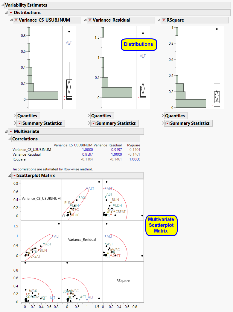
The Variability Estimates section contains the results of a distribution and multivariate analysis for each sample.
These show the distributions of each of the variance component estimates from the fitted ANOVA models, including quantiles and summary statistics. You can see which variance components are explaining the most variability across Findings (or adverse event) tests. RSquare is an approximation to the proportion of variability explained by the model. The quantiles can be useful when conducting a power and sample size exercise.
See Distribution for more information.
|
•
|
Multivariate Analysis.
|
These plots provide a multivariate analysis of the variance component estimates, including their correlations and a scatterplot matrix. These reveal interrelationships between the components and how they compete to explain variability.
See Scatterplot Matrix for more information.
|
•
|
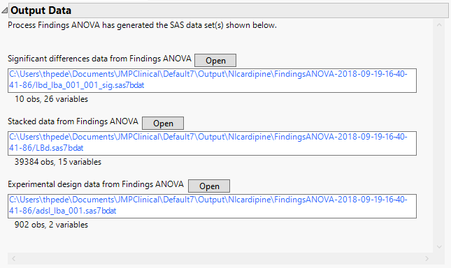
Significant Differences Data Set: This output data set contains a complete list of the Findings tests significant by one or more criteria. This data set is indicated by the _sig suffix. Click to view the data set.
|
|
•
|
Stacked Data Set: Contains findings measurements at subject level in a stacked format. Click to view the data set.
|
|
•
|
Experimental Design Data Set: This is a SAS data set that provides information about the columns of a tall data set. It describes relevant experimental variables such as treatment conditions and covariates as well as a variable named ColumnName. Refer to The Example Data for more information. Click to view the data set.
|
|
•
|
Fit Model and Plot LS Means: Select points or rows and click
|
|
•
|
Construct One-way Plots: Click
|
|
•
|
Trend Plots: Select Findings tests of interest and click
|
|
•
|
Shift Plot: Select Findings tests of interest and click
|
|
•
|
Box Plot: Select Findings tests of interest and click
|
|
•
|
Waterfall Plot: Click
|
|
•
|
Click
|
|
•
|
Click
|
|
•
|
Click
|
|
•
|
Click
|
|
•
|
Click the arrow to reopen the completed report dialog used to generate this output.
|
|
•
|
Click the gray border to the left of the Options tab to open a dynamic report navigator that lists all of the reports in the review. Refer to Report Navigator for more information.
|
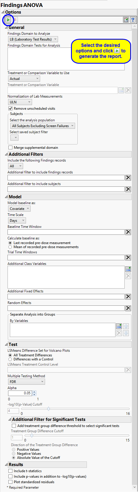
Use the Findings Domain to Analyze option to specify whether to plot the distribution of measurements from either the Electrocardiogram (EG), Laboratory (LB), or Vital Signs (VS) findings domains. LB is selected by default.
You can use the Findings Domain Tests for Analysis option to plot the distributions of one or more selected findings tests. Leaving the field blank (the default selection) plots the distributions for all available findings tests.
The primary goal of clinical trials is to distinguish treatment effects when reporting and analyzing trial results. Treatments are defined by specific values in the treatment or comparison variables of the CDISC models. These variables are specified in this report using the Treatment or Comparison Variable to Use andTreatment or Comparison Variable options.
Available variables include Planned, which is selected when the treatments patients received exactly match what was planned and Actual, which is selected when treatment deviates from what was planned.
You can also specify a variable other than the ARM or TRTxxP (planned treatment) or ACTARM or TRTxxA (actual treatment) from the CDISC models as a surrogate variable to serve as a comparator. Finally, you can select None to plot the data without segregating it by a treatment variable.
Unscheduled visits can occur for a variety of reasons and can complicate analyses. By default, these are excluded from this analysis. However, by unchecking the Remove unscheduled visits box, you have the option of including them.
Filters enable you to restrict the analysis to a specific subset of subjects and/or findings records, based on values within variables. You can also filter based on population flags (Safety is selected by default) within the study data.
If there is a supplemental domain (SUPPXX) associated with your study, you can opt to merge the non-standard data contained therein into your data.
See Select the analysis population, Select saved subject Filter1, Merge supplemental domain, Include the following findings records:, Additional Filter to Include Findings Records, and Additional Filter to Include Subjects2
By default, time is measured in days. However, you can change the Time Scale to measure time in weeks. This option is useful for assessing report graphics for exceptionally long studies.
To establish a baseline measurement for each finding, you must specify the time period (usually prior to day one of the study) and whether to use on or more than one measurement. Use the Baseline Time Window option to specify the time period during which baseline measurements are taken and the Calculate baseline as: option to use the last pre-dose measurement or the mean of all the measurements taken during the baseline time window as the baseline measurement.
You can opt to assess interventions across the entire study (specified by default). Alternatively, you can use the Trial Time Windows option to limit it to selected time points or intervals.
You can examine the effects that demographics classes have on the occurrence of adverse events by specifying one or more variables using the Additional Class Variables option. Indicator variables are then created for each level of each specified variable.
Use the Additional Fixed Effects option to specify effects by which to model the mean of the response variable. These effects are in addition to the primary time and/or treatment effects, so do not specify any effects confounded with those. The effects can include any mixture of class variables (as specified above) or continuous covariates.
Random Effects are typically comprised of class variables and their interactions that are used to model the covariance structure of the response variable. Commonly used random effects are SITEID (for multi-center trials) and STUDYID (for data assembled from multiple studies).
You can also subdivide the subjects and run analyses for distinct groups by specifying one or more By Variables.
The LSMeans Treatment Control Level is specified as either “Placebo” or “Pbo”, depending on the value found in your data, by default. However, if your control is defined differently you can use the text box to specify the control level is identified in your study.
The False Discovery Rate test is selected by default. You can use the Multiple Testing Method option to select alternative test protocols.
The Alpha option is used to specify the significance level by which to judge the validity of the summary statistics generated by this report. The meaning of alpha depends on the adjustment method that you select. Alpha can be set to any number between 0 and 1, but is most typically set at 0.001, 0.01, 0.05, or 0.10. The higher the alpha, the higher the error rate but also higher the power for detecting significant differences. You will need to decide on the best trade-off for your experiment.
Note that instead of performing multiple testing adjustments of the p-values, you can opt to simply specify a cutoff value for -log10(p-values) in order to select significant hypothesis tests. Using unadjusted p-values with a cutoff has the benefit of more expansive volcano plots, whereas adjusted p-values tend to squish points along the y-axis.Refer to -log10(p-Value) Cutoff for more information. Note: This option is available only when no multiple testing method is specified.
The Add treatment group difference threshold to select significant tests option enables you to use an additional filter based on the magnitude of the treatment group difference (the value that is plotted on the X-axis of the resulting volcano plots) for each statistical test when creating significant indicator variables. This filter, can be used to further highlight clinically interesting results from tests found to be statistically significant. The significant indicator variables formed in the output data set are based on both the p-value cutoff and the magnitude of the treatment group difference specified below.
The Treatment Group Difference Cutoff option enables you to specify a cutoff for the treatment group differences (calculated from the treatment group LSMeans) that are displayed in the X-axis of volcano plots formed for the statistical tests. This cutoff is used to further select significantly interesting hypothesis tests. Note values entered should be positive values indicating the magnitude of the cutoff. Use the Direction of the Treatment Group Difference to specify the direction of the treatment group difference you wish to apply for further selection of significant tests.
Check the Include T-statistics to include extra output columns containing the t-statistics for results from the ESTIMATE statements and LSMEANS differences.
Check the Include p-values in addition to -log10(p-values) option to include extra output columns containing p-values for results from the ESTIMATE statements and LSMEANS differences in addition to the default -log10 p-values.
Residuals are computed as observed dependent variable values minus the predicted values from the anova model. Studying the residuals can help you decide on the validity of the assumptions underlying the anova model, namely, that the errors are approximately normally distributed and independent. The Plot standardized residuals option creates quantile-quantile (Q-Q) and scatter plots of the standardized residuals from the anova model fits. These plots are useful for assessing the quality of each fit. Caution: This option creates a large SAS data set and opens it in JMP for plotting. It can greatly slow execution time for large trials.
Subject-specific filters must be created using the Create Subject Filter report prior to your analysis.
For more information about how to specify a filter using this option, see The SAS WHERE Expression.