This report displays shift plots to compare test measurements for a specified findings domain at baseline versus on-therapy values and performs a matched pairs analysis on average score during baseline and a summary score during the trial. A separate analysis is done for each findings measurement.
Note: JMP Clinical uses a special protocol for data including non-unique Findings test names. Refer to How does JMP Clinical handle non-unique Findings test names? for more information.
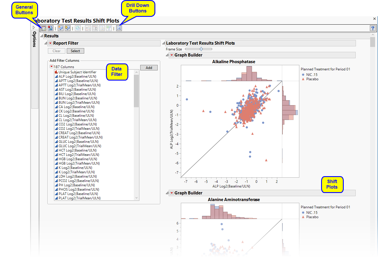
Running Findings Shift Plots for Nicardipine using default settings generates the report shown below.
|
•
|
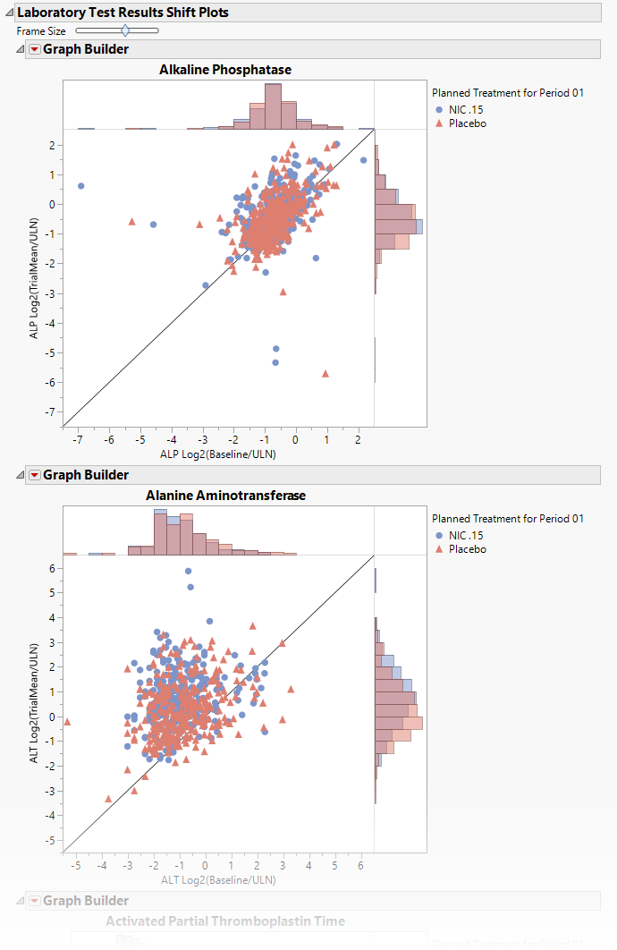
These plots show how findings levels change from baseline values as a result of treatment. Blue points represent patients treated with nicardipine. Red points represent patients receiving the placebo. The approximately square spread of points (with a diagonal line splitting approximately even across it) indicates similar variability of measurements before and after treatment, although the placebo group appears to have greater variability in both cases compared to the treatment group (due to outliers).
|
•
|
One set of overlayed treatment-specific Histograms for each findings test.
|
Note: This section is generated only if the Display cross-tabulation tables of Baseline versus Trial laboratory measurement elevations box is checked on the report dialog.

These tables contain subject counts and percentages (for each treatment group) of laboratory elevations in reference to the upper limit of normal (LBSTNRHI) for measurements taken at baseline versus trial summary measurements. Each table can be interpreted as a categorized representation of the shift from baseline.
Tip: You can select table cells to view the corresponding subjects and their locations in the respective shift and matched pairs plots.
All tables are associated with the Local Data Filter (located on the right side). You can use this filter to subset the tables based on variable filters. You can select cells of these tables (either counts or percents) to select the corresponding rows in the data table.
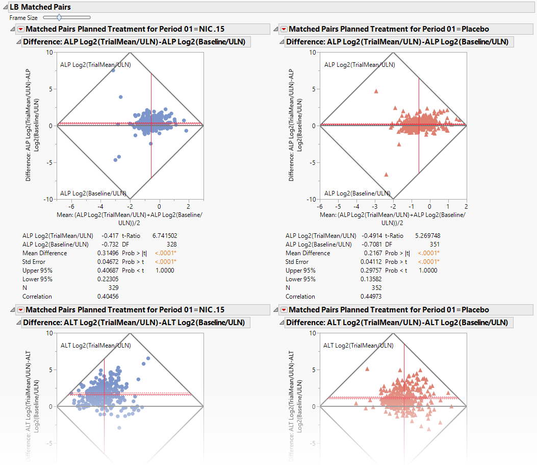
Compares experimental groups for each finding through the use of Matched Pairs Analysis plots. Tis output is generated when the Perform Matched-Pairs analysis of Baseline versus Trial measurements for each treatment group option is checked.
|
•
|
A set of Matched Pairs Analysis Plots.
|
Each Matched Pairs Analysis Plot set compares the different treatment groups for each finding. Blue dots (left) represent patients treated with nicardipine. Red dots (right) represent patients treated with the placebo. In the example shown above, nicardipine appears to have little effect on individual potassium level or variation of potassium level between patients.
This enables you to subset subjects based on demographic characteristics and study site. Refer to Data Filter for more information.
|
•
|
Profile Subjects: Select subjects and click
|
|
•
|
Show Subjects: Select subjects and click
|
|
•
|
Cluster Subjects: Select subjects and click
|
|
•
|
AE Narrative: Select subjects and click
|
|
•
|
Demographic Counts: Select subjects and click
|
|
•
|
Click
|
|
•
|
Click
|
|
•
|
Click
|
|
•
|
Click
|
|
•
|
Click the arrow to reopen the completed dialog used to generate this output.
|
|
•
|
Click the gray border to the left of the Options tab to open a dynamic report navigator that lists all of the reports in the review. Refer to Report Navigator for more information.
|
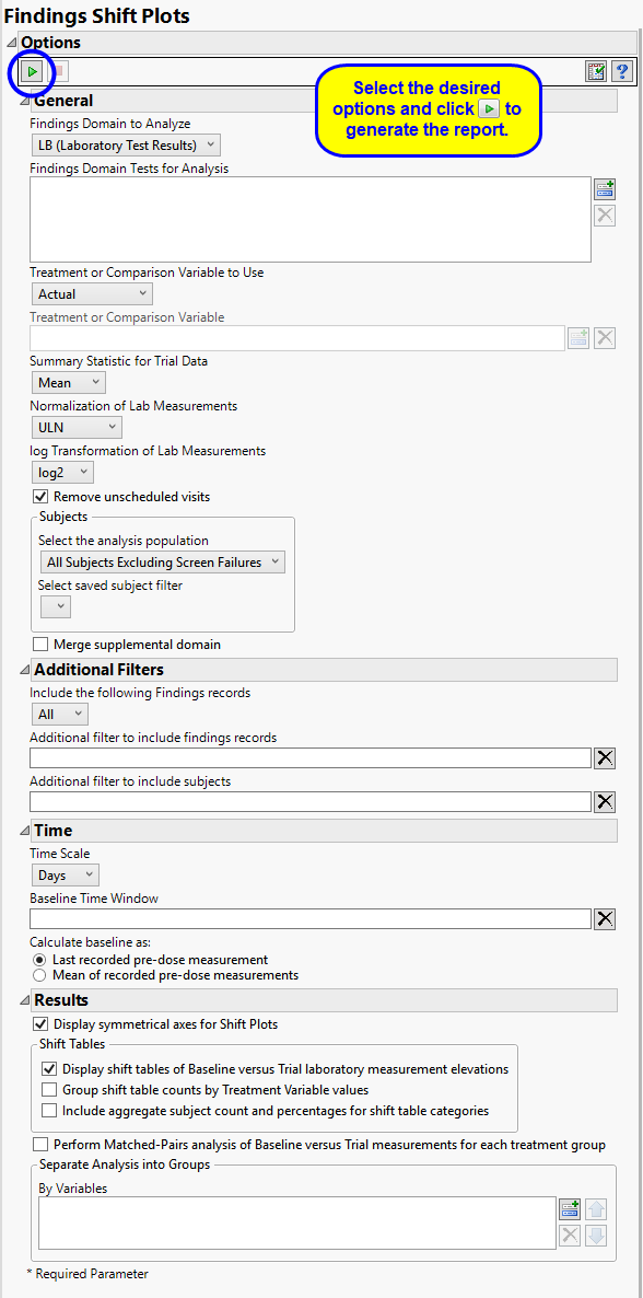
Use the Findings Domain to Analyze option to specify whether to plot the distribution of measurements from either the Electrocardiogram (EG), Laboratory (LB), or Vital Signs (VS) findings domains. LB is selected by default.
You can use the Findings Domain Tests for Analysis option to plot the distributions of one or more selected findings tests. Leaving the field blank (the default selection) plots the distributions for all available findings tests.
The primary goal of clinical trials is to distinguish treatment effects when reporting and analyzing trial results. Treatments are defined by specific values in the treatment or comparison variables of the CDISC models. These variables are specified in this report using the Treatment or Comparison Variable to Use andTreatment or Comparison Variable options.
Available variables include Planned, which is selected when the treatments patients received exactly match what was planned and Actual, which is selected when treatment deviates from what was planned.
You can also specify a variable other than the ARM or TRTxxP (planned treatment) or ACTARM or TRTxxA (actual treatment) from the CDISC models as a surrogate variable to serve as a comparator. Finally, you can select None to plot the data without segregating it by a treatment variable.
Use the Summary Statistic for Trial Data option to specify whether to display the mean, median, maximum, minimum, or last values to summarize the results of the trial period.
By default, JMP Clinical reports unaltered laboratory measurement values. In any cases, simply examining the raw numbers can make interpretation somewhat confusing. Normalization of Lab Measurements to accepted values can often ease these difficulties. JMP Clinical offers three options for normalizing your data.
Selecting LLN normalizes the data to the lower limit of the expected normal range and is best used when you expect the values to fall below the normal. Normalized values less than one are considered to be lower than normal.
Selecting ULN normalizes the data to the upper limit of the expected normal range and is best used when you expect the values to exceed the normal range. Normalized values greater than one are considered to be higher than normal.
Selecting Geometric normalizes the data such that the lower limit of the expected normal range is set to -1 and the upper limit of the expected normal range is set to +1. This method is best used when there is no expectations of where the values might fall. Normalized values less than -1 are considered to be lower than normal while values greater that +1 are higher than normal.
Log transformations can make certain response distributions closer to Gaussian with constant variance and can enable you to draw more accurate statistical conclusions under standard modeling assumptions. They are especially useful for ratio-type measurements or measurements that are always positive and skewed to the right. You can use the log Transformation of Lab Measurements options to either use non-transformed data or to log2- or log10-transform your measurements.
Note: These options are available only when LB is the specified domain.
You might or might not want to include unscheduled visits when you are analyzing findings by visit. Check the Remove unscheduled visits to exclude unscheduled visits.
Filters enable you to restrict the analysis to a specific subset of subjects and/or findings records, based on values within variables. You can also filter based on population flags (Safety is selected by default) within the study data.
If there is a supplemental domain (SUPPXX) associated with your study, you can opt to merge the non-standard data contained therein into your data.
See Select the analysis population, Select saved subject Filter1, Merge supplemental domain, Include the following findings records:, Additional Filter to Include Findings Records, and Additional Filter to Include Subjects2 or more information.
By default, time is measured by visits. However, you can change the Time Scale to measure time in either weeks or days. This option is useful for assessing report graphics for exceptionally long studies.
To establish a baseline measurement for each finding, you must specify the time period (usually prior to day one of the study) and whether to use on or more than one measurement. Use the Baseline Time Window option to specify the time period during which baseline measurements are taken and the Calculate baseline as: option to use the last pre-dose measurement or the mean of all the measurements taken during the baseline time window as the baseline measurement.
When the Display symmetrical axes for Shift Plots option is checked, the axes on the resulting shift plots are adjusted to make the scale between the minimum and maximum the same. This results in a symmetrical plot for each finding in which the line indicating no change between baseline and trial values has a slope of 45°.
Use the Display shift tables of Baseline versus Trial laboratory measurement elevations option to compute and display tables of subject counts and percentages (per treatment group) of laboratory elevations in reference to the upper limit of normal for measurements taken at baseline versus trial summary measurements. This table can be interpreted as a categorized representation of the shift from baseline. This option is specified by default.
Use the Display shift tables by Treatment Variable values to create separate lab elevations cross-tabulation tables by Treatment groups. This option is specified by default.
Use the Include aggregate subject count and percentages for shift table categories to include the aggregated sum of subjects that falls in each of the cross-tabulation categories based on laboratory elevations from baseline vs. trial in the shift tables.
The Perform Matched-Pairs analysis of Baseline versus Trial measurements for each treatment group option enables you to perform a matched-pairs statistical analysis for each treatment group comparing the differences between baseline values and trial measurements. The resulting graphics are split out for each treatment group and show a rotated shift plot with tests and associated statistics for the mean difference of Trial versus Baseline findings results.
Subject-specific filters must be created using the Create Subject Filter report prior to your analysis.
For more information about how to specify a filter using this option, see The SAS WHERE Expression.