This report compares the distribution of study visit days for each center compared to all other centers combined, and identifies unusual differences. For example, a site where all visits occur on the same study day can be flagged for further investigation.
Running this report with the Nicardipine sample setting and default options generates the output shown below.
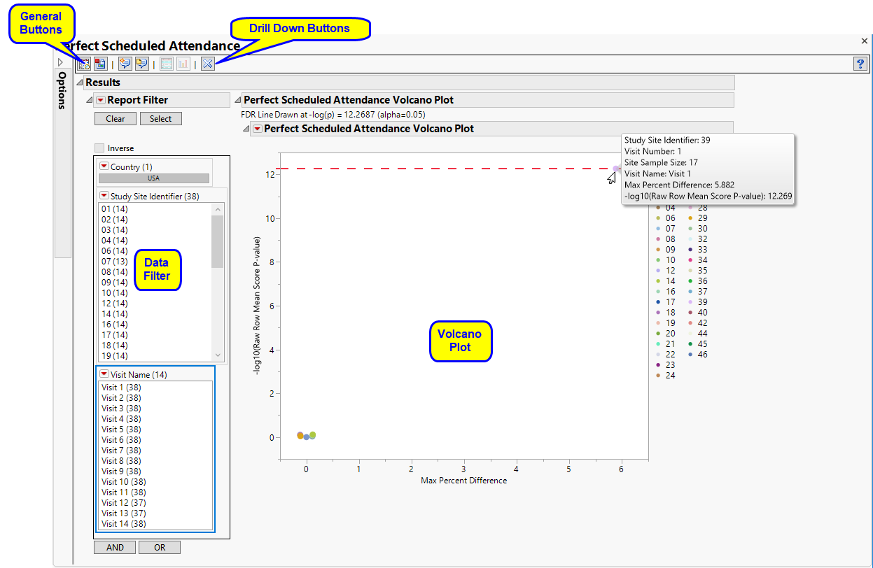
Each point represents the comparison of a site to all other sites. This comparison is used to determine whether there is a difference in distribution for perfect attendance and is done for all sites across all tests in all findings domains.
The Y axis is the -log10(Row Mean Score p-value). Large numbers indicate statistically significant results.
The X axis is the maximum percent difference across all visits between a site versus all sites.
Values far from 0 indicate important differences between a site and the reference distribution of all other sites. An FDR line is indicated by the dotted red line. Values above this line (Such as site 39, above) can be considered significant adjusting for multiple comparisons. This could identify rounding issues or other problems with how a site reports a particular test compared to other sites.
Note: In the example shown above, the vast majority of the study sites (circled above) show little or no differences in Perfect attendance. In fact, the points representing these sites overlap such that individual sites cannot be differentiated at this scale.
|
•
|
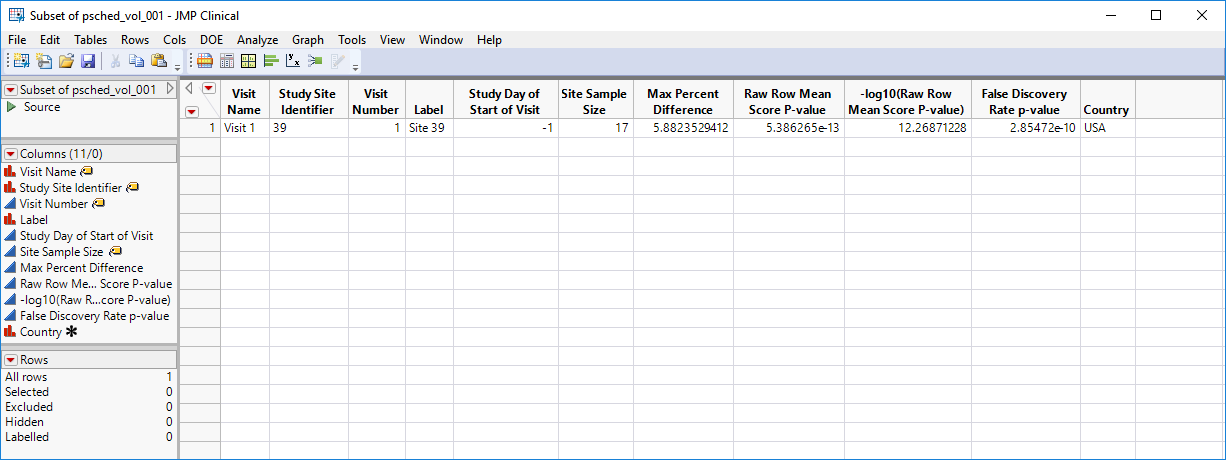
Show Sites: Shows the rows of the data table for the selected points from the volcano plot.
|
|
•
|
Visit Bar Charts: For the points selected in the volcano plot, clicking
|

This enables you to subset your data based on study site and/or visit number. Refer to Data Filter for more information about how to use the Data Filter.
|
•
|
Click
|
|
•
|
Click
|
|
•
|
Click
|
|
•
|
Click
|
|
•
|
Click the arrow to reopen the completed report dialog used to generate this output.
|
|
•
|
Click the gray border to the left of the Options tab to open a dynamic report navigator that lists all of the reports in the review. Refer to Report Navigator for more information.
|
This report compares the observed distribution of study day for each visit with each site compared to all other sites taken together as a reference. The comparison is made using a row mean score chi-square tests as described for Digit Preference, with study day replacing digit as the column variable.
Alternatively, exact Mantel-Haenszel p-values can be computed. The Mantel-Haenszel chi-square statistic tests the alternative hypothesis that there is a linear association between the row variable and the column variable. Both variables must lie on an ordinal scale. The Mantel-Haenszel chi-square statistic is computed as (n-1)r^2 where r is the Pearson correlation between the row variable and the column variable. 5000 samples (default) are used to compute resampling p-value, which is the proportion of resampled values that are more extreme the observed p-value.
FDR p-values are calculated and the reference line is determined as described in How does JMP Clinical calculate the False Discovery Rate (FDR)?.
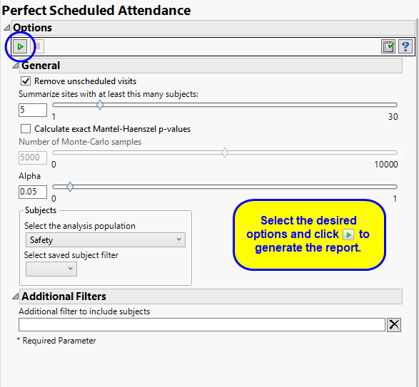
Unscheduled visits can occur for a variety of reasons and can complicate analyses. By default, these are excluded from this analysis. However, by unchecking the Remove unscheduled visits box, you have the option of including them.
The Summarize sites with at least this many subjects: option enables you to set a minimal threshold for the sites to be analyzed. Only those sites which exceed the specified number of subjects are included. This feature is useful because it enables you to exclude smaller sites, where small differences due to random events are more likely to appear more significant than they truly are. In larger sites, observed differences from expected attendance due to random events are more likely to be significant because any deviations due to random events are less likely to be observed.
Use the Calculate exact Mantel-Haenszel p-values option computes exact p-values using permutation distributions on stratified groupings of the responses. They can often be more accurate and reliable. If you are unsure if this method is appropriate, try it and compare the results with those from the default method. Agreement between the methods gives some assurance that they are robust. If they do not agree, you should explore your data further to identify the cause of discrepancies. Check frequencies, counts, and cross-tabulations.
The Number of Monte-Carlo Samples option enables you to specify the number of simulated samples you want to generate. In general, the more samples you take, the more robust your conclusions. However, increasing the number of samples can greatly increase the time needed to run the analysis. You should experiment with this option to find the right balance for your needs. One common approach is to begin with a small size and gradually increase it until results stabilize.
The Alpha option is used to specify the significance level by which to judge the validity of the statistics generated by this report. By definition, alpha represents the probability that you will reject the null hypothesis when the null is, in fact, true. Alpha can be set to any number between 0 and 1, but is most typically set at 0.01, 0.05, or 0.10. The higher the alpha, the lower your confidence that the results you observe are correct.
Filters enable you to restrict the analysis to a specific subset of subjects based on values within variables. You can also filter based on population flags (Safety is selected by default) within the study data.
See Select the analysis population, Select saved subject Filter1, Additional Filter to Include Subjects, and Subset of Visits to Analyze for Findings for more information.
Subject-specific filters must be created using the Create Subject Filter report prior to your analysis.