Reliability Diagram
A reliability diagram is a graph where the conditional distribution of the observations, given the forecast probability, is plotted against the forecast probability. The distributions for perfectly reliable forecasts are plotted along the 45-degree diagonal. A guide is shown below.
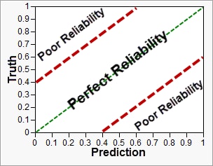
The more tightly data points are packed along the central 45-degree diagonal line, the better the model. An example is shown below.
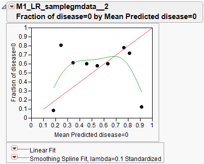
You can see that in this case, fair-or-better forecast reliability for correct disease status prediction was observed for most points except for x=0.25 and x=0.91.