Variable Contributions to Distance
Use this option to create plots for each selected subject that explain how much each variable contributes to a patient being an outlier, with a total possible of 100% for each subject.
| 8 | Select the subjects, either manually or using the Select Percentage of Subjects Exceeding Threshold drill down option, that you want to explore. |
| 8 | Click  to generate a Pareto plot (shown below) for each of the selected subjects. to generate a Pareto plot (shown below) for each of the selected subjects. |

Note that proportions (of the contributions) always add up to 100% across all variables - this is true even for inliers. The plots might indicate that certain variables contribute a lot to an inlier. However, the value of the distance is still small.
In the Pareto plots, users can select the bars/points/subjects to run a follow-up analysis to view how selected subjects are extreme for the selected covariates.
| 8 | Click on points or bars on the subject-specific plots to select one or more individual variables on the subject-specific plots or click  to select all subjects and variables. to select all subjects and variables. |
| 8 | Click  to generate the following plot: to generate the following plot: |
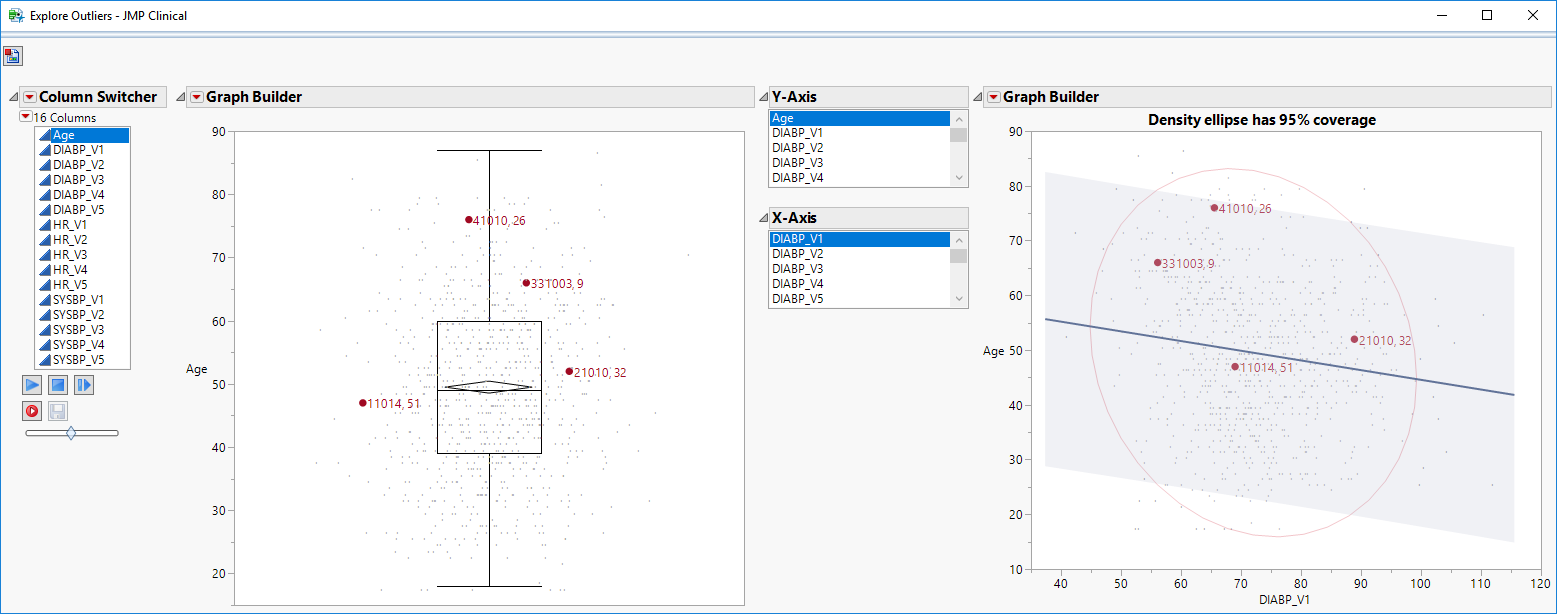
Selected subjects are highlighted in the plots. Users can explore how extreme patients are according to the outlier or scatter plot (which has reference lines for a linear fit and a density ellipse).