The All Results tab is shown below:
The All Results tab contains the following elements:
|
•
|
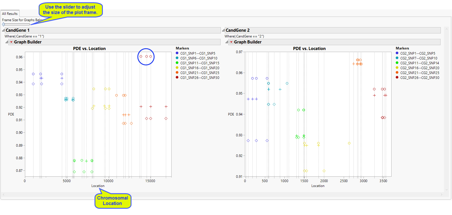
For each annotation group, and each BY group if BY variables are specified, a plot is displayed where the y-axis represents the value of the htSNP evaluation criterion (PDE or RSQH) and the x-axis represents the location within the annotation group (chromosome or candidate gene, for example).
|
A vertical, gray, dashed line is drawn at every SNP included in the analysis. Each range of markers or window has its own color within the annotation group. All the SNPs from the same htSNP set are given the same symbol within that color so that you can easily compare sets of SNPs for a window or range of markers. The number of sets for each marker window is at most the value given for the Number of Selections to Display in the process dialog.