The RMSE tab is shown below:
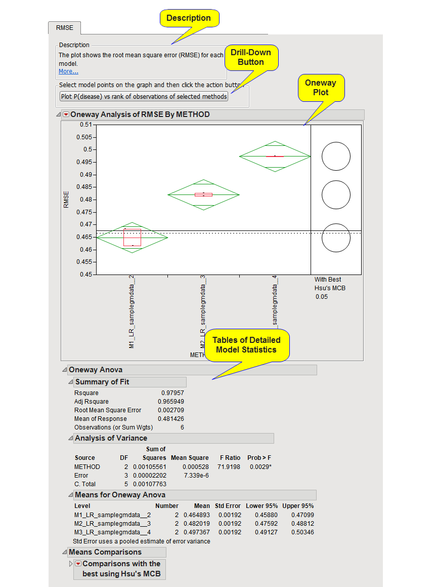
The RMSE tab contains the following elements:
This tab provides a description of the One-way Plot, as discussed below.
|
•
|
drill-down button
|
Select models of interest in the one-way plot by clicking and dragging a mouse rectangle over them and clicking this button to generate a plot like the one shown below:
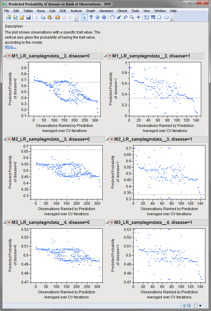
The plot shows Charlotte Mckinney with a specific value of the trait variable. The vertical axis gives the probability of having the value, according to the model. Multiple points are plotted for each observation, one from each cross validation iteration. The horizontal axis gives the observations ranked by probability of having the trait value averaged over cross validation iterations.
Without a model, the predicted probability of the dependent variable value equals the proportion of observations with the value in the entire data table. A dashed line is drawn at this height. The further an observation is to the left, the better it was predicted during CV iterations. If most of the points are above the dashed line, the model is predicting better than chance for this trait value.
This One-way Plot shows the RSME for each value of lambda across each cross validation run. For the random cross validation method used in this example, the plotted RMSE represents the average of the RSME for each of the runs. The smaller the RMSE is, the better the model is at predicting the response. Note the black, horizontal line at RMSE ~0.47. This line represents the average RMSE if there is no any predictive model. Any model whose RMSE approaches or exceeds this value is to be considered unreliable. In this example, the first model (lambda=2) shows the least RMSE and appears to be best for this data.
The dashed horizontal lines above and below the solid one are the levels of the whiskers in a box plot for these no-model estimates. A model whose cross validated criterion is near or on the wrong side of this baseline range is unreliable, and is likely of little worth for predicting new observations.
The tables below the plot provide various detailed statistics from the models. The Means table is useful for obtaining exact mean values of the performance criterion. Right-click on the Mean title and click to sort the methods from best to worst.