The Mean Spectra tab is shown below:
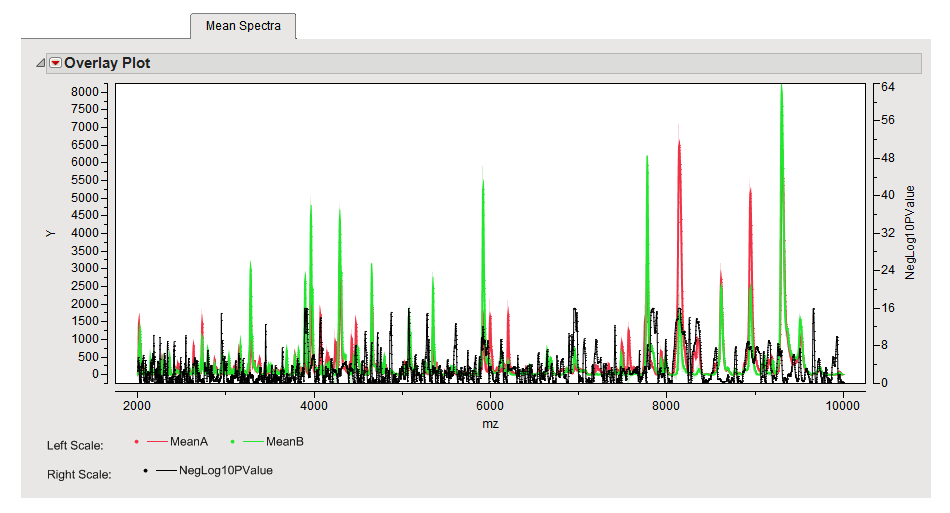
In this example, sample spectra were obtained from patients with prostate cancer (CCD) and from normal patients (NOR).
This Overlay Plot shows the mean values of the two groups of spectra plotted against each other (CCD is Group A, in red, and NOR is group B, in green). The shading represents the variation among the samples. The black spectrum along the bottom, which is indexed on the right axis, displays negative log10 p-value2 from t-tests between the two groups, conducted separately for each m/z value and without any adjustment for multiple testing. The peaks in this plot represent m/z values exhibiting statistically significant differences between the two groups.
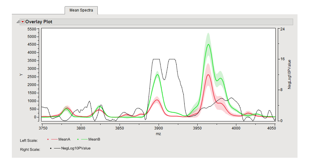
Adjustments were made to the axes to focus on the portion of the spectra between 3750 and 4050 m/z to better discern differences between the spectral profiles (shown below). Differences in the profiles between the two groups can be clearly seen in the expanded view.
You can use the lasso tool  to select a rectangular region containing points of interest. The rows containing these points are highlighted in the output data set. You can use Tables > Subset in JMP to generate a subset data set containing only these rows that can be subjected to further analysis.