The Data Overview tab is shown below:
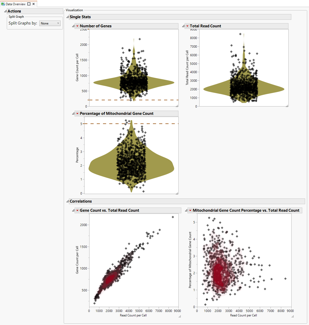
The Single Stats section contains several contour plots.In each of these, the dot represent individual cells. the horizontal dashed lines indicate the maximum and minimum values specified on the report dialog. Cells exceeding the maximum or not meeting the minimal values should be considered outliers. These plots summarize overall features of the data, as follows:
|
•
|
The Number of Features plot shows the total number of individual genes expressed in each cell. A gene is counted the same regardless of how many transcrips are generated. Maximum and minimum values were specified using the Cells with Maximum Features Detected and Cells with Minimum Features Detected options, respectively. Number of features per cell are plotted on the y-axis. The red** illustrates the density distribution of features per cell.
|
|
•
|
The Total Read Count plot shows the total number of transcripts of all genes found in each cell.
|
|
•
|
The Percentage of Mitochondrial Count plot shows the percentage of the counts in each cell made up by mitochondrial genes. Maximum value was specified using the Percentage of Mitochondria Genes Allowed option.
|
The Correlations section contains two correlation plots. As before each dot represents a single cell.