Cell Plot
The Cell Plot tab is shown below:
| • | One Cell Plot, |
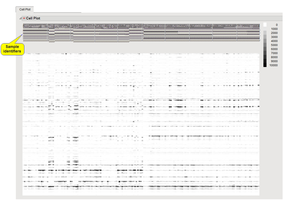
This plot illustrates the individual spectra as a gray-scale heat map. Each spectrum is presented as a “lane” below it’s identifier. The intensity of each “band” is related to the height of the corresponding portion of the spectrum.
You can use the lasso tool  to select a rectangular region containing points of interest. The rows containing these points are highlighted in the output data set. You can use Tables > Subset in JMP to generate a subset data set containing only these rows that can be subjected to further analysis.