Gene Expression Visualization
This tab displays several plots showing you log-transferred expression level of each gene across identified cell clusters by the specified clustering method.

Actions
| 8 | You can recode cluster names to actual cell family names. The cluster names will be updated in all the tabs. |
| 8 | You can also obtain annotation and other information on selected genes from several online data bases. |
| 8 | You can exclude selected cells from the visualization. |
| 8 | Use the drop-down menu to split the graphs based on one or more features. |
Violin Plot
The violin plot, shown below, shows log-transferred expression level of selected gene across identified cell clusters by Hierarchical Clustering.
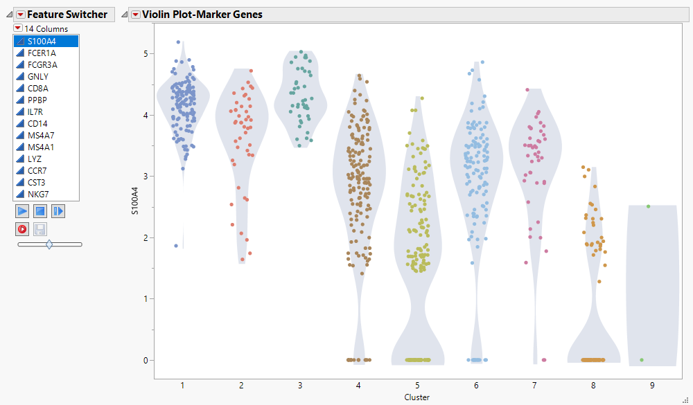
A Feature Switcher helps to quickly navigate through the selected gene list. Each dot represents a single cell. Expression of selected genes in each cell is plotted on the y axis by cluster.
Ridgeline plot
The ridgeline plot, shown below, is another representation showing log-transferred expression level of the selected gene across identified cell clusters by Hierarchical Clustering.

A Feature Switcher helps to quickly navigate through the selected gene list. Expression of selected genes in each cluster is plotted on the x axis.
Dot Plot
The dot plot, shown below, is another representation showing level of all of the marker genes across cell clusters. The color of each dot represents the percentage of cells expressing the indicated gene whereas the relative size of the dot is indicative of the average level of expression.
