Running this process for the
GeneticMarkerExample
sample setting generates the tabbed
Results
window shown below. Refer to the
Linkage Disequilibrium
process description for more information. Output from the process is organized into tabs. Each tab contains one or more plots, data panels, data filters, and so on. that facilitate your analysis.
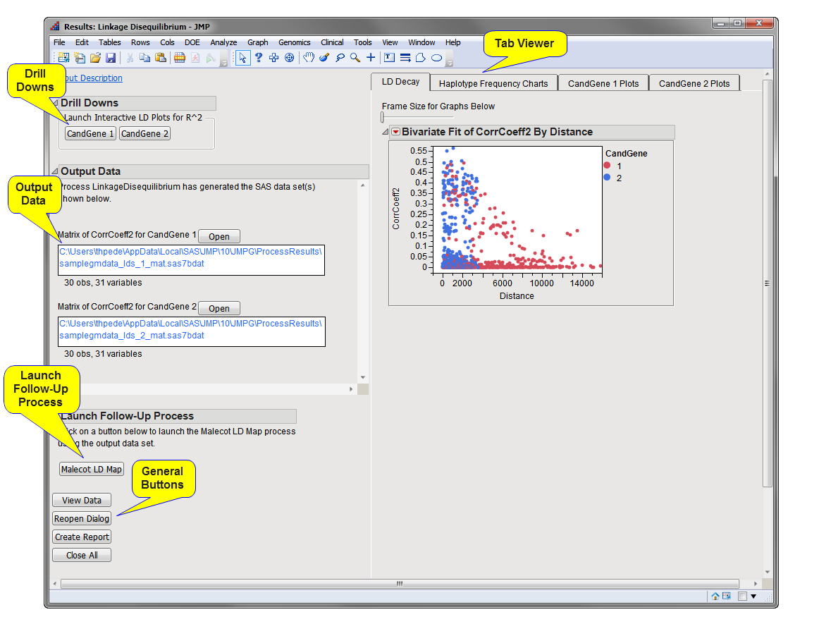
The
Results
window contains the following panes:
This pane provides you with a space to view individual tabs within the
Results
window. Use the tabs to access and view the output plots and associated data sets.
|
•
|
LD Decay
: This tab shows how the LD, in terms of whatever measure, Dprime or CorrCoeff, has been selected for the
Measure for LD Decay Plot
option, decays over distance.
|
|
•
|
Haplotype Frequency Charts
: When the
Create haplotype frequency charts
check box has been checked, this tab displays frequency charts of the possible
haplotypes
at each pair of markers for which LD was calculated.
|
|
•
|
Annotation Group Plots/All Markers Plots (Linkage Disequilibrium)
: When there are multiple annotation groups (
chromosomes
or genes, for example), each
Annotation Group Plots
tab displays a lower triangular plot of the LD
p-values
for pairs of markers in that annotation group. A contour plot of the measure, if any, selected for the
Measure for LD Decay Plot
option is also shown.
|
If there is only one annotation group or no annotation group
variable
is specified, this tab displays these one or two plots for all marker pairs.
There is either one button for each annotation group, or one for all markers if no annotation groups have been specified. In this example, there are two annotation groups:
CandGene 1
and
CandGene 2
.
Each button opens a window with a HaploView-style LD plot for that annotation group (chromosome, for example) along with a legend displaying the color gradient for the values for
R
2
(also called
CorrCoeff2
, the square of the
correlation coefficient
). Markers are spaced uniformly in the triangular plot, but have lines drawn to their chromosomal position.
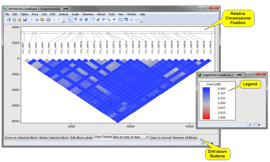
Note
: The values plotted along the
x
-axis of the LD plot refer to the chromosomal position of the markers, as shown at the top of the plot.
Matrix of CorrCoeff2 Data Set(s)
: This data set contains the square of the LD
correlation coefficients
in matrix form (that is, one row and one column per marker in the annotation group). One data set is generated for each annotation group.
Note
: These data sets are generated only if the
Create data sets of CorrCoeff2 in matrix format
check box has been checked.
LD Statistics Data Set
: This data set contains all of the marker statistics computed by the
Linkage Disequilibrium
process. The name of this data is set is given by the
Output File Prefix
, or input data set name if none given, with the suffix
_lds
.
Note
: This data set is generated and placed in the specified output folder every time this process is run. However, a link to this data set is not surfaced in the
Results
window
For detailed information about the files and data sets used or created by JMP Life Sciences software, see
Files and Data Sets
.
: Click to launch the
Malecot LD Map
process with LD statistics data set preloaded as input.
Note
: This button is generated only when the
Estimate
Rho
and
K Rho
check box has been checked.
|
•
|
Click
to reveal the underlying data table associated with the current tab.
|
|
•
|
Click
to reopen the completed process dialog used to generate this output.
|
|
•
|
Click
to generate a
pdf
- or
rtf
-formatted report containing the plots and charts of selected tabs.
|
|
•
|
Click
to close all graphics windows and underlying data sets associated with the output.
|