Output Graphics and Action Buttons | Expression | Residual Plots

Residual Plots
The Residual Plots tab displays residual plots that provide you with a view of the systematic adjustment of the data done by quantile normalization . Each plot represents in individual array.
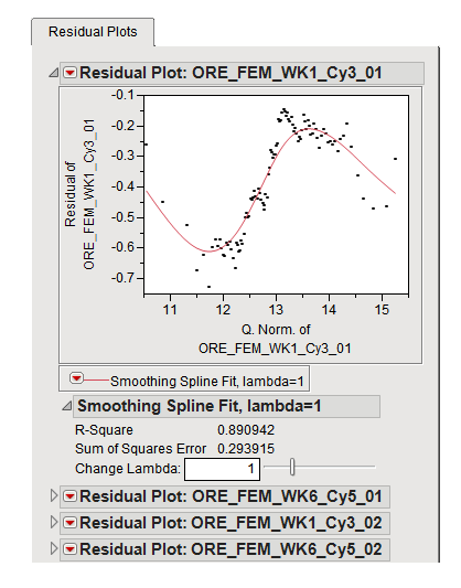
The Residual Plots tab contains the following elements:
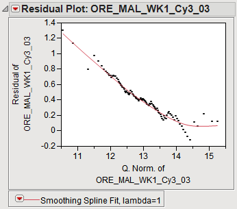
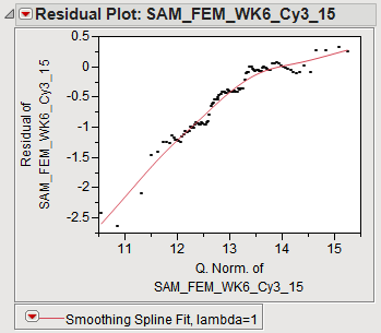
The normalized values are plotted along the x axis and the residuals (calculated by subtracting the normalized values from the original values) are plotted along the y axis. The spline in each plot represents the average adjustment across the array. The magnitude of adjustment of any one probeset depends on the magnitude of intensity of that probeset.
Quantile normalization represents a very aggressive approach to normalization. Adjustments vary greatly both within and between experiments. The magnitude of adjustment depends on the magnitude of intensity. Under ideal circumstances, data from different experiments would require similar adjustments across the arrays and the residual plots would be similar in shape and magnitude. However, because circumstances are seldom ideal, you can see large differences from one plot to another. Two additional plots from this example that demonstrate this variability are shown below: