The
Reliability Diagrams
tab is shown below:
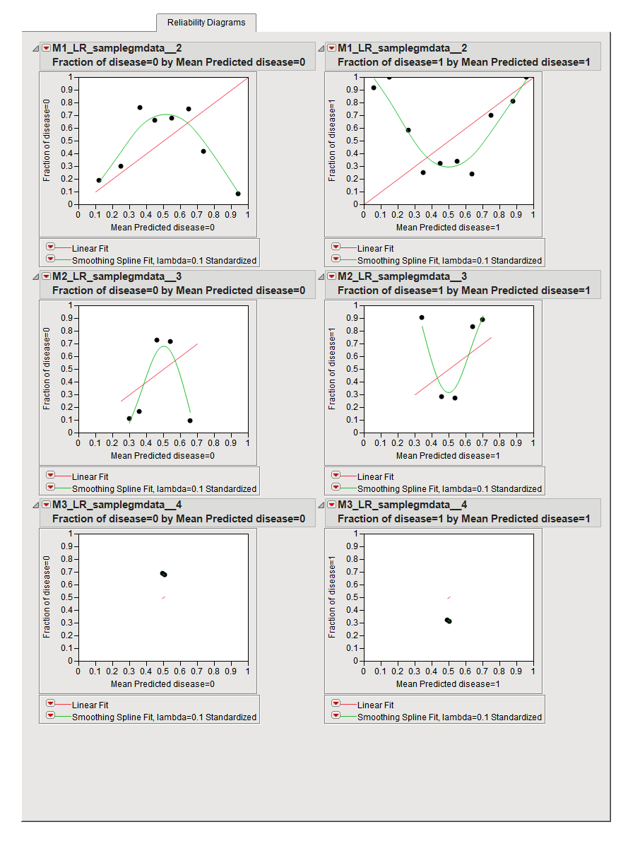
The
Reliability Diagrams
tab contains the following elements:
Each plot is based on a derived data set that partitions the
dependent variable
and its predicted value into
bins
. The average values in each bin are plotted against each other. The points on the plot for a method that is performing well falls along the 45-degree identity line plotted in
red
. The further points are away from this line, the poorer the prediction in that bin.
You can use this plot to diagnose regions of the response that the method is performing well or poorly in. The
green line
is a nonparametric smoothing spline fit that helps visualize trends the points exhibit in relation to the red line.
See
Reliability Diagram
for more information.