More traditional across-time displays are available using the
drill-down button. The figure below shows the lower limit of the 95% credible limit for Dyspnoea, illustrating example output from this button accessed from the
Plot by Event
panel.
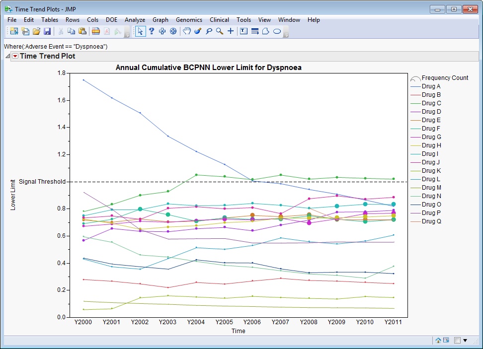
It is straightforward to see that
Drug A
was initially disproportional although this signal disappeared over time. However, in 2004,
Drug C
began showing signs of disproportionality that has continued to the present (though the lower limit is just beyond the specified signal threshold). Using
dialog
options, you can specify whether data is summarized annually, biannually, or quarterly, and the number of most recent time points to include for figures. Limiting the analysis to a reasonable number of recent time points can have implications on
signals
(since rare events might have occurred in a limited number early on) and the
speed
at which an analysis is generated. By default, JMP Clinical limits analyses across time to the most recent
12
time points.
The
y
-axis displays disproportionality while the
x
-axis represents time (
Y
indicates year,
H1
is for the first half of the year, and
H2
is for the second half of the year.
Qx
represents the first through fourth quarters). A
dotted reference line
highlights the limits from the
Statistical Measures
tab of the
Disproportionality Analysis
input dialog (
1
for all measures, by default). Each
line
represents a different drug and symbol
size
is indicative of event frequency.
Accessed from the
Plot by Drug
panel, time trend plots of event signals are constructed for each of the selected drugs instead.