The
Results
tab contains the following elements:
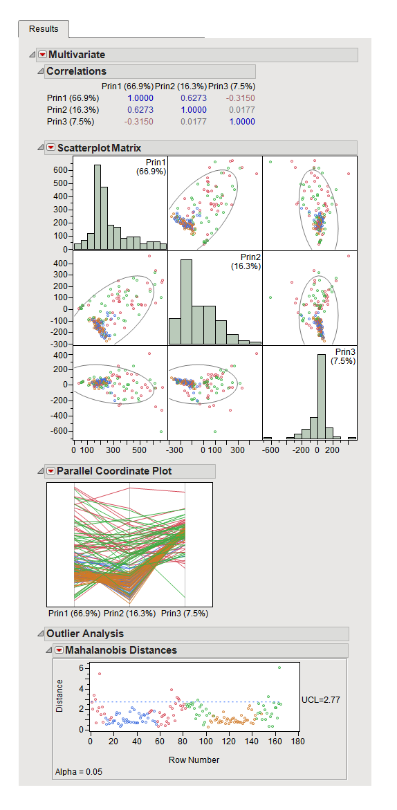
This plots the computed scores against each other. Points are colored by both data source and the
color variables
that you specified. Study these plots to make sure the scores from the secondary data fall within the range of those of the primary data. If the secondary data scores do not fall within this range, predictions are likely to be poor..
This
Parallel Plot
shows the same data, but each set of scores are connected across dimensions.
Refer to the
JMP Multivariate Platform documentation
for additional details.