The
RMSE
tab contains the following elements:
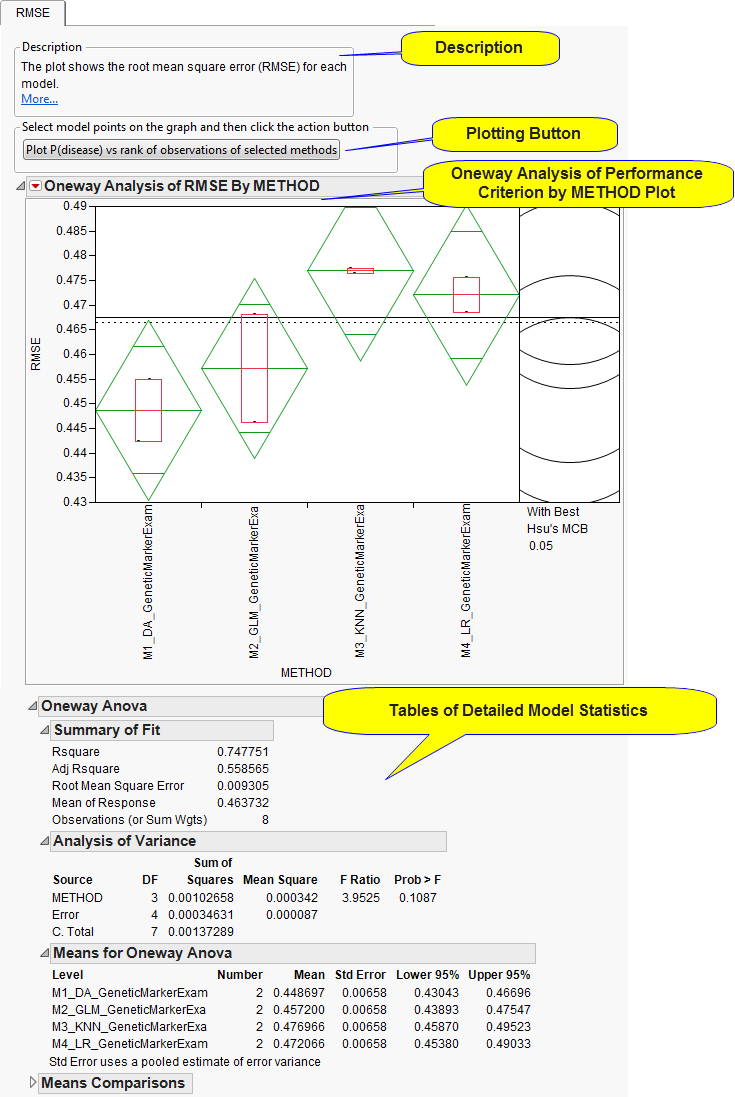
This tab provides a description of the
One-way Plot
, as discussed below.
|
•
|
button
|
Select
models
of interest in the oneway plot by clicking and dragging a mouse rectangle over them and clicking this button to generate a plot like the one shown below:
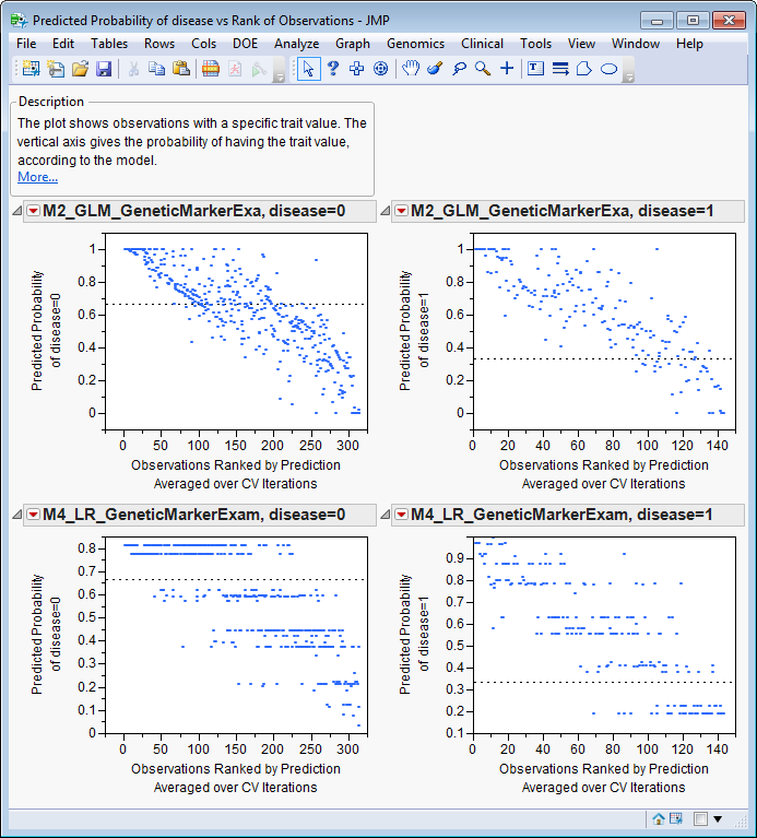
The plot shows
observations
with a specific value of the
dependent variable
. The
vertical axis
gives the probability of having the value, according to the model. Multiple points are plotted for each observation, one from each
cross validation
iteration. The
horizontal axis
gives the observations ranked by probability of having the
trait
value averaged over cross validation iterations.
Without a model, the predicted probability of the
dependent variable
value equals the proportion of observations with the value in the entire data table. A
dashed line
is drawn at this height. The further an observation is to the left, the better it was predicted during CV iterations. If most of the points are above the dashed line, the model is predicting better than chance for this trait value.
This plot shows the
performance criterion
(
RMSE
, (
AUC
, Accuracy, or Harrell's C) for each model for each cross validation iteration in the form of a oneway analysis of
variance
. Note that
smaller
values of RMSE indicate better performance, whereas
larger
values of AUC, Accuracy, and Harrell's C indicate better performance. Without any model, the predicted probability for a response category equals the proportion of the category in the
training data set
, and the prediction of a continuous response equals the average in the training data set. The
solid black horizontal reference line
is the
median
among cross validation iterations of the performance criterion estimated without any model. The
dashed horizontal lines
above and below the solid one are the levels of the whiskers in a
box plot
for these no-model estimates. A model whose cross validated criterion is near or on the wrong side of this baseline range is unreliable, and is likely of little worth for predicting new observations.
The box plots in the oneway display show how each model performed across cross validation iterations. The
center horizontal line of the plot
is a measure of overall performance and the
spread of the red box plot
shows the variability of the predictions. Models with smaller spread have higher consistency.
Hsu multiple comparisons with the best (MCB) comparison circles
are displayed on the right. Use these as rough guides for determining which models are significantly different from the best one. Note that the independence assumptions behind MCB are violated in this case, so the comparisons are only approximate.