Running this process for the
BackCross_Example
sample
setting generates the tabbed
Results
window shown below. Refer to the
Linkage Map Order
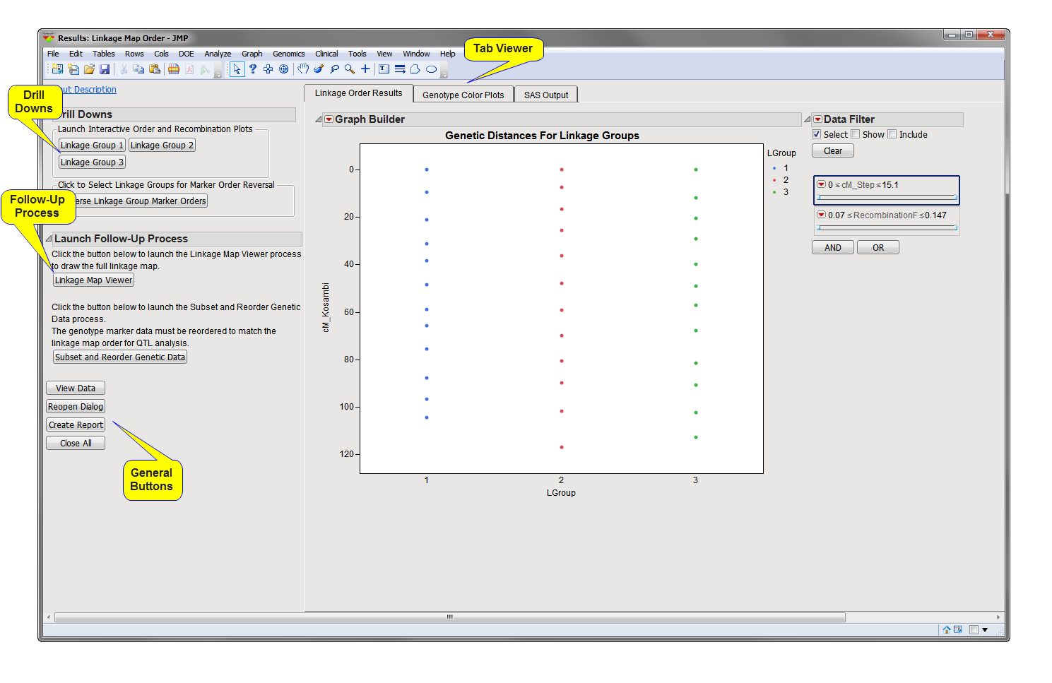
process description for more information. Output from the process is organized into tabs. Each tab contains one or more plots, data panels, data filters, and so on, that facilitate your analysis.
This pane provides you with a space to view individual tabs within the
Results
window. Use the tabs to access and view the output plots and associated data sets.
|
•
|
Linkage Order Results
: This tab displays a plot of the
genetic distance
as calculated based on the optimized/estimated marker order for each
linkage
group. Genetic distance (either Kosambi or Haldane) is plotted on the
y
-axis against linkage group on the
x
-axis.
|
|
•
|
Genotype Color Plots
: This tab displays a
cell plot
for each linkage group colored by the marker
genotypes
. This plot is useful to visually evaluate the marker order and can also detect potential genotyping errors in the data. This tab only is displayed if a
Genotype Data Set
is specified and the
Display marker genotype cell color plots
check box option is checked.
|
|
•
|
MDS Residual Plots
: This tab, not shown by default, will be available only if
Multidimensional Scaling
is chosen as the
Order Algorithm
. It displays plots of the
residuals
from the MDS model for each linkage group. In general, this method gives only a rough estimation of map order and should be used only if Map Order Optimization cannot be completed or if the linkage groups are very small and well formed.
|
|
•
|
SAS Output
: This tab displays the SAS output numerical results and history of the
Map Order
algorithm.
|
The map order optimization algorithm runs the OPTMODEL Procedure in SAS/OR to use a traveling salesman problem approach to determine optimal marker order. The results of the procedure are shown in this tab. If MDS was used for the order algorithm, results from the MDS Procedure in SAS/STAT would be shown. The
Map Order Optimization
is a superior algorithm for determining order and should be used when feasible.
|
•
|
Linkage Group X
: One or more buttons (one for each linkage group) in the
Launch Interactive Order and Recombination Plots
outline box. Click
to launch a triangle plot view (shown below) of the markers in the computed order for the specified linkage group.
|
The colored triangle plot corresponds to pairwise values of recombination frequency for the markers in the linkage group. The genetic distance and marker labels are plotted at the top of the plot along the
x
-axis (genetic distance in cM). You can annotate this plot to add blocks of regions where there might be a significant
QTL
signal or other known information.
|
•
|
Reverse Linkage Group Marker Orders
: Click
to reverse the order either for selected groups or all linkage groups, so that the marker that was originally placed first (at 0 genetic distance) becomes the last marker and vice versa. This feature is useful when trying to match marker orders to known consensus orders or chromosomal order.
|
|
•
|
: Click this button to launch the
Linkage Map Viewer
process with the generated output data set from the
Linkage Map Order
process (data set with suffix
_lmo
) preloaded as input. This process enables you to visualize the computed linkage map using a custom JMP graphic.
|
|
•
|
: Click to launch and run the
Subset and Reorder Genetic Data
process using the generated output data set from the
Linkage Map Order
process and the
Genotype Data Set
(if specified) preloaded as input. You must run this process to reorder the original genotype data set to match the computed genetic linkage map annotation for further QTL analysis processes.
|
|
•
|
Click
to reveal the underlying data table associated with the current tab.
|
|
•
|
Click
to reopen the completed process dialog used to generate this output.
|
|
•
|
Click
to generate a
pdf
- or
rtf
-formatted report containing the plots and charts of selected tabs.
|
|
•
|
Click
to close all graphics windows and underlying data sets associated with the output.
|