An
Annotation Group Plots
tab is shown below:
When no annotation
variables
are specified, this plot is labeled as the All Markers Plots tab
The
Annotation Group Plots/All Markers Plots
tabs, contain the following elements:
|
•
|
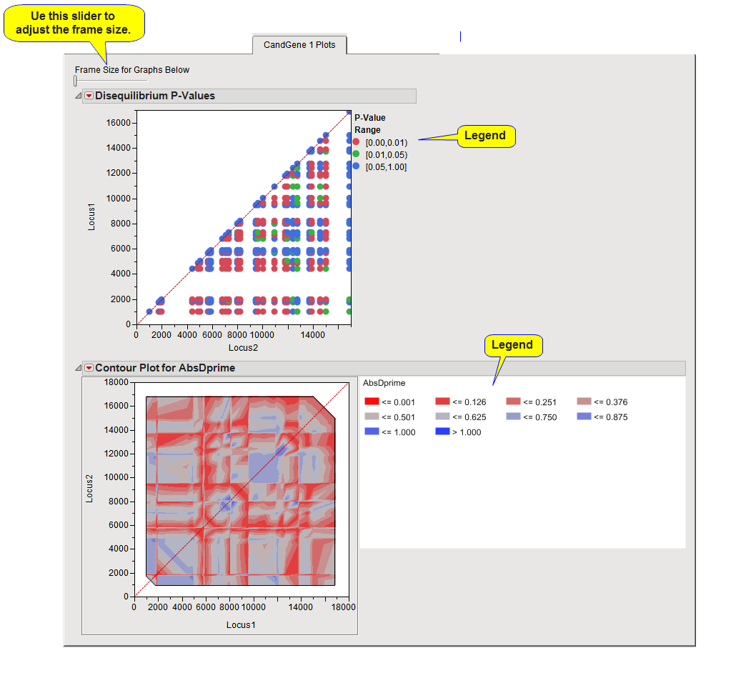
This scatter plot has marker positions along both axes, with a point at each marker pair, colored by the
p-value
range for its LD coefficient. The legend to the right of the plot indicates the colors associated with each value.. Along the diagonal (indicated by the dotted line
1
), where the same marker is represented on the
x
and
y
axes, this
p
-value corresponds to the test for
Hardy-Weinberg equilibrium
(HWE) instead.
Note
: If any
BY variables
were selected, a separate plot is displayed for each
BY group
.
|
•
|
One or more contour plots (
bottom
).
|
A contour plot of the LD measure is included on this tab when
Dprime
or
CorrCoeff
is selected for the
Measure for LD Contour Plot
option. As with the previous plot(s), the axes represent the marker positions and a legend showing the color for the LD measure ranges is to the plot's right. This plot is symmetric along the 45 degree line (indicated by the dotted line).
Note
: If any By Variables were selected, a separate plot is displayed for each BY group.
These plots, along with the interactive
LD plot
drill-downs, give you several ways of viewing the LD for your data in the different annotation groups so that you can see the extent of LD for this sample.