|
|
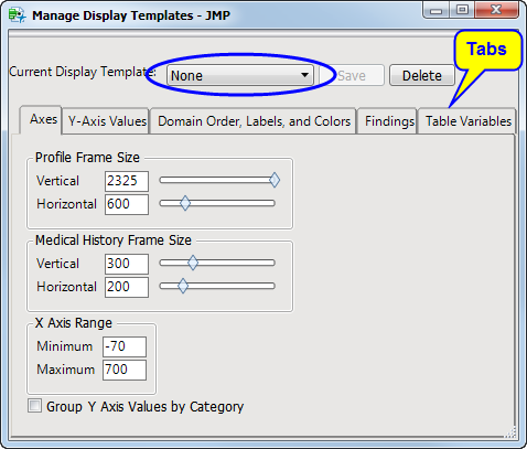
Click
to open the
Manage Display Templates
window.
|
|
|
Select a template using the
Current Display Template
drop-down menu (circled above) and either select a template that is closest to the one that you want to create, or just work from the default
None
template.
|
Note
: Each action automatically updates the current display.
|
|
When you are satisfied with the display, click
, enter a template name, and then click
to save the new template.
|
|
|
To delete one or more templates, click
, select the templates that you want to delete, and then click
.
|
The
Manage Display Templates
window contains several tabs that enable you to configure the attributes of the
Patient Profiler
:
|
•
|
|
•
|
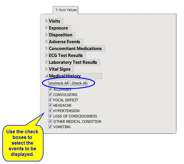
Y-Axis Values
tab: These options enable you to control exactly what domain data are displayed in the displayed profiles on the
General
tab. Click on the triangle next to a domain (
Medical History
, for example) to expand it, and use the check boxes to remove or add items.
and
buttons (circled) are available for removing or adding entire domains.
|
|
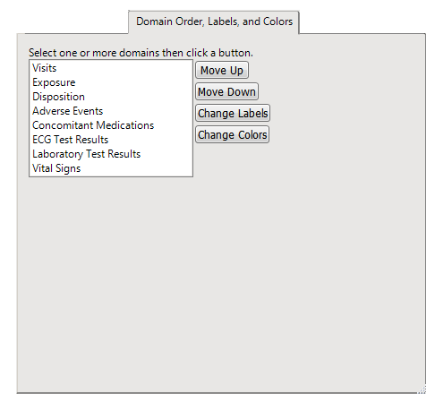
•
|
Domain Order, Labels, and Colors
tab: These options enable you to control the organization and appearance of data in the profiles. Select a domain in the list and click
or
to change the position of the domain in the display. Click
and/or
to change how domain data are labeled and colored in the profiles
|
|
•
|
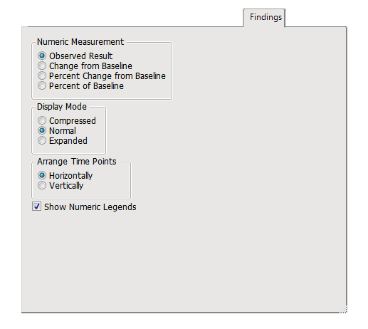
Findings
tab: This pane contains options for specifying how numeric measurements are presented and to control the degree of detail shown for findings domains. Use the
Numeric Measurement
options to specify how numeric results are presented. Use the
Display Mode
options to control the degree of detail presented
2
. Determine which axis the time points are to be plotted on using the
Arrange Time Points
options. Toggle the visibility of numeric legends with the
Show Numeric Legends
check box.
|
|
•
|
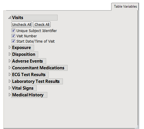
T
able Variables
tab: These options enable you to control exactly what domain data are displayed in the Tables shown on the
Tables
tab. Click on the triangle next to a domain (
Medical History
, for example) to expand it, and use the check boxes to remove or add items.
and
buttons (circled) are available for removing or adding entire domains.
|
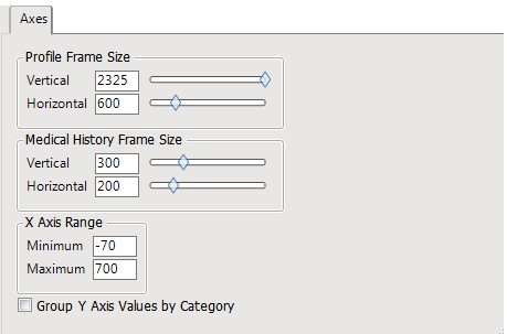
Use the
Profile Frame Size
controls to adjust the vertical and horizontal space allocated to the primary subject profile view. Use the
Medical History Frame Size
controls to adjust the vertical and horizontal space allocated to the primary subject profile view. Use the
X Axis Range
controls to adjust the
x
-axis of the display. Enter minimum and maximum values into the text fields.
Compressed
: Saves vertical space by collapsing values that have been grouped into a single row. (You must create an XXgrp.sas7bdat for the grouping to occur.) In the example, note the groupings for labs such as POTASSIUM / SODIUM and ALT / AST. Note a slight shift in the x-axis time value is used for visual clarity of groupings. Includes mini color legends on the right hand side of the display. The scale of these legends changes for each value. Normal: Allocates one row for each value, using more vertical space but aligning all measurements exactly on the x-axis time scale. Includes mini color legends on the right hand side of the display. The scale of these legends changes for each value. Expanded: Creates spark line plots for each row, using even more vertical space, but is informative for clearly visualizing time trends.