The
Charts by Test Set
tab is shown below:
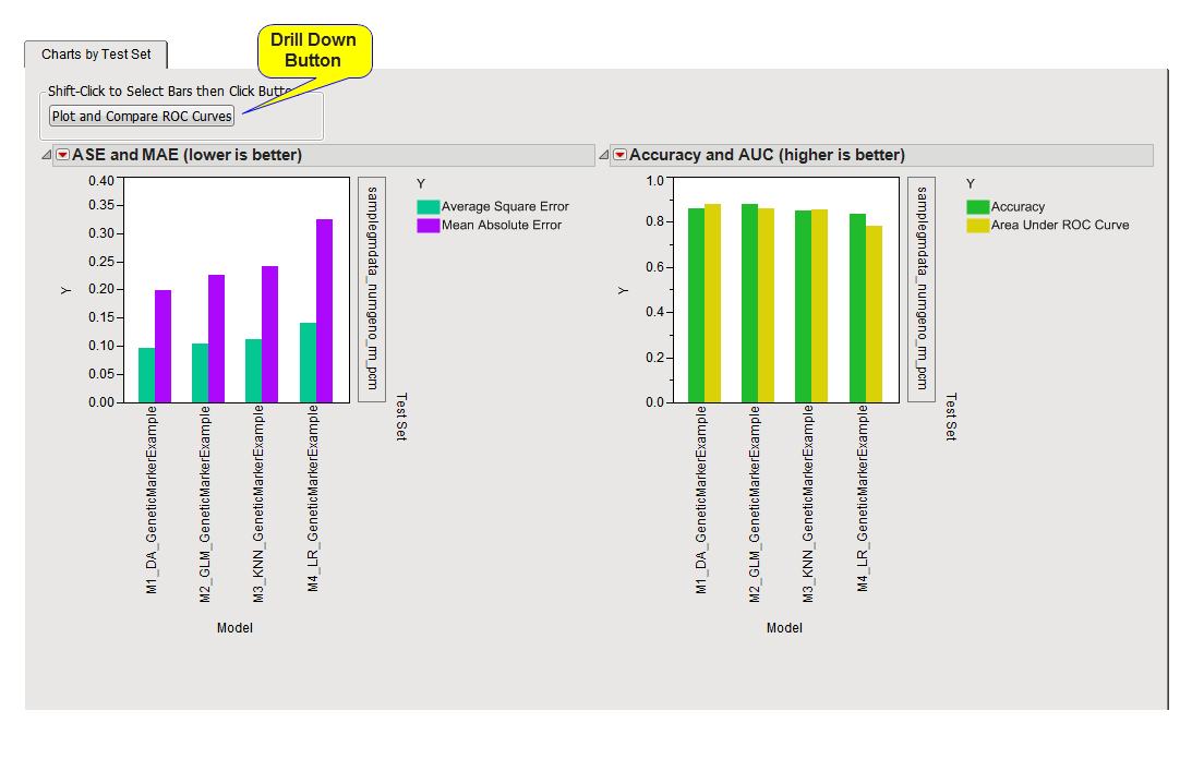
The
Charts by Test Set
tab contains the following elements:
|
•
|
Drill-down
to plot and compare
Receiver Operating Characteristics (ROC) Curves
: Use this button to compare ROC curves from models selected in the
bar charts
. Just click on one or more of the bars to select the models that you want to examine and click
to generate the plots.
|
|
•
|
Bar Charts
: Two bar charts are shown, one comparing Average Square Error (ASE) and Mean Absolute Error (MAE) and the other comparing Accuracy and Area Under the Curve ((
AUC
).
|
On both plots, the
x
-axis is divided into sections for each model compared, and the
y
-axis is the performance metric.
The first plot (
left
) shows both the average square error and mean absolute error for each model across each run. The smaller the errors, the better the model is at predicting the response.
The second plot (
right
) shows accuracy and area under the curve (AUC) statistics for each of the
predictive models
. Accuracy is a measure of the proportion of the test set samples that are predicted correctly. The AUC is the area found
below
the Receiver Operating Characteristics (
ROC
) curve, which plots true-positive predictions versus false-positive predictions for a binary-response
variable
. The greater the AUC, the better the model is at predicting true-positive responses.