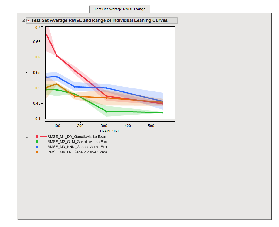
The
Test Set Average RMSE Range
tab is shown below:
The
Test Set Average RMSE Range
tab contains the following elements:
The plot shows the average
RMSE
learning curve for each
model
as a solid line, and a shaded region around it indicating the range of individual curves. The width of the shading provides a measure of variability for the average learning curves. Curves with narrow bands are more reliable than those with wide bands.
Learning curves are constructed by using a succession of different sized subsets of the full data and assessing
cross validation
performance on each.
Sample size
is plotted on the
x
-axis while the cross validation performance metric is plotted on the
y
-axis. The primary goal of this process is to determine whether adding more samples will change performance. This is achieved by inspecting the slope of the curves, especially toward the right-hand side. If the curves have a slope similar to that show in this example, it is likely that adding more samples will improve performance. If the slopes are flat, adding more samples will likely not make much of a difference.
Note
: This situation is completely different from classical
power
and sample size calculations, which are performed in the context of statistical
hypothesis testing
.
The plots
above
show the RMSE for each model across the range of training set size. The plotted root mean square error (RMSE) represents the average of the RMSE for each of the validation runs. The smaller the RMSE is, the better the model is at predicting the response. Refer to
RMSE
for more information about this statistic.
For predictive modeling,
learning curve
analysis is a good way to assess the adequacy of your current l
sample size
, although conclusions are not as rigorous as they are with hypothesis testing.