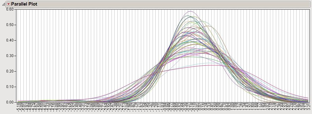
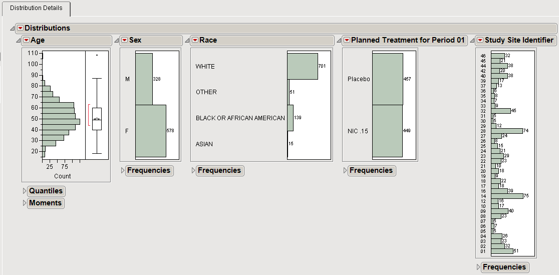
Data distributions show the number or proportion of the events falling within a particular interval. JMP Life Sciences software presents these distributions as histograms or parallel plots.
The histograms below show the number of patients in a clinical trial that fall into specific bins or categories. For numeric variables, you can adjust the bin size using the hand tool.
Distribution estimates can also be overlaid using a parallel plot. The parallel plot below is generated from gene expression data (as determined by hybridization intensities whose relative scale is plotted on the x-axis) from a large number of individual subjects. Each curve represents one subject. Curves show the relative proportion (plotted on the y-axis) of gene probes exhibiting specific intensity values across the experiment.