|
•
|
The “M” refers to minus in the log scale. The log ratios of the two measurements are plotted on the vertical (y) axis.
|
|
•
|
The “A” refers to average in the log scale. The mean values of the two measurements are plotted on the horizontal (x) axis. The A component serves as a common data range reference (for example, the average across all arrays). Many processes in JMP Genomics use the average as the common reference A component, making the MA plots visually comparable through shared x-coordinates, unless you override this default.
|
In the context of microarray expression data, MA plots are used to examine the intensity measurements resulting from two channels. These channels can be drawn from either:
|
•
|
|
•
|
Two or more chips from a one-color platform. (We can call the intensity measurements from chip 1 R, and those from chip 2 G.)
|
|
•
|
|
•
|
A standard assumption in some microarray experiments is that few genes should exhibit a change in expression, meaning that most points on M should be close to zero (0). Under this assumption, wild deviations from zero suggest that the data should be further normalized before additional statistical analyses are conducted.
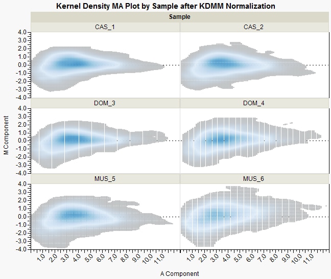
Tip: You can obtain direct (non-contour) MA plots by unchecking the Apply normalized data for MA plot box in the KDMM Normalization and TMM Normalization process dialogs.