The following example illustrates the use of a Grouping column and the construction of a Shift Graph using Consumer Prices.jmp.
The consumer price index data table contains monthly data on 17 products. The time periods vary by product. The data are arranged so that all 17 products are listed in a single column called Series. To separate the products, you must treat Series as a Grouping column.
|
1.
|
|
2.
|
Select Analyze > Screening > Process Screening.
|
|
3.
|
|
4.
|
This ensures that each level of Series is treated as a separate process.
|
5.
|
|
6.
|
Set the Control Chart Type to XBar and R.
|
|
7.
|
Set the Subgroup Sample Size to 3.
|
|
8.
|
Click OK.
|
|
10.
|
|
11.
|
Click OK.
|
The columns Largest Upshift, Upshift Date, Largest Downshift, and Downshift Date are added to the Summary table. The shifts are the largest shifts exceeding one within-sigma unit. The position of each shift is given in terms of the Time variable, Date. SeeShift Magnitudes and Positions.
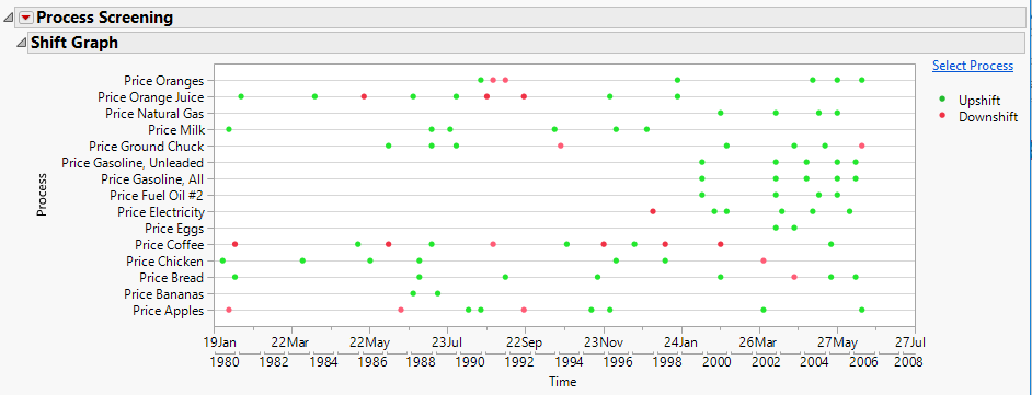
A Shift Graph also appears. The Shift Graph shows all shifts that exceed the number of Shift Threshold within-sigma units, which is set to three by default. See Shift Graph. Green points correspond to upshifts and red points correspond to downshifts.
Notice that Gasoline, All has values for both Largest Upshift and Largest Downshift in the Summary table. The Largest Downshift value, 1.8296, is less than three. Because the Shift Graph only shows shifts of three or more within-sigma units, the Largest Downshift value for Gasoline, All is not plotted on the Shift Graph.
Also notice that Tomatoes is not included on the Shift Graph. For Tomatoes, no shifts of three or more within-sigma units were found.
|
13.
|
In the Tick/Bin Increment panel, set # Minor Ticks to 1.
|
|
14.
|
Set Label Row Nesting to 2.
|
|
15.
|
Click OK.
|
|
16.
|
|
17.
|
Click the Process Screening red triangle and select Control Charts for Selected Items.
|
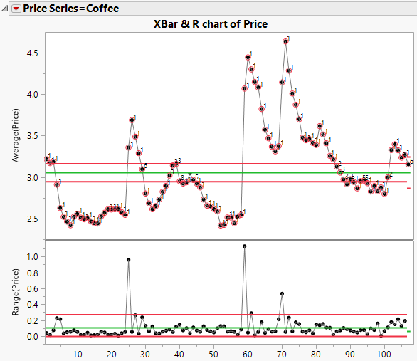
The Summary table indicates that the largest upshift (25.399 within-sigma units) occurs for the subgroup that includes September 1994. In the control chart in Control Chart for Coffee, this is the subgroup in position 59. The Summary table also indicates that the largest downshift (9.1674 within-sigma units) occurs for the subgroup that includes March 1981. This is the subgroup in position 5 in the control chart.