A bubble plot is a scatterplot that represents its points as bubbles. You can change the size and color of the bubbles, and even animate them over time. With the ability to represent up to five dimensions (x position, y position, size, color, and time), a bubble plot can produce dramatic visualizations and make data exploration easy.
This example uses the PopAgeGroup.jmp data table, which contains population statistics for 116 countries or territories between the years 1950 to 2004. Total population numbers are broken out by age group, and not every country has data for every year.
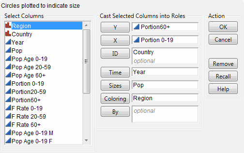
|
1.
|
|
2.
|
|
3.
|
This corresponds to the Y variable on the bubble plot.
|
4.
|
This corresponds to the X variable on the bubble plot.
|
5.
|
|
6.
|
|
7.
|
|
8.
|
Each level of the Coloring variable is assigned a unique color. So in this example, all the bubbles for countries located in the same region have the same color. The bubble colors that appear in Initial Bubble Plot are the JMP default colors.
|
9.
|
Click OK.
|
|
•
|
Note: For detailed information about how the bubble plot aggregates information across multiple rows, see Bubble Plots in the Essential Graphing book.
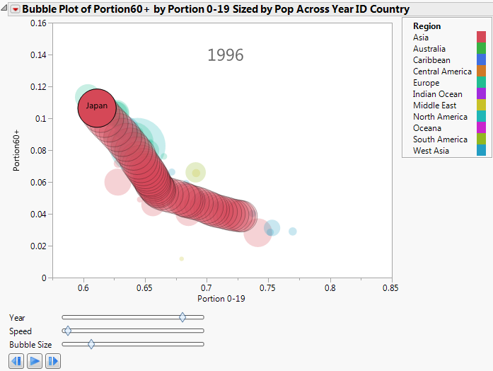
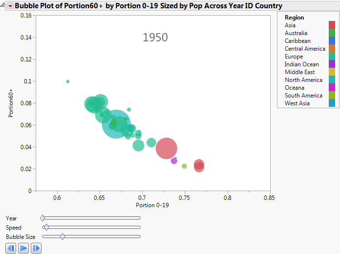
Click the play/pause button to animate the bubble plot through the range of years. As time progresses, the Portion 0-19 decreases and the Portion60+ increases.
 plays the animation, turns to a pause button after you click it.
 pauses the animation.
 manually controls the animation back one unit of time.
 manually controls the animation forward one unit of time.
|
2.
|
From the red triangle menu, select Trail Bubbles > Selected.
|