|
1.
|
|
2.
|
Select Graph > Chart.
|
|
3.
|
|
4.
|
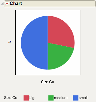
Select Pie Chart from the menu of chart types.
|
|
5.
|
Click OK.
|
|
1.
|
|
2.
|
Select Graph > Chart.
|
|
3.
|
|
4.
|
Click OK.
|
|
5.
|
Select Pie Chart from the red triangle menu for chart.
|
You can also right-click in the chart and select Chart Options > Pie Chart.
|
1.
|
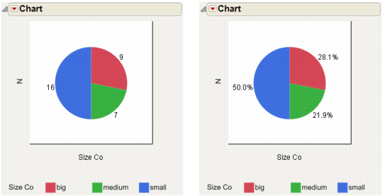
Starting with the pie chart in Example of a Pie Chart, select Label Options > Show Labels from the red triangle menu for Chart.
|
|
–
|
You can also right-click in the chart and select Label > Show Labels.
|
Label By Value is the default setting, so the pie chart now shows the number of companies that are big, medium, and small. See the chart on the left in Example of a Pie Chart.
|
2.
|
To show percentages instead, select Label Options > Label by Percent of Total Values from the red triangle menu for Chart.
|
|
–
|
You can also right-click in the chart and select Label > Label by Percent of Total Values.
|